
Andrée Lange has over ten years of experience working as a digital designer at several agencies. At heart, she is a true UX and UI designer. In recent years, she has specialised in web accessibility and, more specifically, in accessible design.

Accessible design is crucial, not only for compliance with legal standards but also for ethical and business reasons. It ensures your website is usable by everyone, including:
- Those with visual impairments, hearing loss, motor difficulties, and cognitive disorders.
- People facing situational challenges, such as trying to navigate your site in a noisy environment, under bright sunlight, or with a temporary injury like a broken arm.
To help these people use your website, you need accessible User Experience (UX) design.
This guide presents a checklist to make your website more user-friendly for a diverse audience, covering visual, auditory, motor, and cognitive needs. Plus, we’ll share resources to further your understanding of accessible design.
Let’s dive in to make digital spaces inclusive for all!
5 quick checks for any design
Before diving into the comprehensive checklist, here are the five most impactful accessibility checks you can do right now. These catch the majority of issues that affect real users:
1. Colour contrast – Can everyone read your text?
Check that text has at least a 4.5:1 contrast ratio against its background (3:1 for large text over 18pt). This single check helps users with low vision, colour blindness, and anyone viewing your site in bright sunlight.
Quick test: Squint at your design – if text becomes hard to read, your contrast needs work. Use tools like WebAIM’s Contrast Checker or the Stark plugin for instant feedback.
2. Alt text for images – Do your images speak to screen readers?
Every meaningful image needs descriptive alt text. Decorative images should have empty alt text (alt=””) so screen readers skip them.
Quick test: Hide all images on your page. Can you still understand the content and context? If not, your alt text needs improvement.
3. Form labels – Does every input field announce itself?
Every form field must have a visible, properly associated label that tells users what information to enter. Placeholder text alone isn’t enough – it disappears when users start typing!
Quick test: Tab through your form with your eyes closed. Would you know what to enter in each field if a screen reader announced only the labels?
4. Keyboard focus indicators – Can keyboard users see where they are?
Users navigating by keyboard need clear visual indicators showing which element has focus. Never remove focus outlines without providing an alternative.
Quick test: Put your mouse away and navigate using only the Tab key. Can you always tell where you are on the page? If you get lost, so will your users.
5. Heading structure – Does your content have a logical outline?
Use heading tags (H1 through H6) to create a proper document structure. Screen reader users navigate by headings, so they need to flow logically: H1 → H2 → H3, not H1 → H4.
Quick test: List just the headings from your page. Do they tell a complete story about your content? Would someone understand your page structure from headings alone?
Why these five matter most
Each of these checks addresses multiple user needs simultaneously:
- Colour contrast helps people with low vision, but also parents browsing while holding a baby, or anyone outside on a sunny day.
- Alt text serves screen reader users, but also helps when images fail to load on slow connections.
- Form labels assist users with cognitive impairments, but also help everyone avoid mistakes.
- Keyboard focus supports users with motor impairments, but also power users who prefer keyboard shortcuts.
- Heading structure aids screen reader navigation, but also helps everyone scan and understand your content faster.
Now that you’ve got these quick wins under your belt, let’s explore the complete checklist for each type of impairment…
Making UX design more accessible: A comprehensive checklist
Before you begin, it’s crucial to consider the full spectrum of disabilities and impairments. This section will guide you through key considerations for enhancing accessibility in UX design, focusing on visual, auditory, motor, and cognitive impairments. Each type of impairment requires specific design strategies to ensure that everyone can navigate, understand, and interact with your website efficiently.
Remember, this checklist is a solid starting point but not exhaustive. For a more detailed approach to designing accessible websites, we highly recommend getting acquainted with the Web Content Accessibility Guidelines (WCAG). These guidelines serve as the gold standard in establishing accessible web practices, ensuring your site is accessible to the broadest audience possible.
Designing for visual impairments
Visual impairments can significantly affect how users interact with digital platforms. These impairments range from colour blindness and low vision to complete blindness, each presenting unique challenges in navigating and understanding web content.
So here is how you can design with the visually impaired in mind.
1. Ensure good colour contrast
High contrast between text and background colours makes it easier for users with low vision or colour blindness to read the content. The WCAG recommends a contrast ratio of at least 4.5:1 for normal text and 3:1 for large text.
Colour contrast checker tools like the WebAim Contrast Checker, the Stark plugin for Sketch, Adobe XD, and Figma, and the Accessible Color Palette Builder can help verify that your website meets these standards.
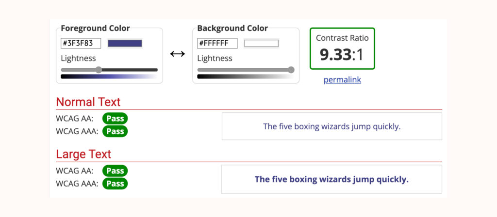
As an example, this is what good contrast looks like when tested with the WebAim Contrast Checker:
And this is what bad contrast looks like:
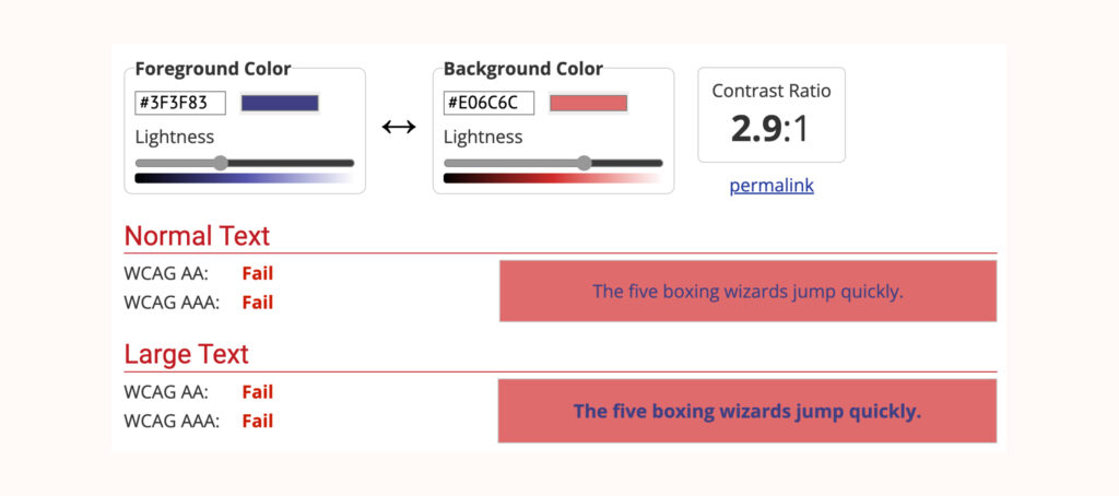
As you can see, even if you don’t have colour blindness or another form of visual impairment, this can be hard to read.
2. Don’t convey meaning with colour alone
Relying solely on colour to convey information (e.g., using red to indicate errors) can leave colour-blind users at a disadvantage. Instead, always include text labels or icons alongside colour or use other visual cues like thicker borders or underlines to ensure everyone can understand the information presented, regardless of their ability to perceive colour.
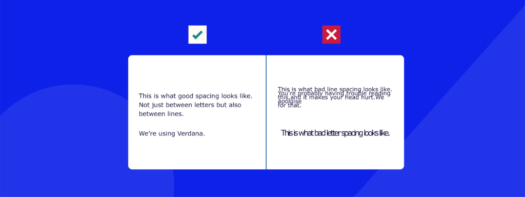
3. Use suitable text size, spacing, and font
Text readability is crucial for all users, but poses particular challenges to those with visual impairments. Here are some best practices you can follow to maximise the readability of text on your website:
- Opt for fonts that are easy to read, such as Arial, Helvetica, Proxima Nova, Futura, and Calibri. These are all sans-serif fonts, and because they lack the little “serif” feature, they appear much cleaner.
- Avoid using small text sizes and allow users the flexibility to resize text without breaking the website’s layout.
- Make sure that the text size works for all kinds of devices, like smartphones, desktop devices, and screen readers.
- Provide enough spacing between lines of text (line height) and between letters (letter spacing).
Wondering how big to make your text? Check out our guide on the best font size!
4. Include alt text for non-text content
Alt text provides a textual alternative to non-text content, such as images and videos, which is essential for screen-reader users to understand the content’s context. Descriptive alt text helps convey the purpose or function of the visual content, ensuring that all users have access to the same information.
For example, if you have this picture:

The alt text should be something along the lines of: “A happy brown and white dog walking down a dirt road.”
Don’t go into too much detail, but still make sure that you’re clear enough and provide all of the relevant context that users need to understand the content of the image. If you want to become a pro at writing these descriptions, take a look at our in-depth tutorial on writing comprehensive alt text.
5. Make content screen-reader and keyboard accessible
Ensure that your website is navigable using a keyboard alone, which is crucial for users who rely on screen readers or cannot use a mouse due to motor impairments. This includes providing a logical tab order, using ARIA (Accessible Rich Internet Applications) landmarks for navigation, and ensuring interactive elements are keyboard-accessible.
6. Use descriptive link text
Instead of writing something vague like “click here,” use descriptive link text that clearly explains its destination or purpose. For example, a link can lead to downloading a file, sending an email, a different page or website, or even dialling a telephone number. In any case, you should make sure that the action to follow is crystal clear.
This practice helps screen-reader users understand the context of links without needing to read surrounding text, providing them with a smoother navigation process.
7. Use headings effectively
Proper use of headings (H1, H2, H3, etc.) structures your content, making it easier for screen-reader users to navigate and understand the layout of your website. Headings should be used hierarchically to denote sections and subsections, providing a clear outline of the page content.
For instance, this is how the heading structure looks for one of our articles:
H1: Improving Icon Usability and Accessibility: 6 Valuable Tips
H2: Understanding the importance of accessible Icons
H3: Key elements of accessible icon design
H2: Key steps in creating accessible icons
H3: 1. Use accompanying text
H3: 2. Apply sufficient colour contrast
H3: 3. Use effective alt text
H4: Standard <img> elements
H4: SVG (Scalable Vector Graphics)
H4: CSS background images
H4: Icon fonts
H4: Image maps
H3: 4. Make your icons clearly visible
H3: 5. Be consistent with your use of icons
H3: 6. Ensure your icon buttons and links are mouse, touchscreen, and keyboard accessible
H2: Finding and using accessible icons
H2: Next steps: Improving your platform’s accessibility with The A11y Collective
Designing for auditory impairments
Auditory impairments, ranging from partial to total hearing loss, affect how users consume audio and video content on the web. This category also includes those in temporarily noisy or sound-sensitive environments, necessitating alternative ways to interact with auditory information. Here is what you can do to help!
1. Ensure captions or transcripts for audio and video content
Captions provide a text version of the audio content in sync with the video, allowing users with hearing impairments to follow along. Transcripts offer a full written account of audio and video content, beneficial for those who cannot access audio for any reason.
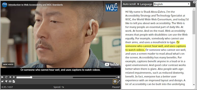
To implement this, use HTML5 video and audio elements with caption tracks (using the <track> tag) and provide transcripts in an accessible format nearby. If you want to learn more, check out W3C WAI’s detailed guidelines on creating effective captions and transcripts.
2. Provide alternatives to voice-only interactions
For interactions or content that is originally voice-based, ensure there are text-based alternatives. This could include providing text instructions for voice-activated services or offering a chatbot as an alternative to voice customer support. The goal is to ensure that information and services are accessible to everyone, regardless of their ability to hear.
3. Add options to stop, pause, and adjust the volume for audio and video content
Interactive controls for media content are essential for users with hearing difficulties. Ensure your website’s audio and video players have easily accessible controls for stopping, pausing, and adjusting volume.
This not only aids users with auditory impairments but also enhances usability for all users. The W3C provides resources and guidelines on designing accessible media player controls.
Designing for motor impairments
Physical and motor impairments can drastically affect a person’s ability to interact with digital content. These impairments may be the result of genetic conditions, illnesses, or injuries and can either be temporary or permanent. They might impact fine motor skills, making tasks like clicking a mouse, touching a screen, or using a keyboard challenging.
Designing for motor impairments means ensuring that websites are navigable and usable without reliance on precise movements.
1. Provide full keyboard support
Many users with motor impairments rely on keyboard navigation instead of a mouse. Implementing full keyboard support, including ‘Skip to main content’ links, ensures users can navigate your website more efficiently. An important element of keyboard navigation is the focus indicator, but these are automatically provided by the browser, and the only thing you can do is make them more visually enhanced, for example, by providing them with a clear and high-contrast border.
The heading structure and navigation on your website are also essential because they help keyboard navigators guide their users logically. For more information, check out the WebAIM’s guide on keyboard accessibility.
2. Ensure clickable areas for interactive elements are optimally sized
Small clickable areas can be difficult for users with motor impairments to accurately select. Enlarging clickable areas and ensuring sufficient space between interactive elements – for example, in drop-down menus – makes your website more navigable for users with limited dexterity.
3. Make tooltips accessible
Tooltips often provide additional information when hovering over an element. For users with motor impairments, ensure tooltips are accessible by making them dismissible without requiring precise mouse movement, hoverable without disappearing unexpectedly, and persistent enough to be read comfortably.
Designing for cognitive impairments
Cognitive impairments encompass a wide range of conditions that can affect a person’s memory, attention, learning, and problem-solving abilities. These impairments can make it challenging for users to understand, remember, or recognise elements on a website.
When designing for cognitive accessibility, it’s essential to minimise cognitive load and make the website as intuitive as possible.
1. Ensure consistency across the website
A consistent design across all website elements, such as icons, navigation, and content structure, helps users with cognitive impairments navigate and understand your site more easily. Consistency in design elements and site navigation reduces the cognitive effort required to use the website. For guidance on consistent design elements, take a look at our guide on creating accessible icons.
2. Simplify website design
A clear and straightforward website design, free from unnecessary or intrusive visual elements, aids users with cognitive impairments. Avoid complex navigation schemes, busy backgrounds, and excessive motion, which can be overwhelming. Focus on simplicity and clarity in your design choices to facilitate easier comprehension and navigation for all users.
3. Accommodate time-bound activities
For activities that are time-bound, such as completing a form or reading content before it disappears, provide accommodations that allow users to control time limits. If possible, design your website to avoid time constraints altogether.
This gives users with cognitive impairments – or anyone who needs more time to process information – the flexibility they need to interact with your site at their own pace.
As you can see, a lot of thought goes behind designing an accessible website, but hopefully, we’ve given you an idea of the types of considerations you should be aware of when designing with accessible UX in mind. Below, we’ve included all of these points in a handy checklist format that you can use to help assess the accessibility of your website. Remember, this list is a strong starting point for enhancing accessibility across your digital platforms, but it is not exhaustive.
For a thorough understanding and implementation of accessibility practices, always refer to the Web Content Accessibility Guidelines (WCAG) as your primary resource.
| Visual impairments |
| ☑️ Ensure adequate colour contrast. ☑️ Avoid conveying meaning with colour alone. ☑️ Use suitable text size, spacing, and font. ☑️ Include alt text for non-text content. ☑️ Make content screen-reader and keyboard accessible. ☑️ Use descriptive link text. ☑️ Utilise headings effectively. |
| Auditory impairments |
| ☑️ Provide captions or transcripts for audio and video content. ☑️ Offer alternatives to voice-only interactions. ☑️ Add options to stop, pause, and adjust the volume of media content. |
| Motor impairments |
| ☑️ Provide full keyboard support, including ‘Skip to main content’ links. ☑️ Ensure clickable areas are optimally sized. ☑️ Make tooltips accessible (dismissible, hoverable, persistent). |
| Cognitive impairments |
| ☑️ Maintain consistency across website elements and navigation. ☑️ Simplify website design, avoiding unnecessary elements. ☑️ Accommodate time-bound activities, allowing users to control time limits. |
Take the next step to expand your accessible design skills
Ensuring your website is accessible to all users is more than a legal obligation – it’s a commitment to inclusivity and a promise to offer a positive experience to every visitor. Throughout this guide, we’ve highlighted essential considerations for making your digital platforms more welcoming to individuals with various impairments. However, it’s important to remember that this checklist is just the beginning.
Creating fully accessible web content requires continuous learning and adaptation as the tools and techniques available are constantly changing. This is where further education and training become invaluable.
To truly excel in accessible design and ensure your websites remain compliant and inclusive, we encourage you to delve deeper into this field. The A11y Collective offers comprehensive web accessibility courses designed to expand your knowledge and competencies.
Don’t wait! Take the next step to enhance your accessible design skills by enrolling in The A11y Collective’s “Accessible design, the basics” course.

Ready to level up your accessible design skills?
Get started with our “Accessible design, the basics” course to improve user experience and ensure your website design is accessible for all users!