
Florian Schroiff has been building for the web for almost 20 years. He has worked on countless accessible websites as a freelancer and for various agencies. As a front-end expert he is always searching for ways to improve accessibility and user experience and to share them with his team — and now with you!
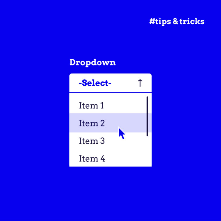
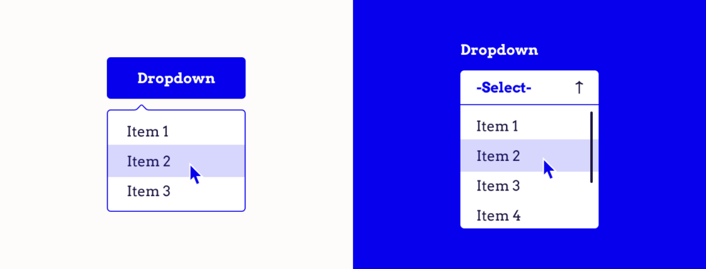
The drop-down menu is a compact, expandable list that guides visitors through the pages of your website without overwhelming them. When done well, they enhance user experience and keep your site’s aesthetics crisp and uncluttered.
However, there’s a crucial aspect that often gets overlooked in the rush to create a visually appealing and functional website: accessibility.
While drop-down menus can be a convenient feature for many, they can pose significant challenges for others, particularly for users with disabilities. A poorly designed drop-down menu leads to a frustrating user experience. This, in turn, can have far-reaching implications for your business, potentially alienating a significant portion of your audience.
In this article, we’ll look into the common accessibility hurdles associated with drop-down menus and offer solutions to ensure they are user-friendly for all!
Exploring the role of drop-down menus in web design
Offering shortcuts to various corners of a site without the need for endless scrolling or clicking, drop-down menus, also known as fly-out navigation, are much more than just another element in web design. By grouping related items together under umbrella categories, these menus simplify the user’s journey, guiding them to where they want to go with minimal effort.
By design, these drop-down menus are typically hidden and appear when a user hovers over or clicks on a designated area. This method is especially handy for sites with a lot of content, as it helps maintain a clean, uncluttered look while still offering many choices right at the user’s fingertips
Common accessibility challenges with drop-down menus
When we talk about drop-down menus, we often focus on their aesthetics and functionality. However, it’s important to recognise that these menus can present significant challenges for some users, particularly in terms of accessibility.
Let’s unpack these issues and understand their impact.
Challenge 1: Mouse navigation
For users with conditions like muscle spasms, tremors, or muscle weakness, accurately selecting options from a drop-down menu can be very frustrating and often impossible. This difficulty can completely bar access to essential parts of your website.
Challenge 2: Keyboard navigation
Many drop-down menus are not designed with keyboard users in mind. This oversight can render a website virtually inaccessible for those who rely on keyboard navigation, such as users with motor impairments or those who simply prefer not to use a mouse.
The lack of a clear focus style exacerbates this issue. Without visible cues indicating which part of the menu or page is active, users can easily get lost in a maze of options, unsure of where they are or how to proceed.
These accessibility issues can snowball into bigger problems for your website and business and lead to:
- Poor user experience: When users struggle or find it impossible to navigate your site, the likelihood of them leaving increases. A high bounce rate indicates dissatisfaction and can signal to search engines like Google that your site might not be providing value, potentially impacting your SEO negatively.
- Legal complications: Inaccessible drop-down menus can put your website at risk of non-compliance with accessibility laws, leading to potential legal issues and damaging your brand’s reputation.
Addressing these challenges is essential for creating an inclusive digital environment.
How to create an accessible drop-down menu
The W3C Web Accessibility Initiative (WAI) has laid out a roadmap of standards and best practices specifically for drop-down and fly-out menus to ensure your website is both functional and inclusive. Let’s take a look:
Ensure submenus are indicated both visually and using markup
It’s not enough to make drop-down menus and submenus function well. They need to be user-friendly and accessible, especially for individuals with disabilities. They should be clearly indicated to the user.
Visually, this can be done through design elements. Icons such as downward arrows, rightward arrows, or chevrons next to menu items represent the presence of additional options. This can be further complemented by text style alterations, such as underlining the text of the menu items or making them bold.
Hover and focus states also enhance the user experience. The hover state is a visual effect applied to an element (like a menu item) when a user moves their mouse cursor over it. It’s a common way to indicate that an element is interactive.
The focus state becomes active when an element is selected using a keyboard (like using the Tab key to navigate). It’s crucial for keyboard-only users, as it shows which element is currently selected and ready for interaction.
When a user either hovers over a menu item with their cursor or focuses on it using the keyboard, it’s helpful to change the appearance of that item. This can be done through:
- Colour changes: Altering the text or background colour of the menu item.
- Background highlighting: Adding a background colour to the item to set it apart from others.
These changes are immediate indicators of interactivity, signalling to the user that the item is clickable or selectable.
Make sure to keep the design consistent – it helps users quickly understand and learn how to navigate your site. When users recognise that all menu items behave the same way, it reduces confusion and enhances the overall usability of your website.
But not everyone can see these visual hints – some individuals use screen readers. That’s why it’s necessary to do the following:
- Implement a semantic HTML structure: Using the correct HTML elements (like
<ul>for menus and<li>for items) helps assistive technologies, like screen readers, understand the structure and purpose of your content. - Incorporate ARIA attributes: ARIA (Accessible Rich Internet Applications) attributes provide a way to make web content and applications more accessible to people who use assistive technologies like screen readers.
- Consider accessibility in your JavaScript: If your JavaScript updates menu content, it should also update ARIA attributes accordingly. This ensures that changes in the menu’s state (like an expanded sub-menu) are communicated to users with visual impairments.
- Balance style and function: While CSS (Cascading Style Sheets) is used for styling, it’s important to ensure it doesn’t hinder the functionality and accessibility of the menu. Proper styling can improve the visibility and distinction of menu elements, aiding users with visual impairments or cognitive disabilities.
Let’s look at an example. In the following code, we’re using the WAI-ARIA markup aria-expanded="false" to tell the user that the submenu navigation is currently hidden/collapsed:
  <body>
    <h1>Navigation component</h1>
    <nav class="navigation">
      <ul class="navigation__list">
        <li class="navigation__item">
          <a href="#item-1" class="navigation__link">About</a>
        </li>
        <li class="navigation__item js-has-submenu" data-expanded="false">
          <a href="#item-2" class="navigation__link">Posters</a>
          <button class="navigation__button js-button" aria-label="Submenu of posters" aria-expanded="false">
            <!-- SVG Truncated -->
            <svg aria-hidden="true" xmlns="http://www.w3.org/2000/svg"></svg>
          </button>
          <!-- Submenu content here -->
        </li>
        <li class="navigation__item js-has-submenu">
          <a href="#item-3" class="navigation__link">Contact</a>
          <button class="navigation__button js-button" aria-label="Submenu of contact" aria-expanded="false">
            <!-- SVG Truncated -->
            <svg aria-hidden="true" xmlns="http://www.w3.org/2000/svg"></svg>
          </button>
          <!-- Submenu content here -->
        </li>
        <li class="navigation__item navigation__item--button">
          <a href="#shopping-cart" aria-label="Shopping cart" class="navigation__link button button--red">
            <!-- SVG Truncated -->
            <svg aria-hidden="true" xmlns="http://www.w3.org/2000/svg"></svg>
          </a>
        </li>
      </ul>
    </nav>
  </body>
Here’s what this code snippet does:
- The
<nav>tag defines a section of navigation links. It’s a semantic HTML element that tells browsers and assistive technologies that the enclosed links are primarily for navigation purposes. <ul>represents an unordered list (<ul>) with the classnavigation__list, which is styled using CSS to display the navigation items.<li>lists the menu items and gives them the classnavigation__item. Each list item represents a single navigation link or a group of links. The list items that contain submenu items have a data-attributedata-expandedthat out javascript uses to track the current state.<a href="#item-1" class="navigation__link">is an anchor tag that defines hyperlinks. The href attribute points to the ID of the element on the page that it links to (like#item-1,#item-2, etc.).<button>is used to toggle submenus. Thearia-label="Submenu of posters"attribute provides accessible names for screen readers, and thearia-expanded="false"attribute indicates the state of the submenu (collapsed by default).- The
<svg>tag is used to display a dowards chevron icon. - The
aria-hidden="true"attribute means that submenus are initially hidden from screen readers, becoming visible when the button is clicked. - You’ll notice some classes are prefixed with
js-(likejs-has-submenu). This is a commonly used good practice that hooks JavaScript to an HTML element, separating them from classes used for styling (decoupling functionality from styling).
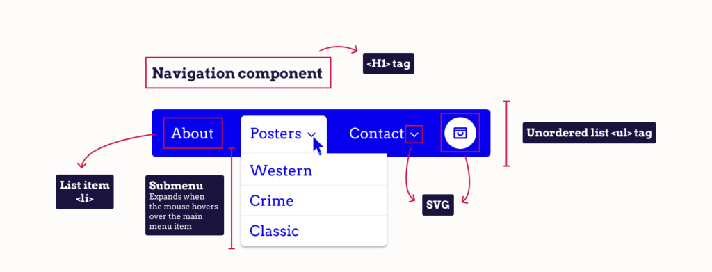
The actual visibility and behaviour/interactivity of this menu (like dropdown toggling) are controlled by CSS and JavaScript, which you can find in this repository.
Accessible drop-down menus for mouse users
For mouse users, submenus that appear only when hovered over with a cursor and disappear as soon as the cursor leaves the menu area can be a huge accessibility problem. This design can be particularly challenging for users with limited fine motor control, who may struggle to navigate these menus without accidentally moving the mouse outside the intended area.
Here are a few things you can implement to make it easier for users with limited dexterity or motor control to interact with your website without precise mouse movements:
Increase target size: Clickable area vs. visual design
Sometimes, the visual design element (like icons, buttons, or text) might be smaller than the desired clickable area. Ensure that the clickable area extends beyond the visual element itself, creating a larger ‘hit area’ for the user so that they’re easier to click on. This helps in reducing the risk of the user clicking on the wrong item or missing the target.
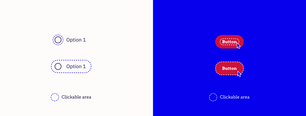
Make sure to follow established guidelines for minimum target sizes. For instance, the WCAG (Web Content Accessibility Guidelines) suggests a minimum target size of at least 24 by 24 CSS pixels for touch targets.
Optimise spacing between elements
Provide enough space between clickable elements to prevent accidental clicks on adjacent items. This spacing is particularly important in drop-down menus, where items are often listed closely together. Adequate spacing reduces the likelihood of selecting the wrong option.
Use CSS effectively
Use CSS to style elements and ensure that the enlarged clickable areas don’t disrupt the overall layout and design of the page.
Testing and user feedback
Test your design with real users, including those with motor disabilities. User testing helps identify specific issues with target sizes and element proximity that might not be evident during the design process.
Adding delays
Implementing a delay before the menu closes when the mouse leaves the menu area could be a partial solution. This delay gives users additional time to move the mouse to the desired submenu item without worrying about the menu disappearing too quickly.
However, this solution has limitations. Since the extent of motor control disabilities varies widely among users, it’s difficult to set a delay that accommodates everyone. A delay that’s too short may not help those who need more time, while a delay that’s too long could hinder the experience for users who don’t require it.
Although this is a possible solution, it’s best to implement the four above solutions before opting for this one. As we do not know how severely a user is impacted by their motor control disability, we can’t know if a timer of one second is enough. Along with this, it’s also not the best way to go when catering to keyboard users.
Accessible drop-down menus for keyboard users
Keyboard-only users typically navigate using the Tab key to move between items and the Enter key to select an item. That’s why drop-down menus must be fully operable using these keys. Users should be able to open, navigate through, and close these menus without any mouse interaction.
A common issue with keyboard navigation in drop-down menus is the need to tab through every single submenu item to reach the next top-level menu item. This can be time-consuming and frustrating for users.
To prevent this, submenus should not open automatically when tabbing through the main menu items. Instead, the submenu should only open when the user chooses to do so. The solution is to use a separate toggle button for each submenu.
Using a button as a toggle
This button can be activated using the Enter key to expand or collapse the submenu. This toggle button should be placed immediately after the corresponding top-level menu item in the tab order. This way, keyboard users can choose to enter the submenu (by pressing Enter on the toggle) or continue to the next top-level item (by pressing Tab again).
The toggle button should have a clear visual indicator (like an arrow or plus sign) and an accessible name (via ARIA attributes) to denote that it controls the display of a submenu.
Let’s see how this is done with code.
<nav aria-label="Main">
  <ul>
    <li><a href="...">Home</a></li>
    <li><a href="...">Shop</a></li>
    <li class="has-submenu">
      <a href="...">Space Bears</a>
        <button aria-label="Submenu of Space Bears" aria-expanded="false">
          <svg .../>
        </button>
        <ul>
          <li><a href="...">Space Bear 6</a></li>
          <li><a href="...">Space Bear 6 Plus</a></li>
        </ul>
    </li>
    <li><a href="...">Mars Cars</a></li>
    <li><a href="...">Contact</a></li>
  </ul>
</nav>
This is just a sample HTML structure snippet for a navigation menu (<nav>) with a drop-down list (<ul> and <li>), including a submenu.
To make this drop-down menu fully functional and accessible, we’ll need to add JavaScript to handle the interactive elements, such as expanding and collapsing the submenu when the button is clicked and updating the aria-expanded attribute accordingly.
const menuItems = document.querySelectorAll(".has-submenu");

let expandedItem = null;

const expandSubMenu = (item) => {
    const subMenu = item.querySelector("ul");
    const button = item.querySelector("button");
    expandedItem = item;

    subMenu.setAttribute("aria-hidden","false");
    button.setAttribute("aria-expanded","true");
    item.dataset.expanded = "true";
    subMenu.querySelectorAll("a")[0].focus(); // Focus on the first link in the submenu
};

const collapseSubMenu = (item) => {
    const subMenu = item.querySelector("ul");
    const button = item.querySelector("button");
    expandedItem = null;

    subMenu.setAttribute("aria-hidden","true");
    button.setAttribute("aria-expanded","false");
    item.dataset.expanded = "false";
    button.focus(); // Focus back on the button
};

menuItems.forEach((item) => {
    const button = item.querySelector("button");

    button.addEventListener("click", (event) => {
        if (button.ariaExpanded === "false") {
            expandSubMenu(item);
        } else {
            collapseSubMenu(item);
        }
    });

    item.addEventListener("mouseenter", () => {
        expandSubMenu(item);
    });

    item.addEventListener("mouseleave", () => {
        collapseSubMenu(item);
    });

    // Handling keyboard navigation
    button.addEventListener("keydown", (event) => {
        if (event.key === "Enter" || event.key === " ") { // Space or Enter key
            event.preventDefault(); // Prevent the default action to stop scrolling when pressing Space
            if (button.ariaExpanded === "false") {
                expandSubMenu(item);
            } else {
                collapseSubMenu(item);
            }
        }
    });

    // Handling tab key inside submenu to loop back to the button
    const subMenuLinks = item.querySelectorAll("ul a");
    if (subMenuLinks.length) {
        const lastLink = subMenuLinks[subMenuLinks.length - 1];
        lastLink.addEventListener("keydown", (event) => {
            if (event.key === "Tab" && !event.shiftKey) {
                event.preventDefault();
                button.focus(); // Move focus back to the button
            }
        });
    }
});
Here’s a breakdown of what this code does:
const menuItems = document.querySelectorAll(".has-submenu");This line selects all elements (menu items) with the class has-submenu (indicating they have a submenu) and stores them in the menuItems variable.
let expandedItem = null;This variable is used to keep track of the currently expanded submenu item. Initially, it’s set to null, indicating no submenu is expanded.
const expandSubMenu = (item) => {};This function takes a menu item as an argument and expands its submenu. It finds the submenu (<ul>) and the toggle button within the passed item and updates their attributes:
- The
subMenu.setAttribute("aria-hidden","false");line setsaria-hidden="false"on the submenu, making it visible to assistive technologies. - The
button.setAttribute("aria-expanded","true");line setsaria-expanded="true"on the button, indicating that the submenu is now open. - The
item.dataset.expanded = "true";line sets a custom attribute on the HTML element representing the submenu to keep track of its state (expanded or collapsed).
const collapseSubMenu = (item) => {};This function is similar to the expandSubMenu one, but does the opposite. It collapses the submenu of the given item. It sets the aria-hidden attribute to “true” and the aria-expanded to “false” on the submenu and button, respectively, and marks the item as not expanded.
menuItems.forEach((item) => {});This loop adds event listeners to each menu item with a submenu. Inside the loop, a click event listener is added to the toggle button. When clicked, it checks the current state of the submenu (button.ariaExpanded) and either expands or collapses the submenu accordingly.
In many traditional web navigation structures, especially in eCommerce settings, top-level menu items serve a singular purpose: either as a link to a page or as a trigger for a submenu. This can limit the user experience in several ways:
- Top-level as a link only: If “Shop” is just a clickable link, users are directed to a general shop page without the option to see specific categories unless they navigate to the submenu from the shop page.
- Top-level as a trigger only: If “Shop” only triggers a submenu, users can’t directly access the general shop page. They must choose from the specific categories listed in the submenu.
By using a separate toggle button for the submenu, you can offer a dual functionality and enrich your site’s accessibility:
- Direct access to the general “Shop” page: Clicking on the “Shop” menu item itself takes users directly to the main shop page. This is efficient for users who want to explore the entire catalogue or aren’t sure which category they are interested in.
- Easy navigation to specific categories: The toggle button, visually distinct and located next to the “Shop” menu item, when clicked, reveals a submenu. This submenu lists different categories like “Electronics”, “Clothing”, “Home Appliances”, etc. Users who have a specific category in mind can directly navigate to it, bypassing the general shop page.
There is just one thing remaining – letting the user know that they tabbed out of the drop-down menu.
Add awareness of when a user tabs out of the menu
For this, we’ll add more JavaScript code.
document.addEventListener("keydown", (event) => {
    if (event.key === "Tab") {
   	 if (!expandedItem) {
   		 return;
   	 }

   	 const subMenu = expandedItem.querySelector("ul");

   	 const focusedElement = expandedItem.querySelector(":focus");
   	 const firstFocusableElement = expandedItem.querySelector("a");
   	 const lastFocusableElement = subMenu.lastElementChild.querySelector("a");

   	 if (!event.shiftKey && focusedElement === lastFocusableElement) {
   		 collapseSubMenu(expandedItem);
   		 return;
   	 }

   	 if (event.shiftKey && focusedElement === firstFocusableElement) {
   		 collapseSubMenu(expandedItem);
   		 return;
   	 }
    }

    if (event.key == "Escape") {
   	 collapseSubMenu(expandedItem);
    }
});
First we check whether any menu is currently expanded. If no menu is expanded (expandedItem is null), we exit the function without executing any action.
Then, we define the key elements within the expanded menu:
subMenu, which is the actual dropdown menu.focusedElement, which is the element within the expanded menu that currently has focus.firstFocusableElementandlastFocusableElement, which are the first and last navigable elements in the submenu, essential for understanding when the user’s focus moves in or out of the menu.
If the user presses Tab (without Shift) and the focused element is the last in the submenu, the code will collapse the menu. The next Tab press will move the focus outside the submenu.
If the user presses Shift + Tab and the focus is on the first element in the submenu, the menu will collapse. This handles the scenario of backward navigation out of the menu.
This code will also respond to the Escape key, which is usually used to close modal elements and, in our case, collapses the expanded menu.
Accessible drop-down menus for touchscreen users
Touchscreen interaction combines the intricacies faced by mouse users with additional limitations, particularly around elements designed for hover interactions. Let’s explore these challenges and a practical solution to enhance accessibility for touchscreen users:
- No hover state: Touchscreen devices lack a hover state, a common trigger for revealing dropdown menus in desktop interfaces. This absence means that traditional hover-based menus are not accessible to touchscreen users.
- Accidental clicks: Users often aim to open a submenu but end up clicking through to the top-level menu item’s page. This occurs because, on touch devices, the first tap on a menu item can act as a click, inadvertently triggering navigation.
- Limited feedback and precision: Touch interactions provide less precise control compared to a mouse. Selecting small targets or distinguishing between clicking a menu item and expanding its submenu can be difficult.
To mitigate these challenges and enhance navigation accessibility, implementing a table of contents on top-level destination pages can be a practical solution. Here’s how it works:
- Reflect submenu headings: The table of contents on a top-level destination page should mirror the headings or links found in the associated submenu. This creates a consistent and predictable structure, aligning with the user’s expectations based on the dropdown menu.
- Quick navigation to desired content: If a user accidentally navigates to a top-level page instead of opening the submenu, the table of contents provides a direct way to access the specific content they were originally seeking. This feature is especially helpful in reducing frustration and improving the overall user experience.
- Enhancing usability: The table of contents offers an alternative navigation method, circumventing the limitations of touch interactions with dropdown menus. Users can directly tap on the desired section from the table, facilitating easier and more efficient navigation.
Here’s an example of how you can organise the table of contents:
<nav aria-labelledby="sections-heading">
    <h2 id="sections-heading">Products</h2>
    <ul>
        <li><a href="/products/t-shirts">T-Shirts</a></li>
        <li><a href="/products/dresses">Dresses</a></li>
        <li><a href="/products/coats">Coats</a></li>
    </ul>
</nav>
The aria-labelledby attribute references the ID of the heading element (sections-heading) to provide a label for the navigation block. This is particularly helpful for screen reader users, as it gives context to the navigation section.
Each list item contains a hyperlink to a specific product category (like T-Shirts, Dresses, or Coats). These links are direct, user-friendly pathways to the respective sections, making it easy for users to find what they’re looking for.
The use of aria-labelledby and semantic HTML (<nav>, <h2>, <ul>, <li>) ensures that the navigation is accessible to users with disabilities, especially those using screen readers. It helps in conveying the structure and purpose of the navigation links.
This table of contents can be adapted to various contexts beyond product categories, such as articles with multiple sections, different service offerings, or any other grouped set of links.
Master web accessibility with The A11y Collective
By considering users with various disabilities or impairments, including those who rely on mouse, keyboard, or touchscreen interfaces, and those using assistive technologies, you can make your website more welcoming and accessible to a broader audience.
Drop-down menus are just the beginning of your journey toward building a fully accessible website. This is where The A11y Collective comes in.
The A11y Collective offers a comprehensive suite of courses tailored for all levels, designed to deepen your understanding of web accessibility and give you the knowledge to create websites that are accessible to everyone.
- For those just starting out, the Accessible design, the basics course is the perfect beginner-level course, covering the key elements of accessible web design.
- For those looking for more technical aspects, Accessible code is a mid-level course that focuses on writing and implementing accessible code.
- For advanced accessibility tools, the ARIA explained course offers a master-level overview of what ARIA is and how to use it effectively.
- For those ready to take their skills to the next level, Advanced Accessible Components is an advanced course that guides you through creating your own accessible web components.
Check out the full range of courses offered by The A11y Collective today to master web accessibility. Take the next steps towards making the digital world a more inclusive space for all!