
Meet Fabio Bindels, a living testament to the power of The A11Y Collective. He embarked on his front-end journey with a deep curiosity for accessibility and has since evolved into an expert at his trade. His commitment to an accessible web fuels his mission to educate and inspire, making him a valuable guide on the path to accessible web development.
Making a website digitally accessible is a great initiative, but it comes with its own set of challenges.
At The A11y Collective, we know that keeping accessibility in mind during web development can seem complicated, to say the least. It’s tough to cover every situation and handle the difficulties that arise.
Resources like the Web Content Accessibility Guidelines (WCAG) are essential, but they are also quite extensive, making it hard for people to wrap their heads around all the information.
That’s why we created this guide, where we’ll provide direct strategies to address prevalent website accessibility challenges – it’s actually why The A11y Collective was born!
Remember, while these are some of the most common accessibility issues, this isn’t an exhaustive list.
Key elements of an accessible website
Digital accessibility is based on four cornerstones according to the WCAG:
- Perceivable: Users should be able to access the information, regardless of whether they do it by sight, hearing, or touch.
- Operable: Users should be able to perform all operations, such as navigating your website and inputting information, using varied tools – from a keyboard or a mouse to voice commands and more.
- Understandable: Text should be legible, with the content written in plain language, and instructions should be straightforward.
- Robust: Content should be reliably interpreted by a wide variety of software, including assistive technologies like screen readers or voice recognition software.
The WCAG is currently the best set of standards available for creating accessible platforms and should always be your touchstone when seeking to enhance your website’s accessibility.
Consider our course, “Web accessibility, the basics”!
For a more comprehensive understanding of web accessibility, you might consider our course, “Web accessibility, the basics”. This course will provide you with a solid foundation in accessibility principles and help you recognise how to make your site more accommodating for all users.
Quick accessibility checklist: the 7 most common mistakes at a glance
Before diving into the details, here’s a quick reference list of the most common accessibility mistakes to check on your website:
| Mistake | Quick check | Impact |
|---|---|---|
| Low colour contrast | Can you read all the text clearly? Use WebAIM Contrast Checker. | Affects 83% of websites – the #1 accessibility error. |
| Missing or poor alt text | Right-click images → Inspect → Check for alt attribute. | Screen reader users can’t understand image content. |
| No keyboard navigation | Try navigating using only Tab, Enter, and arrow keys. | Excludes users who can’t use a mouse. |
| Unlabelled form fields | Check if every input has a visible label. | Users don’t know what information to enter. |
| Vague link text | Look for “click here” or “read more” links. | Screen reader users lack context. |
| Inaccessible PDFs | Test PDFs with a screen reader. | Documents are unreadable for many users. |
| Wrong heading structure | Check if headings follow H1→H2→H3 order. | Disrupts page navigation. |
Did you know? According to the 2025 WebAIM Million report, fixing just 6 of these issues (Low contrast text, missing alternative text for images, missing form input labels, empty links, empty buttons, and missing document language) would resolve 96% of all accessibility errors found on websites.
Identifying the 7 most common digital accessibility issues
Over a billion people globally have some form of disability, so even though web accessibility benefits everyone, it is created with disabled people in mind. The main idea is that every single person, no matter the device they use, their health condition, and their abilities, can access website information without any obstructions.
Taeke Reijenga, Founder & trainer at The A11Y CollectiveDigital accessibility is an ethical responsibility.
Remember that crafting a fully accessible website goes beyond just resolving these common problems – care and attention should be dedicated to every aspect of your website.
Insufficient colour contrast
Poor colour contrast is one of the most common web accessibility problems, and it primarily affects users with colour blindness, low vision, or other visual impairments.
The WCAG suggests a clear contrast ratio between the colour of text and its background, which for normal-sized text means a minimum contrast ratio of 4.5:1.
You might be asking yourself now, how can one even measure that? Don’t worry – there’s a tool for everything.
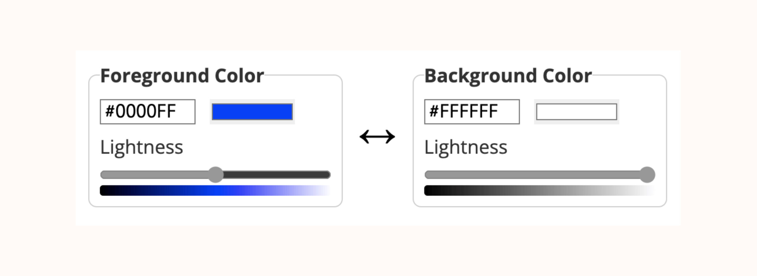
Our personal choice is the WebAim Contrast Checker. Here’s how it works:
- Input the hex codes or RGB values of your text and background colours.
 WebAim Contrast checker
 - The tool will then calculate the contrast ratio and determine whether it passes or fails the WCAG standards.
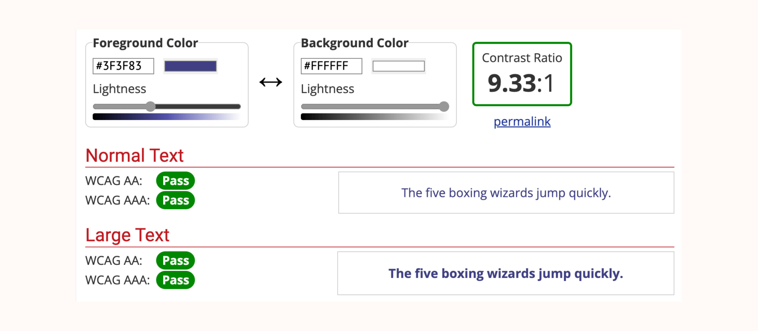 Example of good colour contrast
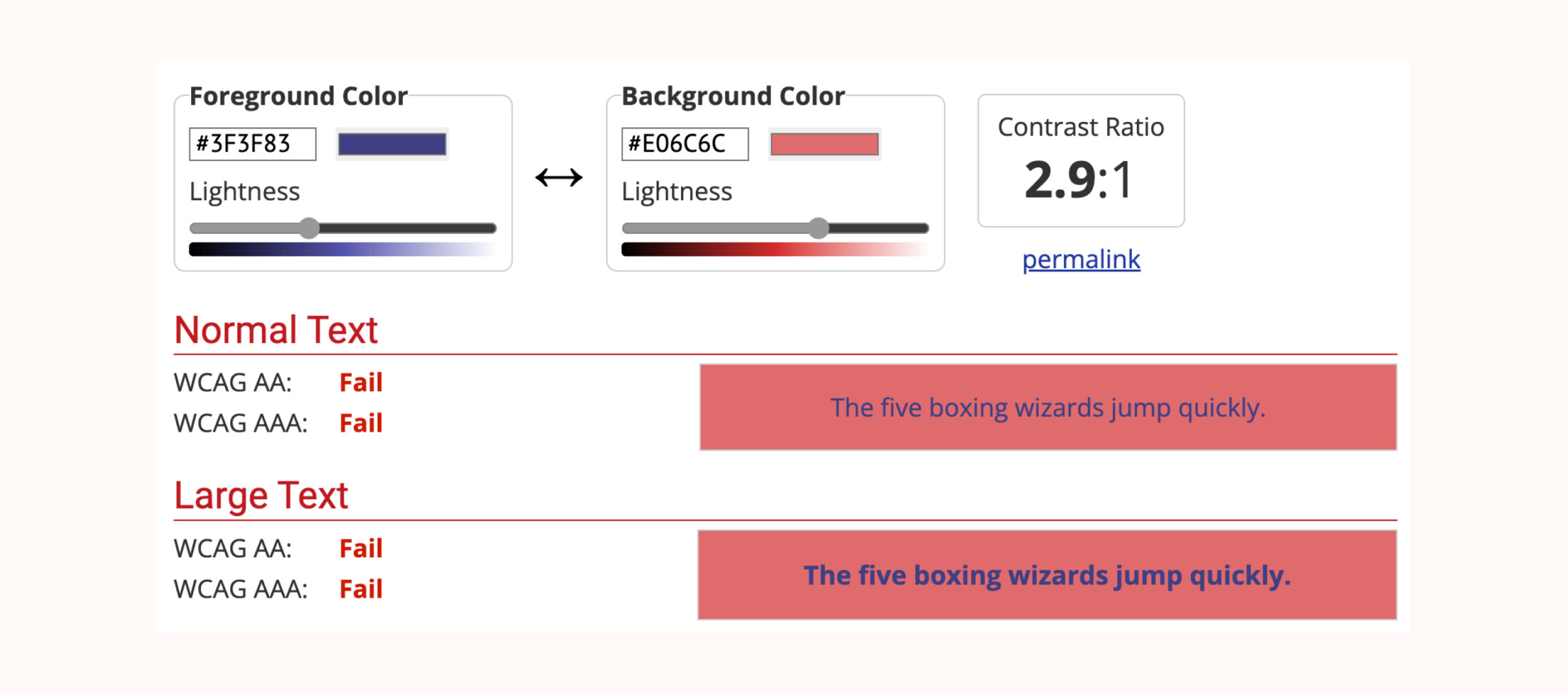 Example of poor colour contrast
Apart from the WebAim Contrast Checker, you can use the Stark plugin compatible with Sketch, Adobe XD, and Figma. Especially beneficial for designers, this plugin can check the contrast of your design right within your preferred design tool.
Another resource is the Accessible Color Palette Builder, which helps you devise colour schemes that are accessibility-compliant from the get-go.
Poor or missing alt text
Alt text, short for alternative text, is a descriptor for imagery on the web, acting as a readable substitute for images in contexts where users cannot view them. Understanding and implementing proper alt text is essential to creating a more inclusive and accessible online environment.
With this in mind, let’s look at some of the best practices for using alt text:
- Be brief and to the point: Keep your alt text within 125 characters as screen readers cut off after this number.
- Describe the content: The text has to be clear, specific, and relevant. For instance, instead of using ‘A dog‘ as alt text, a more suitable description would be ‘A golden retriever playing fetch in the park‘.
- Avoid alt text on purely decorative elements: For images that don’t provide necessary information or context, like decorative borders or spacers, it’s best to use an empty alt attribute
alt="". It informs screen readers to bypass the image, ensuring they don’t read out unnecessary or confusing information to the user. - Avoid redundancy: When creating alt text, there’s no need to begin the description with phrases such as ‘image of’ or ‘picture of’. Screen readers already announce an image element before reading the alt text, making such prefixes redundant and potentially disruptive.
Incorrect use of headings
Headings structure your content, making it navigable for both sighted and visually impaired users. While users use visual cues to quickly scan the text to find the information they are looking for, people who are blind can’t do this. Instead, they can use headings to quickly navigate to certain sections of a page and read only the information that is relevant to them.
There are several aspects to using headers correctly, including:
- Using the correct hierarchy (i.e., only including a single
<h1>then structuring your headings from<h2>down to<h6>). - Ensuring that HTML tags are added to all headings.
- Creating headings that accurately represent the content they relate to.
Errors, such as skipping heading levels or using headings for styling rather than structure, disorient and confuse users who rely on keyboard navigation or screen readers.
Learn more
To learn more about using headings correctly, check out The A11y Collective’s guide on accessible heading structure or, for a more comprehensive overview, enroll in the course “Accessible design, the basics.
Lack of keyboard accessibility
Keyboard accessibility is important for those who cannot use a mouse or trackpad or prefer not to. This includes people with motor or vision impairments.
Here are some steps you can take to accommodate these users:
- Use correct HTML tags for interactive elements on your website, as they have built-in semantics that convey the element’s meaning to assistive technologies.
- Maintain a logical heading hierarchy and tab order to ensure users can easily navigate your site’s content.
- Ensure navigation drop-down menus are keyboard accessible. For instance, each menu option should be reachable using the ‘Tab‘ key, and users should be able to expand and collapse drop-down menus using the ‘Enter‘ key.
- Use clear, visible focus indicators that guide keyboard users navigating your website.
- Provide ‘skip to main content’ links and place them at the top of the webpage to allow keyboard-only users to bypass blocks of navigation and move directly to the main content of each webpage.
Inaccessible forms
Forms often serve as the gateway for users to interact with a website, so prioritising their accessibility is crucial if you want to ensure a great user journey.
Let’s take a look at some common form accessibility issues:
- Missing or unclear labels for form fields: Clear labels make your forms easier and faster to complete and provide vital context for people using screen readers and users with cognitive disabilities. For instance, a form input field labelled just ‘Name‘ fails to specify whether it refers to a first name, last name, or full name. More specific labels, like ‘Enter your full name‘, make the distinction clear. If you want to dive deeper, we recommend checking out W3C’s guide on form labelling.
- The absence of keyboard navigation in form fields: Users who rely solely on the keyboard for navigation – particularly those with motor disabilities – should be able to interact with forms entirely via the keyboard.
- Bad implementation of CAPTCHAs: These elements often rely heavily on visual interaction. While alternatives exist for visually impaired users, like audio CAPTCHAs, these are often hard to pass. It is therefore recommended to not use CAPTCHAs at all and instead look at alternatives like honeypots or computer-run challenges like Cloudflare’s Turnstile.
- Vague and non-descriptive text for buttons and inputs: Instead of ambiguous or commonplace labels like ‘Click here’, use specific descriptions like ‘Download the Annual Report’. This offers clarity to the user and aids understanding for screen reader users.
- Not conveying error messages in an accessible way: Using a different colour to highlight errors may not be effective, as colourblind users may not see it. An accessible error message should clearly state, ‘Email is a required field‘ instead of just changing the border colour of the email field to red. To take it a step further, you can make the message more descriptive, like ‘We need your email address to send you the newsletter’, for example.
More importantly, these error messages should be programmatically linked to the corresponding form field so that screen readers read them out in the correct context. This can be achieved using the aria-describedby attribute:
<div class="form__name">
<label for="firstname" data-validation="We need your first name to address you correctly">

<span class="form__field-name">First name</span>

<span aria-hidden="true" class="form__required"> (required) </span>
</label>

<input
aria-describedby="firstname-validation" required
id="firstname"
name="firstname"
type="text"
autocomplete="given-name"
/>

<small id="firstname-validation" class="form__validation"></small>

</div>
And this is the accompanying JavaScript (JS) code to make the error message work:
const requiredFields = document.querySelectorAll("[required]");
const form = document.querySelector(".js-form");
const summaryBox = document.createElement("div");
const summaryText = document.createElement("p");
const summaryList = document.createElement("ol");

const checkValidity = (event) => {
	event.preventDefault();
	const emptyFields = [];

	requiredFields.forEach((field) => {
		field.setAttribute('aria-invalid', 'false');

		// Check if field is empty
		if (!field.value) {
			field.setAttribute('aria-invalid', 'true');
			emptyFields.push(field.labels[0]);
		}
	});

	if (!emptyFields.length) {
		form.submit();
	} else {
		setSummary(emptyFields);
		setInlineMessage(emptyFields);
	}
};

const setSummary = (fields) => {
	summaryBox.classList.add("form__summary");
	summaryText.textContent =
		"There was a problem with your submission. The following inputs need attention";

	const listItems = fields.map((field) => {
		return `
			<li>
				<a href="#${field.getAttribute("for")}">${field.querySelector('.form__field-name').textContent}: ${field.dataset.validation}</a>
			</li>
		`;
	});

	summaryList.innerHTML = listItems.join("");

	summaryBox.append(summaryText, summaryList);
	summaryBox.setAttribute("tabindex", "0");
	form.prepend(summaryBox);
	summaryBox.focus();
};

const setInlineMessage = (fields) => {
	fields.forEach((field) => {
		const message = field.nextElementSibling.nextElementSibling;
		message.textContent = field.dataset.validation;
	});
};

form.addEventListener("submit", checkValidity);
The front-end result should look something like this:
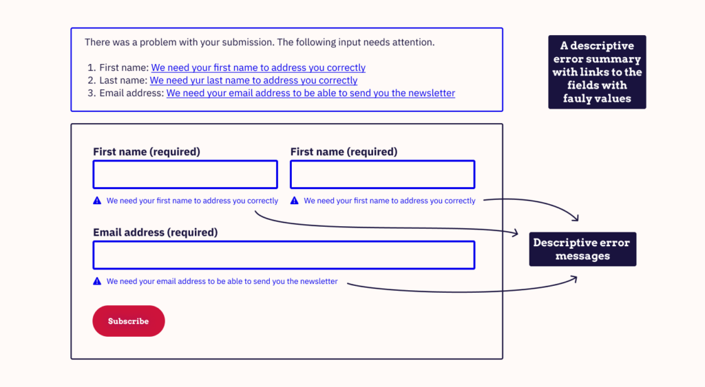
Example front-end result for the previous code.
Non-descriptive link text
Imagine navigating a website where valuable visual context is unavailable – this is often the reality for many users who rely on screen readers or have visual impairments. These users depend heavily on descriptive link text for seamless website navigation.
Here are several strategies to ensure your link texts are meaningful and descriptive:
- Write clear and contextual anchor texts. Using an icon or image as a link without descriptive text may cause confusion as the user is left guessing about its functionality.
- Include important link information, such as ‘opens in a new tab’ or ‘PDF download’, to avoid confusion about the function of the link.
- Provide contextual descriptions for site elements like buttons, checkboxes, and select lists. These elements must be labelled appropriately and descriptively using ARIA labels, as these are particularly useful for elements where the descriptive text might clutter the visual interface but are still crucial for screen reader users.
- Ensure your link text is visually distinguishable from regular text. Visual cues such as colour contrast and underlines help users identify links, even without hovering or focus states – a fundamental principle in accessibility. Ensure that you don’t identify links by colour alone, however, as this is inaccessible for site visitors with visual impairments.
Embedded inaccessible documents
Embedded documents, like PDFs, have to be accessible to all users.
Here is what you can do to ensure this:
- Correct tagging: This ensures a logical structure to your document, which screen readers can readily interpret. You can find a concise step-by-step guide about tagging PDFs in Adobe’s Creating Accessible PDFs guide.
- Alt text for images: All images within your PDF should have alt text to provide context for screen reader users.
- Text blocks aren’t saved as images: Transcribing your text into an image format creates an additional barrier for assistive technologies. They can’t resize or reflow the text for visually impaired users, index the text for search engines, or convert the text into speech for screen reader users.
Commonly used software like Microsoft Word and PowerPoint offer built-in accessibility checkers. These features provide a good starting point for detecting common violations, but they might not catch everything, and manual accessibility testing is always recommended.
Besides, it’s essential to know that even documents in other formats, like EPUB, come with their own accessibility considerations and tools that require attention.
Take the next steps to overcome web accessibility issues
Everybody deserves access to your web content, and your website deserves to be appreciated by all. So take the necessary steps and create a spot on the Internet where every single person feels welcome and comfortable.
This not only fulfils your ethical responsibilities but also significantly improves SEO rankings and ensures you’re compliant with the legal requirements for accessibility.
It doesn’t matter where you are on your journey – The A11y Collective is here to guide you every step of the way.
So try out our range of courses and master the craft of web accessibility today!