Caitlin de Rooij is a Web Accessibility Specialist. She works as an Accessibility Consultant for Level Level and provides training and workshops for enhancing digital accessibility. Caitlin’s expertise lies in ensuring that websites and digital content are designed and developed to be inclusive and usable for individuals with diverse abilities and disabilities.

Have you ever stopped to wonder how accessible your online content truly is? We rely on the internet for education, employment, commerce, and social connectivity. That’s why ensuring that everyone – regardless of disability or impairment – can interact easily with web content is not just important; it’s necessary.
However, despite its critical importance, accessibility is often overlooked, creating barriers instead of bridges for millions of users worldwide.
In this article, we’ll delve into seven crucial accessibility considerations and how to implement them to enhance your web presence.
7 strategies for implementing digital accessibility standards
Building a fully accessible website can feel like navigating a complex maze. With an overwhelming array of factors to consider, knowing where to start is only the beginning.
The Web Content Accessibility Guidelines (WCAG) offer a comprehensive set of standards designed to guide designers, developers, and businesses in creating websites that are accessible to all users, including those with disabilities.
These guidelines represent the gold standard in accessible web design, providing actionable steps to ensure your digital content is perceivable, operable, understandable, and robust.
Many of the most significant accessibility laws and regulations worldwide have been modelled after or directly reference the WCAG’s success criteria. Therefore, aligning your website with these guidelines is not only a proactive step towards inclusivity but also a prudent measure to ensure compliance with legal standards.
Let’s now hone in on seven essential considerations for any site owner or developer aiming to achieve seamless digital interaction.
1. Heading structure and hierarchy
Just as a book is divided into chapters and sections to guide the reader, a website must employ a logical structure and hierarchy in its headings to facilitate ease of navigation for all users.
At the heart of this approach is the use of HTML heading tags, ranging from <h1> to <h6>, which serve as the building blocks of web content structure. These tags provide a framework that assistive technologies, such as screen readers, use to interpret and navigate a page.
By employing these heading tags correctly, you allow users of assistive technologies to jump between sections effortlessly, thereby providing an improved and more inclusive navigation experience.

Implementing headings on your website effectively requires adherence to a few best practices:
- Unique <h1> tags: Each page should have a single <h1> tag to define the main topic or purpose of the page. This acts as the digital equivalent of a book’s title, offering a clear indication of what the page is about.
- Descriptive headings: Use headings that accurately describe the content that follows them to help users understand the structure and content of your site and facilitate smooth navigation.
- Hierarchical organization: Organize your headings in a hierarchical manner, ensuring that <h3> tags fall under <h2> sections, <h4> tags under <h3>, and so on. Avoid skipping heading levels from the top down, as this can confuse both users and assistive technologies.
- Appropriate use of headings: Heading elements should be used strictly for headings, not for text that you wish to emphasise or make stand out. Misusing heading tags can disrupt the page structure and confuse users who rely on headings for navigation.
👉 Check out our “Accessible heading structure” article if you want more in-depth guidance on crafting an accessible heading structure.
2. Use of colour
The use of colour on a website is not just a matter of aesthetic preference. Colours plays a vital role in the accessibility and usability of digital content, especially for users with visual impairments.
Individuals who are partially sighted or have colour vision deficiencies (commonly known as colour blindness) may struggle when interacting with and navigating through sites with inaccessible colour schemes.
Sufficient colour contrast between text and its background
High contrast makes text easier to read for everyone, but it is particularly important for users with visual impairments, as it helps to distinguish text from the background and enhance readability.
The WCAG 2.2 AA standard sets forth minimum requirements for colour contrast, aiming to ensure that text is accessible to users with mild to moderate vision impairments. Meeting or exceeding this standard is a fundamental step toward creating an accessible website.
Colour accessibility checker tools
There are several tools available to help site owners test and achieve the required colour contrast levels:
- WebAIM Contrast Checker provides an easy-to-use interface for evaluating the contrast ratio of text against its background colour.
- Stark plugin, compatible with design platforms like Sketch, Adobe XD, and Figma, offers a suite of accessibility tools, including contrast checking.
- Accessible Color Palette Builder is another valuable resource, assisting in the creation of colour schemes that comply with accessibility standards.
Using colours for communication
Relying exclusively on colour to communicate meaning can exclude users who have difficulty distinguishing between certain colours. Instead, designers should incorporate secondary visual indicators – icons, textures, different shapes, or labels – to ensure that information is accessible to everyone.
Also, the use of too many different colours on a website can lead to visual confusion, affecting users across the spectrum of visual capabilities. A cluttered colour scheme can distract and detract from the user experience, making it difficult for users to focus on important content.
It’s advisable to use colour sparingly and strategically, selecting a palette that supports the usability and accessibility of your site while still aligning with your brand identity.
3. Typography, font, and text size
Clear and easily readable typography (typeface, font size, and text layout) plays a pivotal role in how users interact with your website, affecting everything from engagement to comprehension. For individuals with visual impairments, dyslexia, or other reading difficulties, these choices can significantly impact their ability to access and process information online.
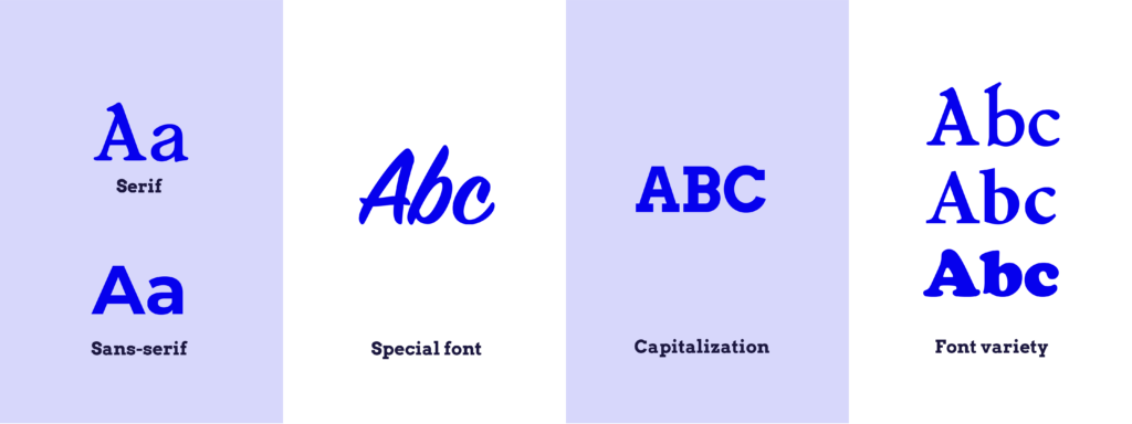
When it comes to selecting an accessible typeface for your website, there are several key considerations to keep in mind:
- Sans-serif fonts: These fonts are generally more accessible for web use because they render more cleanly on various screens. Sans-serif fonts lack the small projecting features called “serifs” at the end of strokes, which makes them appear cleaner and simpler, thereby enhancing readability on digital platforms.
- Avoiding special fonts: While it might be tempting to use handwriting or other decorative fonts to add character to your website, these typefaces can be challenging to read. The unique shapes and close proximity of letters can make them difficult to distinguish, particularly for users with dyslexia or visual impairments.
- Capitalization: Using all capital letters for body text can significantly reduce readability. All-caps text eliminates the natural shape differences found in lowercase letters, which helps our brains recognize words quickly.
- Font variety: Utilising too many fonts can create visual chaos, making your site appear cluttered and disorganised, which detracts from user experience. Conversely, using too few typefaces may not provide enough visual differentiation between headings, subheadings, and body text, making your content harder to navigate.
Recognizing that users have diverse needs and preferences for font size and readability is essential, particularly for those with visual impairments. The most effective approach to accommodate these varying needs is to design your website in a way that allows users to adjust font sizes themselves.
While modern browsers and some assistive technologies offer options for adjusting text size, explicitly coding your site to support manual adjustments ensures that your content is accessible to the widest possible audience.
The A11y Collective offers the “Accessible design, the basics” course, which covers the foundational aspects of creating accessible digital content, with a focus on the critical role of typography in designing inclusive and user-friendly websites.
Want to level up your design accessibility?
Our “Accessible design, the basics” course provides a strong foundation for site owners, developers, and designers looking to build accessible websites.
4. Hyperlinks
Hyperlinks guide users from one piece of content to another with just a click. However, the effectiveness of these links depends significantly on their clarity and context. For a hyperlink to serve its purpose, it should be immediately clear to the user where the link is placed in the text, what action will occur upon clicking, and where the link will lead.
To create the perfect link, one that is accessible and user-friendly, consider the following best practices:
- Descriptive anchor text: Utilise anchor text that clearly describes the link’s destination or function. For instance, “Learn more about accessible web design” is far more informative than “click here”.
- Visual cues: Providing multiple visual indicators for links helps users identify them quickly within your content. Typically, links are distinguished by a different colour and an underline. These cues are especially important for users who rely on visual contrast to navigate web pages.
- Focus indicators: Ensuring that your links are visibly distinct when they receive keyboard or hover focus is crucial for accessibility. For example, you might remove the underline when a link is hovered over with a mouse to signify hover focus or add a border or box around the link when it is selected with a keyboard.
- Clear outcomes: Always inform your users about what will happen when they interact with a link. If clicking a link will initiate a download, specify the file type and size. If it will open content in a new tab or window, make that clear.
- Proper coding practices: When implementing links, it is essential to use the correct HTML element, which is the <a> tag with an href attribute that contains a valid URL. This ensures that the link is operable across all devices and by all users, including those using screen readers or other assistive devices.
5. Alt text
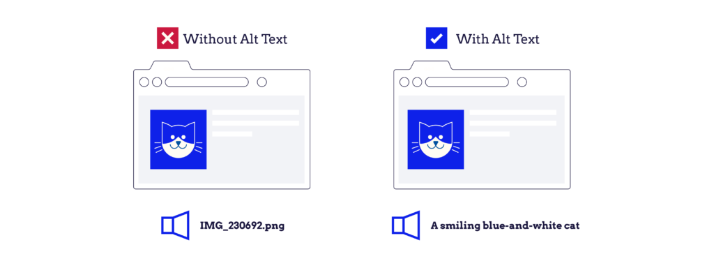
Alternative text, or alt text, is a critical component of web accessibility, serving as a textual substitute for non-text content on web pages like images, videos, and any other visual elements that convey information.
According to the WCAG, providing alt text for all non-text content is a Level A success criterion, the most basic level of web accessibility that should be met by all websites. When screen readers encounter non-text content on a website, they read out the alt text provided. This enables users who cannot see the screen to comprehend what the visual content is and how it relates to the surrounding text.
Without alt text, these users might miss important information conveyed by images or videos, leading to a fragmented or incomplete understanding of the page content.
To effectively add alt text to your website’s content, we recommend adhering to the following best practices:
- Be brief and to the point: Aim to convey the essential information that the image or video presents without unnecessary elaboration. This helps keep the user’s experience smooth and efficient.
- Be specific: Ensure that the alt text accurately describes what is shown in the visual content. For instance, instead of a vague description like “a dog”, provide more detail, such as “a golden retriever playing fetch”.
- Describe the content clearly: Focus on describing the content of the image or video in a way that makes sense to someone who cannot see it.
- Avoid alt text for decorative elements: If an image is purely decorative and does not convey important information, it’s best to leave the alt attribute empty (i.e., alt=“”). This tells screen readers to skip over the element, preventing the user from having to listen to unnecessary descriptions.
- Don’t include the type of content in the alt text: There’s no need to prefix your description with phrases like “an image of” or “a video of”. Screen readers typically provide this context to users. Focus instead on what the content shows or represents.
6. Captions, subtitles, and transcripts
Hearing impairments can range from partial to complete hearing loss and can be either permanent or temporary. It’s important to recognize that even individuals without chronic hearing impairments might face situational challenges where audio content becomes inaccessible, such as being in a noisy environment or needing to keep the volume down to avoid disturbing others.
In these instances, captions and transcripts serve as essential tools that allow users to engage with multimedia content. The WCAG provide specific guidance on making time-based media accessible. Guideline 1.2 addresses the need for alternatives for time-based media, outlining several success criteria designed to ensure that audio and video content is fully accessible.
Captions and subtitles translate audio into text, displaying dialogue and significant sounds visually, typically in real-time alongside the video. They are indispensable for users who are deaf or hard of hearing, as they provide a text-based way to access audio information.
Meanwhile, transcripts offer a full textual representation of audio content, including spoken dialogue and non-speech elements like sound cues. Transcripts are particularly useful for both audio and video content, as they allow users to quickly reference and navigate through the material without needing to listen or watch.
Here are some key considerations for implementing captions, subtitles, and transcripts effectively:
- Accuracy: Ensure that captions and transcripts accurately reflect the audio content, including dialogue and relevant non-speech sounds. Accuracy is crucial for conveying the correct information and context to the viewer.
- Synchronization: Captions should be synchronized with the audio to provide a cohesive viewing experience. This means that the text should appear at the same time as the corresponding audio is played.
- Readability: Choose clear, easy-to-read fonts and colours for your captions and subtitles to ensure they are easily distinguishable from the video background.
- Accessibility features: Offer users the ability to turn captions and subtitles on and off according to their needs. Additionally, ensure that transcripts are easily accessible from the video or audio content.
7. Keyboard navigation
Making your website navigable via keyboard provides all users with the flexibility to interact with your content in the way that works best for them.

Some key best practices for implementing effective keyboard navigation on your website include:
- ‘Skip to Main Content’ links: Placing a ‘skip to main content’ link at the beginning of each page ensures that users don’t have to tab through every menu item to get to the primary content, saving time and frustration. They allow users to bypass lengthy navigation menus and directly access the main content of a page, significantly improving the site’s usability.
- Clear keyboard focus indicators: It’s important to make it visually clear when an element has keyboard focus. This can be achieved through multiple visual cues, such as changes in the border, background colour, or adding an outline.
- Keyboard-accessible dropdown menus: Ensuring that all dropdown menu items are accessible via keyboard commands, including entering and leaving dropdown menus, enhances the navigability of your site. The A11y Collective provides a comprehensive guide on creating accessible dropdown menus, offering valuable insights and techniques for web developers.
- Semantic HTML: Correct use of semantic HTML elements (such as <header>, <nav>, <main>, <footer>, <button>, and <a> tags) is essential for keyboard navigation. These elements provide a structure that assistive technologies and browsers can use to enable more efficient navigation.
Moving forward with accessibility
Web accessibility isn’t just a feature to be added as an afterthought; it’s a fundamental aspect of creating digital spaces that are truly open and welcoming to all users, regardless of their abilities or the ways they interact with technology.
From the structure and hierarchy of content to the nuances of keyboard navigation, each element plays a pivotal role in ensuring that everyone can engage with your content effortlessly and independently.
To help you with this, The A11y Collective is an indispensable resource for anyone looking to deepen their understanding of web accessibility. Offering expert courses tailored to all levels of expertise, The A11y Collective provides the tools, insights, and guidance necessary to navigate the complexities of creating accessible digital experiences.
Enrol in your first course with The A11y Collective today. Together, we can create a more inclusive and accessible internet, one website at a time!