Andrée Lange has over ten years of experience working as a digital designer at several agencies. At heart, she is a true UX and UI designer. In recent years, she has specialised in web accessibility and, more specifically, in accessible design.
What is colour contrast?
Colour can help you design and establish a visually compelling website. But, colour can also have an impact on the way people perceive information on your website. To understand how colour can affect this, it is important to have a bit of background on colour contrast. When we talk about colour contrast, we talk about the difference between two colours, more specifically: the difference between different colour hues. When the contrast between two colours is high, it is easier to distinguish these colours from each other. There are different theories on colour contrast. One of them concerns complementary colours, which are colours that are opposite from each other on the colour wheel.
Why is colour contrast important in web design?
You want to provide the user with an impressive visual experience. But not everyone has the same perception of colours. Some people can’t see colour at all. Others might experience them in a totally different way than yourself. For instance; people who are visually impaired. This can be something like colour blindness, but also people that are old and have bad eyesight. But also different situations like looking at the screen of your mobile phone outside with the sun glaring at your screen can affect the perception of colours.
For web design it is important that the elements of the website that you use to communicate to your end user have enough colour contrast. Think of the text you’re using or other elements like graphic objects and user interface components. In other words; sufficient colour contrast is necessary for all parts of the website that communicate something, this may be in text or in a graphical component. Users need to be able to understand what you are trying to communicate. Luckily there are guidelines for web accessibility when it comes to colour contrast.
WCAG: colour contrast success criteria
These guidelines are written in the Web Content Accessibility Guidelines 2.1 by the World Wide Web Consortium (W3C) and define different contrast ratios for the use in various settings. In this blog we will elaborate on these guidelines.
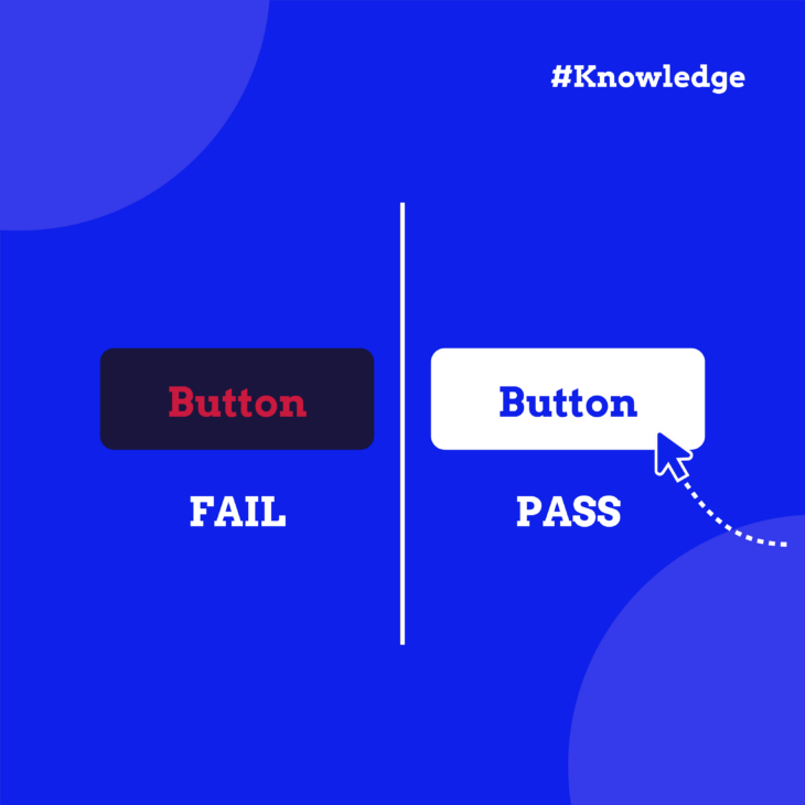
As said previously; colour contrast is defined by the difference between two colours. When we are testing if the colour in web design has sufficient contrast, we test the background and the foreground colour. This applies to all parts in your web design that contains text or is used as a graphical object that was meant for navigation or interaction.
The elements of your website that are pure for decoration, like visual ornaments, don’t have to meet the colour contrast requirements. There’s no need for the user to ‘understand’ them. Without seeing the visual elements, they can still understand what the website is communicating (that is if the rest of the website is accessible).
It is also important to look at the density in pixels the foreground and background colours take up. When there is a higher density, a lower contrast ratio can be used for instance. When we check for colour contrast ratio we distinguish between:
- Normal text
- Large text
- Graphic element / UI elements
Text on your website
Text on your website must meet at least the following requirements:
- 4.5:1 for normal text up to 24px
- 3:1 for bold text of at least 19px or larger
- 3:1 for regular text of at least 24px or larger
Graphical user interface components
UI elements are parts of your design that indicate meaning. For instance; the use of a navigational arrow icon. Or the border of an input field, radio buttons, check boxes. These kinds of elements must meet a minimum contrast ratio of 3:1 because people interact with them, so they need to be understood.
How to measure colour contrast
There are different ways to measure colour contrast. This mostly comes down to your own preference in tools you want to use. Here are a three easy ways to measure colour contrast:
- WebAim Contrast Checker. WebAim is a browser based colour contrast checker. You simply fill in a background and foreground colour by typing in the HEX code, and the contrast ratio of those colours is shown. You can also check if the colour combination passes all or some usages. (like normal, large text etc.)
- Stark is a plugin which you can use in various design tools like: Figma, Sketch, Adobe XD. It is also available in the browser. Stark is a really nice tool to use when you are designing because you can check colour contrast right away in your designs.
- If you want to check a complete colour pallet in one go, use the online tool A11y Colour Contrast Table.
Do you want to learn more about how to create accessible design? Follow our Accessible Design, the basics course to learn more and become an even better designer!


