Andrée Lange has over ten years of experience working as a digital designer at several agencies. At heart, she is a true UX and UI designer. In recent years, she has specialised in web accessibility and, more specifically, in accessible design.

Have you ever stopped to consider how the colours on your website appear to someone who is colour-blind?
Colour blindness, or Colour Vision Deficiency (CVD), affects a significant portion of the population, with estimates suggesting that it impacts approximately 1 in 12 men and 1 in 200 women globally. This condition can dramatically alter the way users perceive and interact with websites.
Colours that are clear and distinct to those with typical vision might blend together or become indistinguishable for someone with CVD, making navigation, understanding content, and performing tasks challenging. Overlooking this aspect of your website can create barriers, impacting the user experience and raising ethical, legal, and business concerns.
Ensuring web accessibility for all users, including those with colour blindness, is a fundamental aspect of responsible web design.
This article aims to shed light on the main challenges users with colour blindness face and offer practical solutions for overcoming these obstacles. We will explore key guidelines on colour blindness accessibility, helping you to design your website with inclusivity, compliance, and user experience at the forefront.
Types of colour blindness
Colour blindness primarily stems from genetic factors resulting from inherited defects in the genes responsible for cone function in the eye. These cones are photoreceptor cells that perceive colour, and any defect in their function can lead to colour vision deficiencies.
Understanding the various types of inherited colour blindness is essential for designers and developers aiming to enhance digital accessibility:
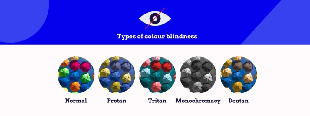
- Protan (Protanopia and Protanomaly): Individuals with Protanopia are unable to perceive red light, seeing it as darker shades or completely different colours, while those with Protanomaly see red light in much weaker shades than typical, often resulting in confusion with greens, browns, and oranges.
- Tritan (Tritanopia and Tritanomaly): Tritanopia involves a complete inability to perceive blue light, altering the perception of blues to greens and causing difficulty distinguishing between blues and yellows. Tritanomaly makes blue light appear weaker and can often result in confusing blues with greens and yellows with violets.
- Monochromacy: This rare condition results in a complete absence of colour vision, causing individuals to see the world in shades of grey, much like viewing a black-and-white photograph.
- Deutan (Deuteranopia and Deuteranomaly): Those affected by Deuteranopia cannot perceive green light, leading to confusion between reds, greens, and browns. Deuteranomaly, the most common form of colour blindness, results in a weakened perception of green light, making certain greens appear more red.
Colour blindness can also be acquired through non-genetic means such as excessive alcohol consumption, exposure to certain chemicals, brain injury, terminal illnesses, or simply as a consequence of ageing.
Challenges of colour blindness in digital accessibility
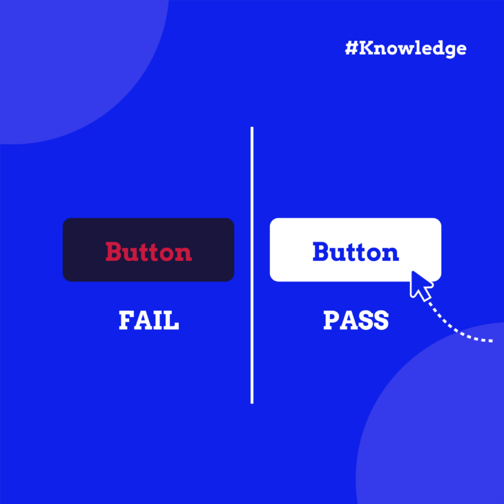
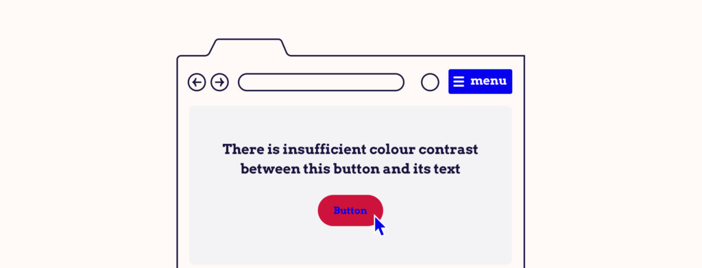
Some common design practices may not consider the difficulties of colour blindness like insufficient colour contrast. This is when there’s not enough difference in brightness or hue between foreground (such as text or buttons) and background colours, making content difficult to discern.
Examples of this include:
Buttons and text
When the text colour on a button closely matches the button’s background colour, it can become nearly impossible for users with CVD to read. Similarly, if website text does not sufficiently contrast with the background colour, it becomes illegible, creating barriers to accessing information.
Colour as the primary means of conveying information
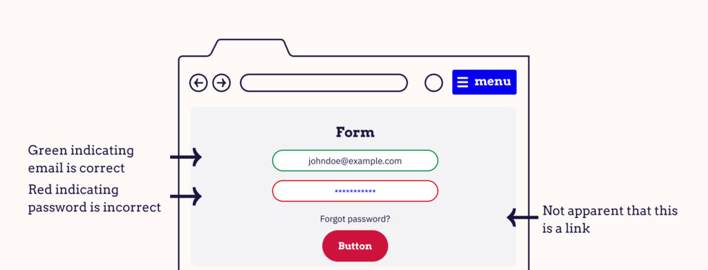
Reliance on colour as the sole or primary means of conveying information can significantly restrict accessibility for individuals with colour blindness. This can create confusion and misinterpretation of vital information. Some common instances where this becomes a problem include:
- In-text links: Links within text that are only distinguished by colour, without an underline or a bold style, can be hard to spot for someone with colour blindness. This makes navigating through content and accessing additional resources challenging.
- Form validation: Contact forms or other input fields that use colour alone to indicate errors or required fields can be problematic. Users with colour blindness may not recognise when they’ve missed a field or made an error, leading to frustration and incomplete submissions.
- Colour filters: In eCommerce platforms, colour filters without accompanying text labels can be difficult for users with colour blindness to use effectively. They may not be able to distinguish between the colour options provided, hindering their shopping experience.
- Graphs and charts: When segments of graphs or charts are differentiated solely by colour, it can make the data impossible to interpret accurately for someone with CVD. Incorporating textures, patterns, or symbols in addition to colour can help make these visual elements accessible.
- Active states: Indicating active pages or menu items with colour changes alone can lead to confusion about navigation. Users with colour blindness might struggle to determine which section of a website they are viewing or which menu item is selected.
Benefits of designing a website with colour blindness in mind
From ethical considerations to legal compliance and business advantages, ensuring your website caters to individuals with CVD can significantly impact its success and reach.
Ethical considerations
Designing a website to be accessible for all users enhances the experience for individuals with CVD and promotes a broader ethos of equality and non-discrimination. By considering the needs of users with colour blindness, you are taking a step towards creating a more equitable and inclusive digital world.
Legal requirements
In many regions around the world, there are legal obligations to ensure websites are accessible to people with disabilities. For instance, the Americans with Disabilities Act (ADA) in the United States mandates that digital content and technologies must be accessible to individuals with disabilities. Similar regulations exist in other countries, emphasising the importance of web accessibility.
Failing to design your website with accessibility in mind, including considerations for colour blindness, can expose your business to legal risks and potential penalties. Compliance with these laws helps you avoid legal complications and demonstrates your commitment to accessibility.
Business case
Accessible websites attract a wider audience by catering to the needs of all users, including the millions of people worldwide affected by CVD. By removing barriers to access, you enhance the user experience for a significant portion of your potential customer base, potentially increasing engagement, customer satisfaction, and loyalty.
Moreover, accessible websites often rank better in search engine results, as search engines (such as Google) favour websites that provide a good user experience. This improved visibility can lead to increased traffic and, ultimately, higher conversion rates.
Exploring colour accessibility guidelines
The Web Content Accessibility Guidelines (WCAG) are designed to ensure that websites are accessible to all users, including those with disabilities such as vision impairments, hearing loss, and motor difficulties.
Colour accessibility is an integral part of these standards, focusing on how colour is used and perceived on websites. Understanding and implementing WCAG standards is essential for creating digital content that is inclusive and accessible to everyone.
The WCAG is structured around three levels of accessibility standards: A, AA, and AAA. Each level represents a stricter set of requirements that websites can aim to meet:
- Level A is the minimum level of accessibility that websites should aim for. It includes basic web accessibility features that are critical for some users.
- Level AA includes a higher standard of accessibility features that address the most common barriers for users with disabilities. This level is often targeted as a compliance standard for many organisations and legal requirements.
- Level AAA represents the highest standard of web accessibility and includes criteria that make a site accessible to the widest range of users with disabilities. Achieving Level AAA is a goal for many, but can be challenging to implement on all content.
Specific parts of the WCAG address the use of colour on websites, highlighting how crucial colour choices are for accessibility. These include:
WCAG 2.2 Success Criterion (SC) 1.4.1 – “Use of Colour”
This criterion necessitates that colour should not be the only means of conveying information, indicating an action, prompting a response, or distinguishing a visual element. This is crucial for users who may not be able to perceive colour differences clearly, ensuring that information is accessible through multiple sensory channels.
WCAG 2.2 SC 1.4.3 – “Contrast (Minimum)”
This standard requires a minimum contrast ratio for text and images of text, excluding large text and logos. For normal text, the minimum contrast ratio should be at least 4.5:1, and for large text, it should be at least 3:1.
This ensures that text stands out against its background, making it readable for users with colour vision deficiencies or low vision.
WCAG 2.2 SC 1.4.11 – “Non-text Contrast”
This criterion extends the concept of contrast to non-text elements, such as graphical objects and user interface components. It requires a minimum contrast ratio of 3:1 against adjacent colours for these elements to be easily discernible by users with visual impairments, including those with colour blindness.
How to design for colour blindness
Ensure adequate colour contrast
Adhering to the Web Content Accessibility Guidelines (WCAG) on colour contrast is vital to ensure your site has adequate contrast levels to be accessible for users with CVD. Elements that often suffer from insufficient colour contrast include regular website text, buttons, and overlays on images.
Use these tools to verify your website meets these standards:
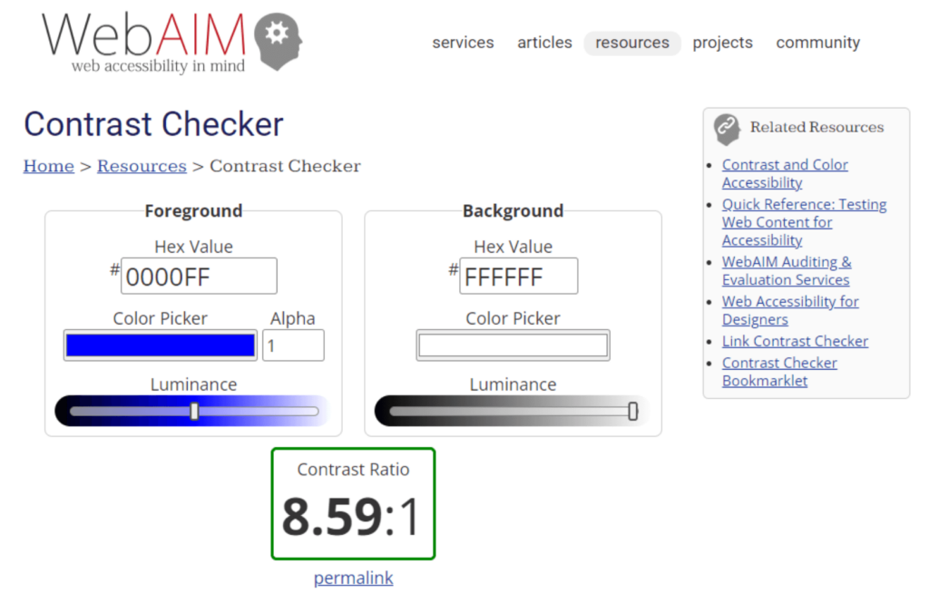
- WebAim Contrast Checker: This tool allows you to check the contrast ratio of text and background colours to ensure they comply with accessibility standards.
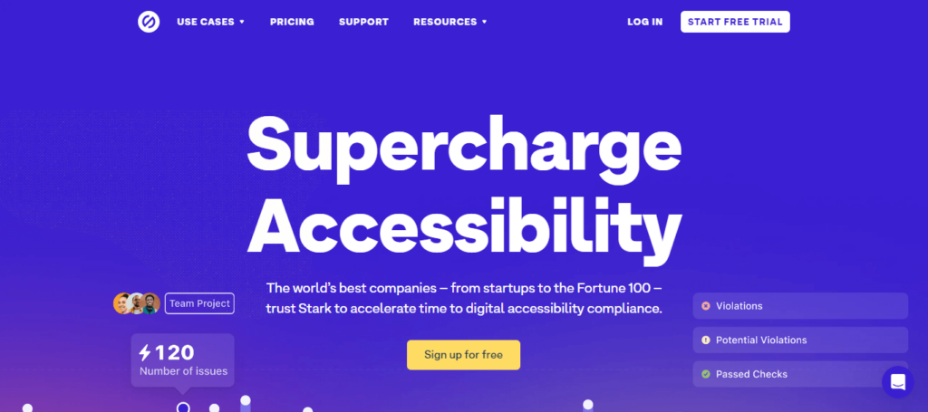
- Stark plugin for Sketch, Adobe XD, and Figma: Stark provides a suite of tools for designing accessible interfaces, including colour contrast checking directly within your design environment.
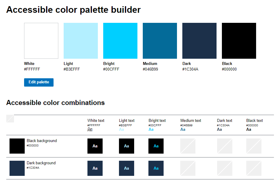
- Accessible Color Palette Builder: This tool helps you create and evaluate a colour palette that is accessible to users with colour vision deficiencies.
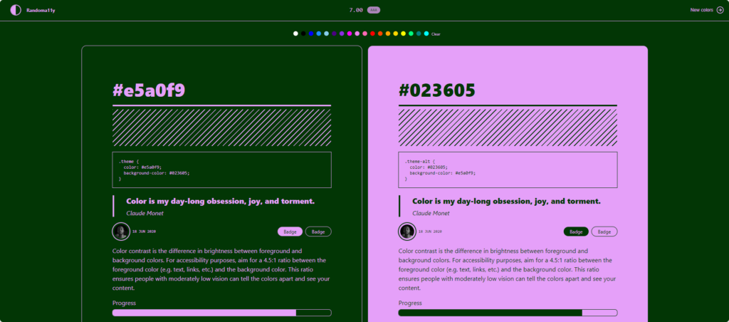
- Randoma11y: If you don’t know where to start with building an accessible colour palette for your site, this handy tool gives you random colour combinations that are accessible, along with an example of how it would look on a website.
These resources can guide you in choosing colour combinations that provide enough contrast to ensure readability and navigability for all users.
Don’t convey meaning with colour alone
It’s important to provide multiple visual cues to ensure that information is accessible to everyone instead of just using colour. Here are some practical tips and examples:
- Link text: Underlining and using a contrasting colour is the best practice when it comes to links. Adding additional visual cues, such as changes in text colour or an icon when the link receives hover or keyboard focus, can further improve accessibility.
- Placeholder text in forms: Enhance the clarity of the placeholder text by incorporating other visual elements, such as icons or labels, to indicate where users should input their information.
- Error text in forms: To clearly identify fields that require attention, use text labels, icons, or shapes alongside colour cues.
- Graphs and charts: Consider incorporating textures, patterns, text labels, or symbols to differentiate data points or sections.
- Colour filters, pickers, and swatches: In eCommerce contexts, where colour selection is crucial, ensure that colour options are accompanied by clear text labels. This practice helps users understand their choices regardless of their ability to perceive colour differences.
Take the next step to enhance accessibility on your website
Ensuring that your website is accessible to all users, including those with colour blindness or other forms of colour vision deficiencies, is crucial for creating an inclusive digital environment. By adhering to the Web Content Accessibility Guidelines on colour, you can take significant steps toward providing a more inclusive experience for your site visitors.
However, the strategies covered in this article merely scratch the surface of what it takes to create a fully accessible website. Accessibility is a broad field that encompasses a range of considerations beyond colour vision, including auditory, cognitive, neurological, physical, and speech accommodations.
If you’re committed to making your site as inclusive and accessible as possible, there’s more to learn and implement. The A11y Collective is a valuable resource in this journey towards web accessibility.
Offering a range of expert courses on the subject of inclusive website design, The A11y Collective can equip you with the knowledge and skills needed to make your digital content truly accessible.
For those looking to build upon what they’ve learned in this article, the “Accessible Design, the Basics” course is an excellent starting point. It delves deeper into the principles of accessible design, covering a wide array of topics that can help you ensure your website meets the needs of all users.
Don’t stop here. Get started with expert courses from The A11y Collective to enhance your understanding of inclusive design and make a tangible difference in how users interact with your digital content!