Andrée Lange has over ten years of experience working as a digital designer at several agencies. At heart, she is a true UX and UI designer. In recent years, she has specialised in web accessibility and, more specifically, in accessible design.
As a website owner, how often do you think about how your website is perceived and used by people who are blind or have other visual disabilities?
For sighted people, it’s often easy to overlook how the visually impaired navigate the internet, but understanding their experience is fundamental to fostering an inclusive web environment.
This article goes into the unique challenges that users who are blind or visually impaired face when accessing websites.
By the end of this guide, you’ll not only gain a deeper understanding of the needs of visually impaired users but also feel empowered to take meaningful steps toward making your website more accessible to all.
Understanding website accessibility and its importance
Website accessibility refers to removing barriers that prevent people with all kinds of disabilities, impairments, and limitations from interacting with or accessing a website. When sites are properly designed, all users should have equal access to information.
Ethically, accessibility is a stride towards inclusivity and equality, granting all individuals, regardless of their abilities, the right to information and participation. Economically, it extends the market reach and taps into the buying power of a wider audience, including the disabled community, which holds considerable untapped market potential.
However, there is also the legal side. Legislations like the ADA (Americans with Disabilities Act), Section 508 in the U.S., and the European Union’s Web Accessibility Directive ensure that people with disabilities enjoy non-discriminatory access to technology.
In the business world, having an easy-to-use website is not only required by law – it’s a valuable asset. For example, case studies have shown that inclusive design can lead to a significant increase in consumers willing to engage with a business or an institution.
💡The A11y Collective offers the course ‘Web Accessibility, the business case’, which provides insight into how accessible design can positively impact your business strategies.
Introduction to Web Content Accessibility Guidelines (WCAG)
The Web Content Accessibility Guidelines (WCAG) were developed to make online content more user-friendly. These guidelines target the needs of individuals with disabilities while ultimately benefiting all users. WCAG is acknowledged as the international standard for web accessibility.
WCAG outlines three levels of conformance: A, AA, and AAA. These levels represent varying degrees of accessibility, with A being the minimum level and AAA the most rigorous. For instance, the text contrast ratio at level AA goes beyond level A, ensuring readability against various backgrounds for those with mild visual impairments and in conditions of glaring sunlight for the average user.
The guidelines are structured around four fundamental principles, often referred to as POUR:
- Perceivable: Information and user interface components must be presented in ways that users can perceive.
- Operable: User interface components and navigation must be operable, ensuring that users can interact with all controls and interactive elements.
- Understandable: Information and the operation of the user interface must be understandable, enabling users to comprehend the information as well as the operation of the interface.
- Robust: Content must be robust enough to be interpreted reliably by a wide variety of user agents, including assistive technologies.
Understanding and applying WCAG principles can significantly impact the lives of people with disabilities, improving their ability to access and use web content effectively.
Challenges faced by visually-impaired internet users
Visual impairment affects people differently, from minor vision problems and colour blindness to a complete lack of vision. This spectrum significantly influences how people interact with websites and digital content.
For instance, someone with a moderate visual impairment may struggle with small text sizes or low-contrast colour schemes, while someone who is completely blind relies entirely on assistive technologies like screen readers to navigate the web.
Users who are blind or visually impaired often encounter several common accessibility issues when using the internet. These include:
- Missing alt text for images: Alternative text provides a textual description of images on websites, which is crucial for screen readers to convey what the image represents. Without alt text, visually impaired users miss out on essential information.
- Lack of support for keyboard-only navigation: Many visually impaired users rely on keyboard navigation instead of a mouse. Websites that don’t support keyboard-only navigation limit the ability of these users to interact with site content effectively.
- Inconsistent or complex page navigation and structure: A website that lacks a logical structure, including clear headings and easy-to-follow navigation paths, can be challenging to navigate for those using screen readers.
- Inaccessibility to screen readers: Parts of websites that are inaccessible to screen readers, such as certain types of media or dynamic content, can exclude visually impaired users from accessing important information.
- Unlabeled inputs, buttons, or links: Inputs, buttons, and links need associated labels or accessible descriptions. Without these, visually impaired users may not understand the function or purpose of these elements, leading to a confusing user experience.
Overcoming these obstacles is important when improving website accessibility for users who are blind or visually impaired. It is a step in acknowledging and valuing the diversity of internet users.
Making your website accessible for the blind: Strategies and techniques
When enhancing website accessibility for blind or visually impaired users, start with a solid understanding of accessible design principles.
A great resource for this foundational knowledge is The A11y Collective’s course, “Accessible design, the basics.” This course provides a comprehensive overview of best practices in accessible web design.
Ensure all key elements are screen-reader and keyboard accessible
Users who are blind or visually impaired typically rely on screen readers and keyboard-only navigation to interact with online content.
Here is what you can do to help them:
Keyboard accessibility
- Proper tab order: Ensure that the tab order of the website follows a logical sequence, enabling users to navigate through elements in an intuitive manner.
- Visible focus indicators: Implement visible focus indicators, like outlines or colour changes, to show which element is currently focused during keyboard navigation. This helps users know their location on the page.
- Bypass or ‘Skip to Main Content’ links: Include ‘skip to content’ links at the beginning of each page. This allows users to bypass repetitive links and directly access the main content, improving navigation efficiency.
Screen reader-friendly content
- Proper use of HTML and ARIA (Accessible Rich Internet Applications) tags and attributes that follow the hierarchy of the page.
- Meaningful link text that is descriptive and conveys the purpose of the link.
- Descriptive alt texts for images that describe their purpose and content, enabling users who cannot see the image to understand their relevance.
- Transcriptions for audio and video content.
Focusing on these aspects to improve website accessibility for users who are blind or visually impaired results in a positive user experience for all.
Add alt text for non-text content
For those who use screen readers, alt text serves as a guide, providing descriptions of non-text content such as images and videos. Crafting alt text with care gives users who are blind or visually impaired an understanding and appreciation of the content that others gain through sight.
Here are some tips for writing your alt text:
- Be concise and clear: For an image of a dog catching a frisbee, use “A brown dog jumping to catch a green frisbee” as opposed to “an image of a pet in action.”
- Avoid redundancy: Since screen readers identify images, there’s no need to include phrases like “picture of.” Simply describe the scene or object.
- For decorative images that serve no informational purpose, use an empty alt attribute, alt=””, to allow screen readers to bypass them without confusion.
- Do not use alt text to stuff keywords. This practice not only hinders accessibility but can also negatively impact SEO.
- Avoid vague descriptions that do not concretely convey the content’s context or function.
Organise page content with headings
Well-structured headings are important for digital accessibility. They help screen reader users understand the organisation of your content, making it easy for them to navigate.
This involves:
- Using semantic HTML to structure your content, such as headings (<h1> through <h6>), lists (<ul>, <ol>), and buttons (<button>). This helps screen readers interpret the page structure and convey it accurately to users.
- Avoiding repetitive headings that lack distinct context or information which can be disorienting for those using assistive technologies.
- Not using heading tags for text that isn’t a heading, like pull quotes or emphasised statements, to maintain the integrity of your page’s architecture.
To better understand accessible design principles, including using headings correctly, consider exploring The A11y Collective’s course on the basics of accessible design.
Reconsider your use of colour
When imagining a website, colours and other visuals may seem like a great way to catch people’s attention. However, for users with visual impairments, the situation is a bit different.
For example, oftentimes, websites would use colour to signal important information – a form field lighting up in bright red when not filled correctly or showing an active menu item only by changing the shade. However, to users who are visually impaired or fully blind, these signals are less clear – and in some cases, completely useless – so you need to find a better way to communicate this information.
Here are some best practices you can follow:
- Make sure that all information conveyed by colour is also available in text.
- Include a text cue for coloured form control labels.
- Provide additional visual cues (like underlines, changing the shape of buttons, etc.) beyond colour to convey information – this is especially important for users with colour vision deficiencies or colour blindness.
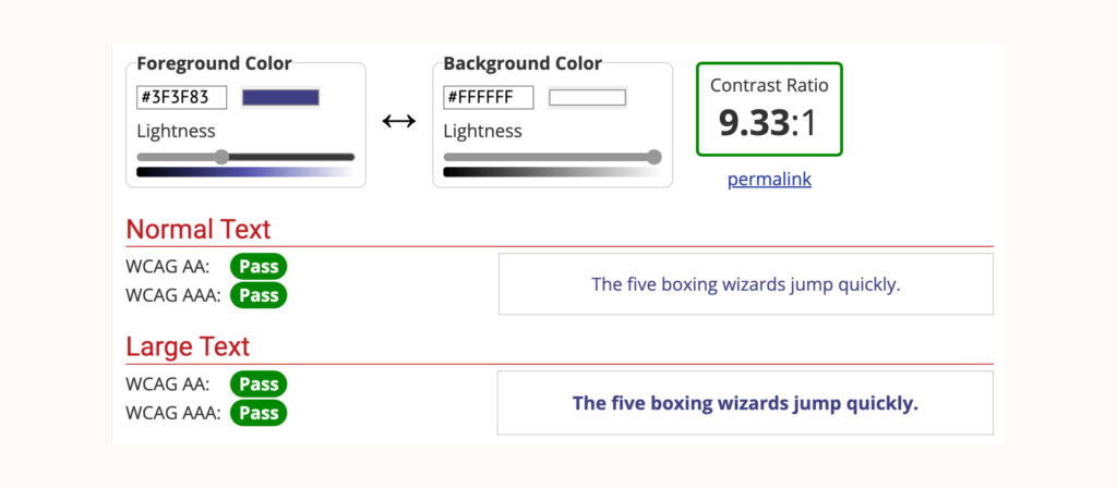
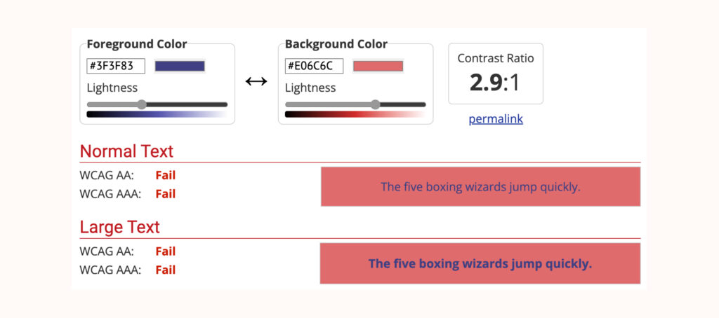
It’s important to remember that the majority of users with visual impairments are not fully blind and will still be able to perceive visual elements on your site. For this reason, you need to ensure that any colour you use in your website design meets accessibility guidelines for colour contrast.
To help you with the exact contrast ratio, go through the WCAG 2.1 AA standards for colour contrast. Additionally, tools like the WebAIM Contrast Checker, the Stark plugin for Sketch, Adobe XD, and Figma, and the Accessible Color Palette Builder can assist in this process.
Visually cluttered pages with too many colours can pose a challenge, not just for the visually impaired but also for users who are colourblind. Compare a web page bathed in neon greens and yellows, fighting for attention, to one where a clear hierarchy is established with a balanced colour palette, and you will see how less is often more.
In creating an interface where colour use is strategic and purposeful, it’s vital to introduce other differentiators, accounting for diverse user needs. A call-to-action button, for instance, could leverage a distinctive shape, an icon, or an additional label rather than relying solely on colour to stand out.
Use descriptive labels for links and buttons
Providing contextual descriptions for inputs like links and buttons enables users to grasp the function and relevance of an interactive element before they decide to engage with it.
Generic labels, such as ‘click here’, aren’t accessible because they fail to impart any meaningful information about what will occur post-click. So instead of that, you can put ‘read more about accessible web design’, which immediately clarifies the destination or action.
Labels serve as a critical navigation aid for screen reader users, helping them understand the purpose and outcome of each interactive element. Descriptive labels can contribute positively to a website’s SEO, offering search engines clear and contextual information, improving the site’s relevance and rankings.
Want to learn more about accessible design?
Enrol in our “Accessible design, the basics” course to learn the fundamentals of how to design your website in a way that is accessible for all users!
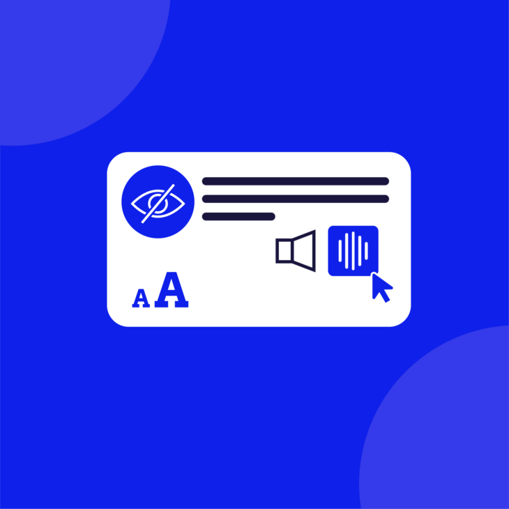
Make it possible to manually adjust the font size
It’s crucial to acknowledge the varied font size preferences and requirements of users. To enhance your website’s text accessibility for visually impaired users, the website’s code should allow for personal adjustments to font size.
While browsers typically provide options to modify text size, and magnifying tools exist, coding your site to support manual changes by users will broaden your site’s accessibility.
Adhering to best practices in HTML and CSS, such as employing relative units like em or rem instead of fixed units like pixels, facilitates user-initiated text resizing.
Stepping towards a more inclusive web
Designing for accessibility is more about compassion than compliance. Making sure that websites are welcoming to all, including those with disabilities or impairments, is both a moral imperative and a technical challenge.
We have gone through essential concepts that can help pave the way for an accessible web, such as screen-reader compatibility and optimising keyboard navigation. These are not just checkpoints but powerful steps that break down digital barriers.
Ready to develop accessible websites that resonate with everyone? The A11y Collective’s “Accessible code” course offers a solid foundation, equipping you with the skills to create web experiences as universal as the internet itself.
With each lesson, you’ll move closer to not just meeting but exceeding accessibility standards. Start now!