Caitlin de Rooij is a Web Accessibility Specialist. She works as an Accessibility Consultant for Level Level and provides training and workshops for enhancing digital accessibility. Caitlin’s expertise lies in ensuring that websites and digital content are designed and developed to be inclusive and usable for individuals with diverse abilities and disabilities.
Accessible web design opens up a universe of possibilities where every user, regardless of their abilities, can easily navigate, interact, and appreciate your website.
But why stop here?
Achieving web accessibility isn’t merely a requirement by law; it’s a critical step towards improving user experience and amplifying your site’s engagement.
Creating an accessible website involves several aspects – optimal colour contrast, appropriate text size, and the use of semantic HTML, among other things. Although it may seem overwhelming at first, knowing where to begin is a challenge that we can tackle together.
In this post, we’ll go over the main areas to concentrate on when constructing an accessible website and discuss six exceptional examples of accessible websites, each illustrating best practices and serving as a source of inspiration.
First, the basics: the four principles of accessibility (POUR)
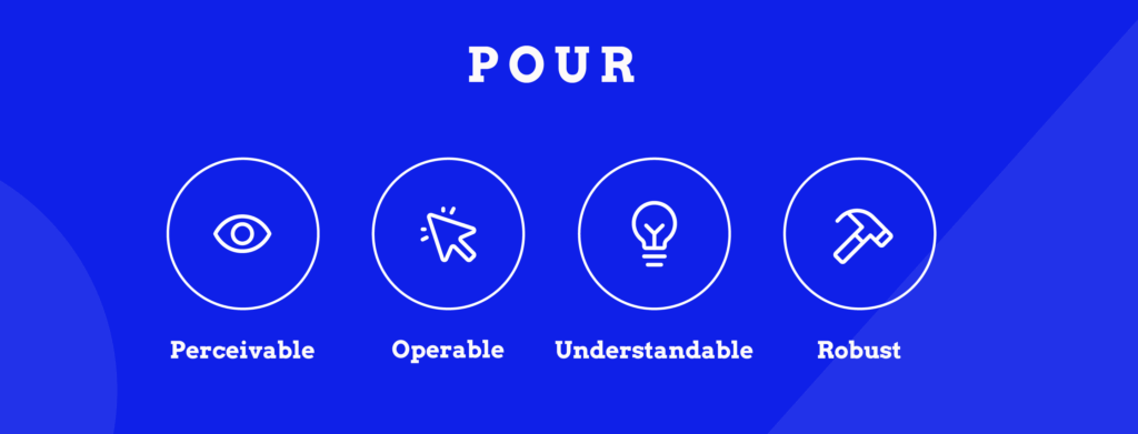
Every accessible website is built on four core principles defined by WCAG. These form the foundation of web accessibility:
- Perceivable: Information must be presentable to users in ways they can perceive. If someone can’t see images, they need alt text. If they can’t hear audio, they need captions. Content can’t be invisible to all of someone’s senses.
- Operable: Users must be able to operate the interface. This means providing keyboard access, giving people enough time to complete tasks, not causing seizures with flashing content, and helping users navigate and find content easily.
- Understandable: Information and operation of the user interface must be understandable. Use clear language, make your site behave predictably, and help users avoid and correct mistakes.
- Robust: Content must work reliably with current and future technologies, including assistive technologies like screen readers, voice recognition software, and alternative input devices.
These four principles – Perceivable, Operable, Understandable, Robust (POUR) – guide every WCAG success criterion. When websites meet these principles, they work for everyone.
What makes a website accessible?
Since accessibility is centred around people, your first job would be to consider the wide range of potential impairments – from vision and hearing impairments to cognitive and physical disabilities. The goal is to create an inclusive experience for every user, regardless of their abilities.
When you test your website for accessibility, we recommend starting with the Web Content Accessibility Guidelines, or WCAG. Published by the World Wide Web Consortium (W3C), the WCAG provides a comprehensive set of recommendations for enhancing web content accessibility.
The guideline identifies three conformance levels:
- A – Very basic accessibility compliance.
- AA – The global standard everyone should adhere to.
- AAA – The strictest requirements that aren’t necessary.
Usually, legal accessibility requirements stipulate at least AA compliance; however, striving for AAA accessibility where possible can elevate the user experience considerably.
The WCAG guidelines cover a wide array of accessibility aspects, from visual design to navigability and coding semantics to input modalities. If you want to read more about them, go to the W3C website.
For the site owners, web designers, and developers who are already interested in learning more about any of these specific topics or just web accessibility in general, our team at The A11y Collective has created a range of online courses for that very purpose.
Essential accessibility features at a glance
Here’s a quick reference guide to the main features that make websites accessible:
| Feature | What it does | Who it helps |
|---|---|---|
| Alt text for images | Provides descriptive text for images | People using screen readers, those with slow connections |
| Readable text | Uses clear fonts, appropriate size, and spacing | People with dyslexia, low vision, or reading difficulties |
| Keyboard navigation | Allows full site use without a mouse | People with motor disabilities, screen reader users, and power users |
| Colour contrast | Ensures text stands out from backgrounds (4.5:1 minimum) | People with low vision, colour blindness, or viewing in bright light |
| Captions/subtitles | Provides text versions of audio/video content | People who are deaf or hard of hearing, non-native speakers |
| Consistent design | Keeps layouts and navigation predictable | People with cognitive disabilities, all users learning the site |
| Semantic HTML & ARIA | Uses meaningful code for assistive technologies | Screen reader users, keyboard navigators |
Below, we’ll explore each of these features in detail with practical examples and implementation tips.
Alt text for images
This descriptive text helps relay the content of the images to users who may depend on screen readers to browse the internet. When crafting alternative text, focus on conveying the essential details contained in the image.
Keep in mind that the aim isn’t to provide an artistic critique of the image but rather to communicate necessary information to visitors who might not be able to visually perceive it.
Let’s do this together.

Photo by: Matheus Bertelli
Which alt description do you think is better?
- A horizontal photograph of a small black-haired boy with a white shirt and short jeans, smiling with anticipation, kneeling in a patch of grass waiting for a little furry dog of unknown breed to meet him at his location.
- A boy sitting on green grass waiting for a dog.
If you said the second one, you’re on the right track. This simple, informative description allows visually impaired users an equivalent content experience to their sighted peers.
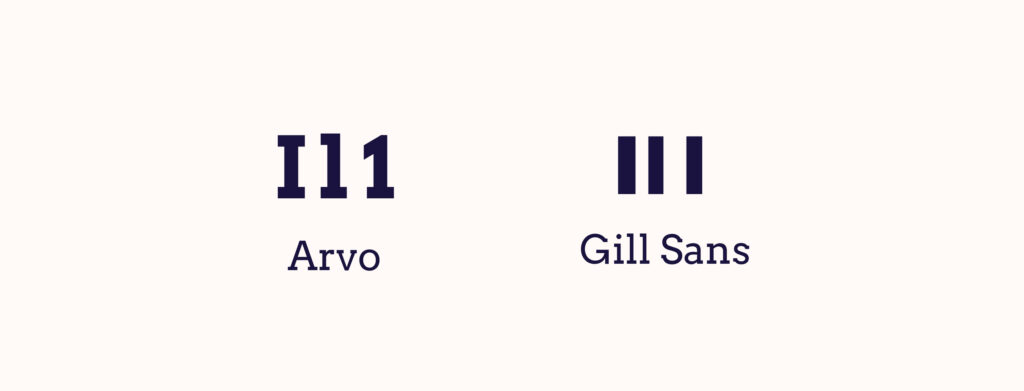
Readable and legible text
Websites, particularly ones dense with content, are more accessible and user-friendly when the text is concise. Fonts, text size, and line spacing are pivotal to the legibility of your content. Avoid fonts that may be challenging for some users to read, for example, ones with “imposter letter shapes”.
- Use relative units like “em” or “rem” when specifying text sizes, typically keeping body text around 1em or larger.
- Appropriate line spacing can make blocks of text easier to read and less daunting.
- Tooltips, which usually appear when users hover over or focus on a particular item, should have a background and text colour with high contrast. These design elements should never block essential information or controls and must be legible.
Keyboard-friendly navigation
In the pursuit of outstanding web accessibility, it’s essential that a website be fully functional via a keyboard. This allows users who are unable to use a mouse due to physical disabilities to browse your website without hindrance.
Key navigation controls such as “Tab” to move forward and “Shift” + “Tab” to move backwards should be fully functional, enabling users to access all actionable elements like links, buttons, and forms.
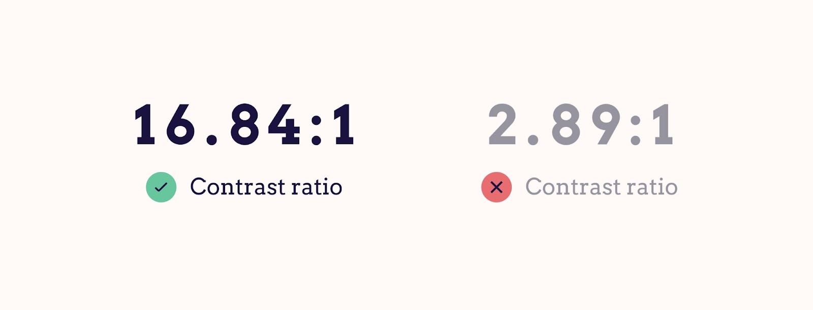
Colour contrast
Adequate colour contrast between text and the backdrop aids visually impaired users, particularly those who are colourblind. High contrast levels between the background and text can greatly augment the visibility and overall accessibility of your website.
And to no one’s surprise, the Web Content Accessibility Guidelines (WCAG) provide recommendations on optimal contrast levels, so you can check them out.
To ensure compliance with these, there are several tools, such as the WebAIM Contrast Checker and the Stark plugin for Figma, Sketch, and Adobe. These tools calculate the contrast ratio and indicate whether your chosen colour combination meets the required standards.
For instance, a colour combination such as black text on a white background gives a high contrast ratio, while light grey text on a white background would not meet accessibility standards.
Captions/subtitles for videos
Besides being beneficial for those with impaired hearing, they also assist non-native speakers in understanding video content and cater to those eager to learn a new language. Similarly, users in a noisy environment or who prefer silenced videos can significantly benefit from this feature.
Consistency in design and navigation
Predictable and intuitive navigation accompanied by a consistent layout provides an exceptional user experience. This involves maintaining a familiar design across the site, using easily recognisable web design patterns such as commonly located search bars, and ensuring a proper hierarchical structure of headings is in place.
Semantic HTML and ARIA landmarks
Using semantic HTML – meaningful HTML elements that describe their function – enables viewers and screen reader users to better interpret different areas of your web pages. The use of heading tags, such as <h1>, <h2>, <h3>, etc., assists visitors and assistive technologies in skimming through different sections of a webpage.
Integrating Accessible Rich Internet Applications (ARIA) landmarks can markedly advance your website’s accessibility. These landmarks, through specially designed code, assist screen readers in providing additional context to users, thereby fostering better understanding and navigation.
A prime example is using ARIA landmarks to label a search section on a website. By doing so, assistive technologies can quickly recognize this feature and guide users to it.For readers eager to delve deeper into ARIA’s details and practical implementation, consider signing up for The A11y Collective’s insightful course, “ARIA explained”.
Understanding the importance of website accessibility
Just as ramps and elevators facilitate physical mobility, web accessibility practices ensure digital inclusivity, making online content usable by all. Accessible web design benefits everyone – it encompasses a wide variety of needs and improves the user experience by considering the diverse range of site visitors.
Web accessibility is particularly essential for users with disabilities who are part of one of the three main types of disability groups: permanent, temporary, and conditional/situational.
- Permanent disabilities may include enduring visual, auditory, or physical impairments.
- Temporary disabilities could be short-term conditions like a broken arm affecting your ability to use a mouse or a scratched cornea impacting your sight.
- Situational or conditional disabilities refer to external factors that could affect how someone interacts with a website, like trying to view a screen in bright sunlight or attempting to browse while holding a baby.
Our goal is to make the digital space as welcoming as possible, no matter the circumstances of any individual.
Take, for example, a site incorporating simple, clear navigation menus: this small design choice eases the experience of all users, particularly those with cognitive impairments who may find complex navigation structures overwhelming.
It’s worth noting that good design is far more than just aesthetic appeal and fancy graphics. It’s about creating a platform that’s intuitive, enjoyable, and inclusive for everyone.
How accessibility affects SEO and rankings
Search Engine Optimisation, more commonly known as SEO, relates to practices aimed at enhancing a website’s visibility on search engine result pages. Although accessibility is not a direct ranking factor for search engines, such as Google, it can significantly impact user experience signals that are central to SEO.
An inaccessible website may lead to higher bounce rates as users may quickly leave if they find it difficult to navigate or interact with the site. So logically, accessible websites tend to encourage more user engagement, signalling to search engines the value of the site to visitors.
This sentiment is echoed by Google Search Advocate John Mueller, who stated:
Accessibility is something that is important for a website because, if you drive your users away with a website that they can’t use, then they’re not going to recommend it to other people.
Accessibility compliance and legal aspects
There are certain legal frameworks, such as the Americans with Disabilities Act (ADA), the European Accessibility Act (EAA), and the Accessibility to products and services directive, which require certain websites to comply with accessibility standards. This is to avoid legal complications and to ensure individuals with disabilities can access online information and services.
Despite these legal frameworks, the case for accessibility extends beyond mere compliance. Of course, the risk of legal repercussions may push certain organisations to prioritise accessibility, but the real prize is the ethical duty of providing equal access to all users. It’s about businesses recognising and validating the diversity of their audience and ensuring their digital platforms mirror these beliefs.
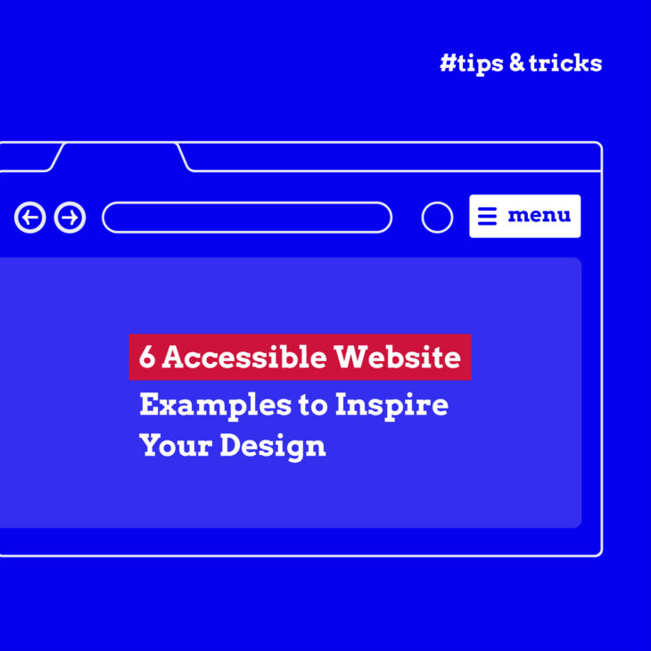
6 stellar examples of accessible websites
Theory is good, but it’s even better to see all of these tips in action. That’s why we’ve collected some of the best examples of websites that follow accessibility guidelines:
BBC
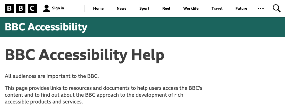
BBC main website accessibility page
Emerging as a leader in the field of the digital inclusivity matrix, the British Broadcasting Corporation (BBC) exhibits a passionate dedication to making its digital services accessible to one and all.
Their specific accessibility page provides a plethora of links to resources and documents to help users access the BBC’s content. This page is indeed a testament to accessibility in action.
The BBC also makes sure that all of their websites work well with assistive technologies to guarantee the best possible browsing journey for their audience.
Rotterdam Innovation City
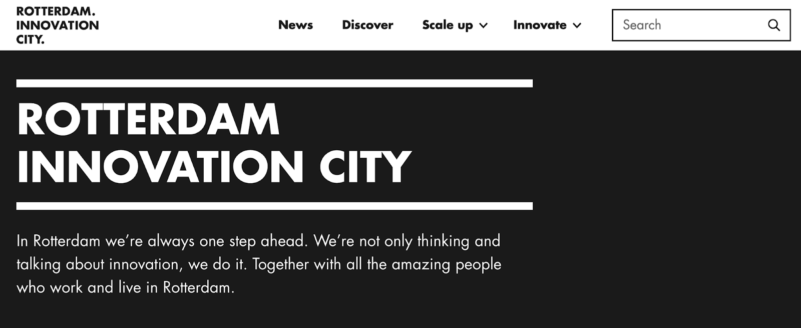
Rotterdam Innovation City website
Rotterdam Innovation City‘s seamlessly designed and keyboard-navigable website is a testament to its commitment to accessibility.
Indeed, their masterful use of semantic HTML provides meaning to the web page content, ensuring users and screen readers alike can nimbly navigate through different website elements.
Harvard University
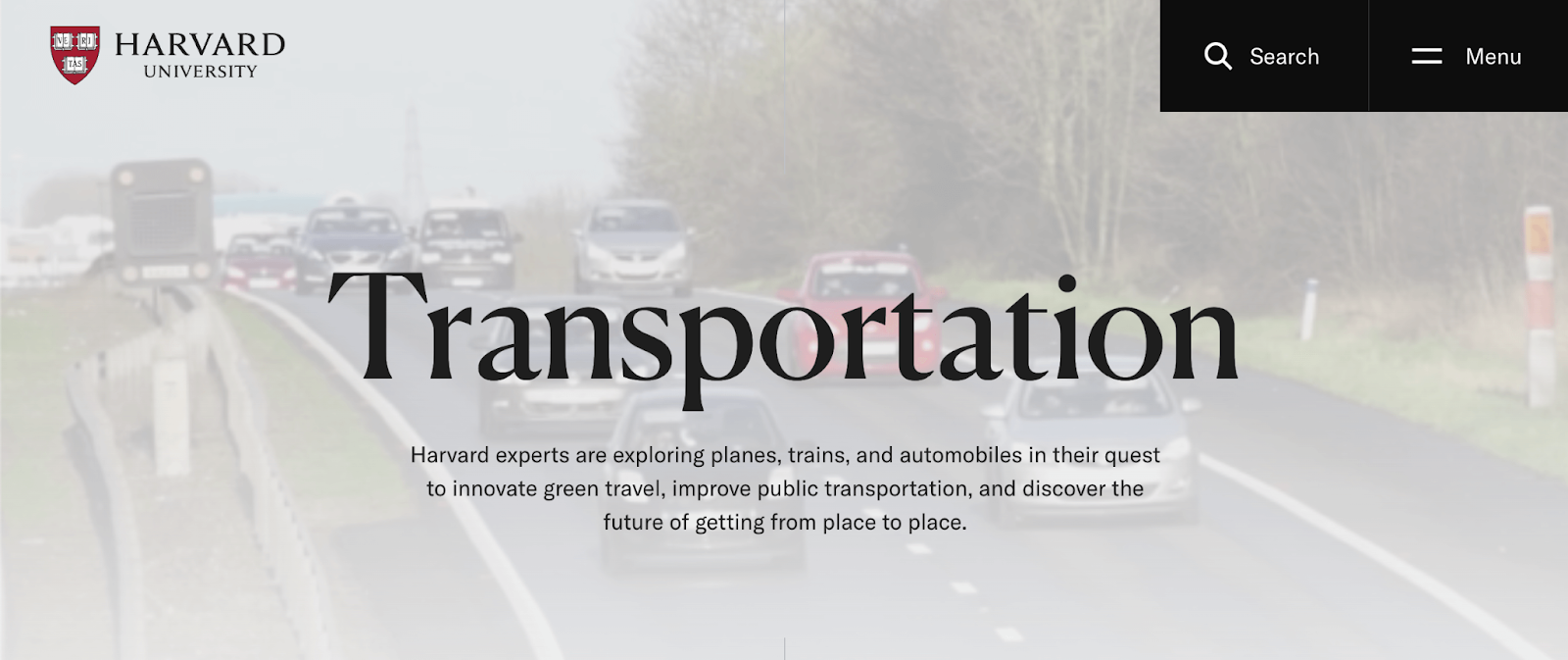
As a reflector of its academic excellence, Harvard University ensures a hurdle-free digital experience. The University provides an array of reading tools, incorporates multilingual video subtitles, and has carefully botched its colour scheming to accommodate the needs of colourblind individuals.
Their menu also reflects the simplistic but effective design of their website with a large and easy-to-read font and clear interface.

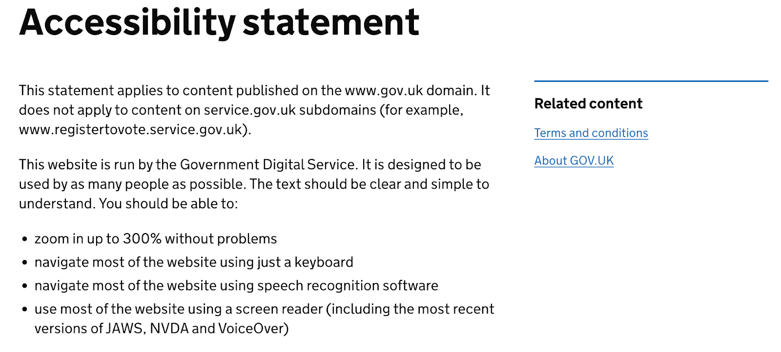
GOV.UK
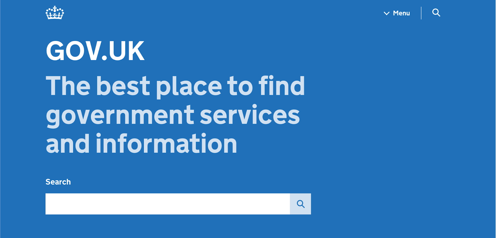
GOV.UK expertly demonstrates its commitment to digital inclusivity and accessibility. The array of accessibility features on its webpage, from clear content displayed with high contrast, consistent navigation, and support for assistive technologies through ARIA landmark roles to full keyboard navigation functionality, is impressive.
In their Accessibility statement, they also directly list all the features included in the website.
Additionally, they offer people the option to request any content in a different format best suited for them, such as plain text, braille, BSL, large print, or audio CD.
Barclays
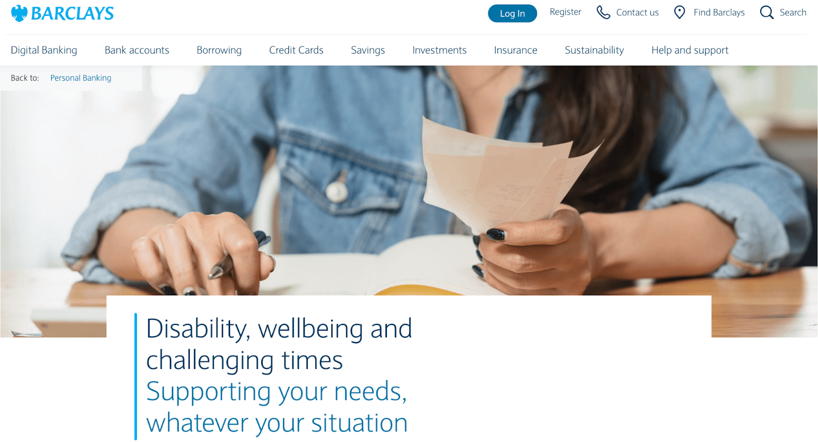
The digital version of Barclays mirrors its corporate commitment to advocating for accessible banking. With provisions for intuitive navigation, sensitive colour schemes, compatibility with screen readers, and a host of other features, the Barclays website makes banking accessible to all.
Apple
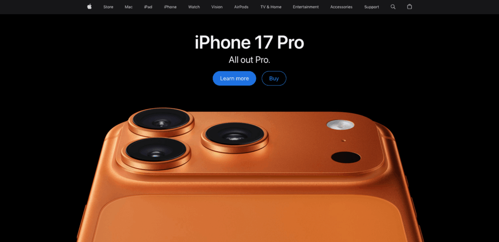
Apple has long been recognised as a leader in accessibility, and their website reflects this commitment. Apple.com demonstrates that accessible design doesn’t mean compromising on visual appeal – their clean, high-contrast design works beautifully with screen readers, keyboard navigation, and voice control.
Their product pages provide comprehensive keyboard navigation throughout complex product configurators, detailed alt text for product images, and video content with captions and audio descriptions. The shopping experience works just as smoothly whether you’re using a mouse, keyboard, screen reader, or voice commands
With these examples serving as a benchmark, start making strides to enrich your own website’s accessibility and usability today! Embed these best practices into your web projects to create a streamlined user experience that truly caters to everyone.
What an accessibility statement looks like
You might have noticed that many accessible websites include an accessibility statement. This is a public commitment that shows users you care about accessibility and provides a way for them to report issues. Here’s what a good accessibility statement typically includes:
EXAMPLE ACCESSIBILITY STATEMENT TEMPLATE
Our Commitment to Accessibility
[Organisation Name] is committed to ensuring digital accessibility for people with disabilities. We are continually improving the user experience for everyone and applying the relevant accessibility standards.
Conformance Status
The Web Content Accessibility Guidelines (WCAG) define requirements for designers and developers to improve accessibility for people with disabilities. We aim to conform to WCAG 2.1 Level AA standards.
**[Website Name] is [fully/partially/not] conformant with WCAG 2.1 Level AA. [Fully conformant means: the content fully conforms to the accessibility standard without any exceptions. Partially conformant means: some parts of the content do not fully conform.] **
Measures to Support Accessibility
[Organisation Name] takes the following measures to ensure accessibility:
• Include accessibility as part of our mission statement • Integrate accessibility into our procurement practices
• Provide ongoing accessibility training for our staff • Test with people who use assistive technologies
Feedback and Contact Information
We welcome your feedback on the accessibility of [Website Name]. Please let us know if you encounter accessibility barriers:
• Email: [accessibility@organisation.com] • Phone: [contact number]
We aim to respond to accessibility feedback within [X business days].
Technical Specifications
Accessibility of [Website Name] relies on the following technologies:
- HTML
- CSS
- JavaScript
- ARIA
Date: [Last reviewed: DD/MM/YYYY]
Take the next steps toward creating accessible websites
Creating an accessible website involves more than just ticking compliance boxes. It’s about welcoming your users into the heart of your online presence and enhancing their experience.
While there are various automated tools that check your website’s accessibility, keep in mind that they provide some insights, but their scope and depth can be somewhat limited. They simply cannot comprehend user experience as humans do.
In particular, be cautious of quick-fix solutions such as accessibility overlays. Despite their tempting promise of making your website accessible with a single click, these overlays often fail to resolve numerous website accessibility issues and have been widely criticised by users with disabilities.
Instead of relying on these patchy solutions, it’s wiser to build a comprehensive understanding of what an accessible website looks like and how to create one. Don’t worry. Building that understanding is not as daunting as it sounds. Remember, The A11y Collective is here for your support. Our bespoke online courses are here to guide you on this journey towards accessibility. “Web accessibility, the basics” is a particularly beneficial course that provides you with the best foundation in this area.
The journey to web accessibility is an ongoing process, not a one-off task. As standards evolve, so should your understanding, and continuous learning is an integral part of the journey toward better accessibility and inclusion.
So, don’t wait – take the next step in enhancing your website’s accessibility and enroll in one of The A11y Collective’s courses today!

Design websites that meet accessibility laws.
Understand how design decisions impact real-world users and teach you to create websites that are inclusive for everyone.