
Taeke Reijenga has extensive experience with the business side of Web Accessibility. As CEO of the full service digital agency Level Level, he has managed in a short amount of time to get his entire team on board when it comes to including web accessibility in their workflow.
A well-implemented tooltip enhances navigation and overall user experience, but if it’s not done right, it’s a stumbling block in web accessibility with the power to deflate a user’s journey.
Here’s the catch: while tooltips can enrich user experience, they often become hurdles for users with disabilities when not designed with accessibility in mind.
In this article, we’re diving deep into the world of tooltips and their role in web accessibility. We’ll share actionable advice that’ll help you make sure your tooltips don’t just meet accessibility standards but become a seamless part of a great experience. Plus, we’ve lined up some top-tier resources to get you up to speed on all things web accessibility.
Let’s get started on making sure everyone can enjoy the whole experience of your site, tooltips and all.
Understanding the role of tooltips in web accessibility
Tooltips are the quiet heroes of user interface design. They’re those small text boxes that pop up when you hover over a button or link.
In the coding world, they’re often brought to life with a simple HTML attribute known as aria-describedby, which connects a UI element with a helpful description that appears on demand.
This attribute lets you offer descriptive information about a specific web element to help understand it better, which is especially beneficial for users of assistive reading technologies.
Tooltips have a critical role in user comprehension, context provision, and overall user experience advancement. By reducing uncertainty about an element’s function, they pave the way for a smooth, user-friendly experience.
The impact of tooltips on user experience and user accessibility
When tooltips are clear and adequately placed – for instance, not obscuring other essential elements or information, they offer a smoother navigation experience.
In considering accessibility, tooltips are even more critical. They become invaluable tools for users with cognitive difficulties, helping them better understand the function of web elements and empowering them to interact with web content. For example, a user with memory impairments might benefit from a tooltip that offers a reminder of what a particular icon does.
On the flip side, think about a tooltip that misses the mark – it’s vague, confusing, or just plain hard to find. The result? Users might end up lost and frustrated, or they might just give up and leave.
Challenges in implementing accessible tooltips
The process of creating accessible tooltips comes with its own challenges. The primary issue lies in striking a balance between aesthetics and functionality, ensuring that all users are considered, regardless of their abilities or the assistive technologies they use.
The dilemma of aesthetics vs. functionality
Every designer and developer faces this dilemma: how do you jazz up your site without leaving some users behind?
We’re often drawn to sleek fonts, subtle colour contrasts, and stylish elements, but these can become stumbling blocks for users with visual impairments. Imagine relying on screen readers and encountering a tooltip that’s more of a riddle because of its fancy design.
Or, think of navigating solely with a keyboard and hitting a wall because the tooltip is a mouse-over away.
Here’s where things can get messy: if we pour all our energy into looks, we risk turning away users who find the design inaccessible. But if we focus only on function and ditch the design flair, the site could end up as inviting as a cardboard box.
Neither extreme is ideal. Skimp on aesthetics, and users might not stick around. Ignore accessibility, and some users can’t get in the door, which isn’t just a bad look – it can have legal consequences, too.
Considering these factors, let’s consider how you can hit that sweet spot between aesthetics and accessibility.
Dealing with variances in users’ abilities and assistive technologies
When you’re building websites, it’s key to remember that your audience is wonderfully diverse. People come to your digital doorstep with various abilities and ways they interact with web content. Some may be using screen readers because they have vision impairments, while others might rely on keyboard navigation due to motor skill challenges.
Taeke Reijenga, Founder and Trainer at The A11Y CollectiveEach user’s experience is unique, and this variety is precisely what makes creating accessible tooltips a bit of a puzzle. You need to find the exact pieces that will fit in the overall picture, or you risk missing out on the beautiful and accessible end result.
Ensuring the information relayed through your tooltips is accessible to such users involves incorporating specific features into your design, such as aria-labelledby or aria-describedby attributes. These encode the tooltip information in a format screen readers can interpret, making the content clear and useful.
Best practices for creating accessible tooltips
The right approach to tooltips not only makes your website more accessible but also helps attract a broader user base. Let’s now look at some practical guidelines for conceiving tooltips that address every aspect of web accessibility – layout, content, colour contrast, font size, and keyboard navigation.
Designing tooltips for inclusivity
Designing for inclusivity means creating tooltips that everyone, no matter their abilities, can use without a hitch. The beauty of clear, concise, and unambiguous tooltips is that they significantly reduce cognitive load. Here’s how you can make that happen.
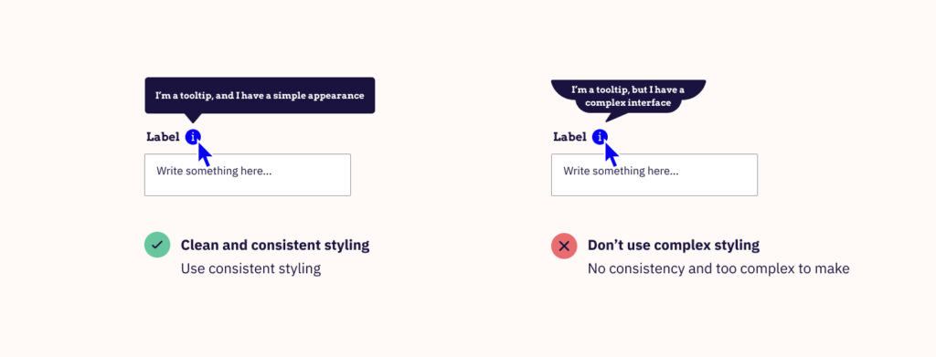
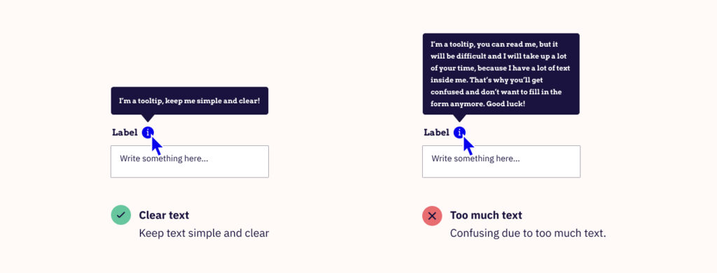
- Write crystal clear content: Ensure that the words inside the tooltips are clear – no fancy jargon, no long-winded sentences. Just straight-up, plain-language explanations. If a tooltip makes you scratch your head, it’s not doing its job.
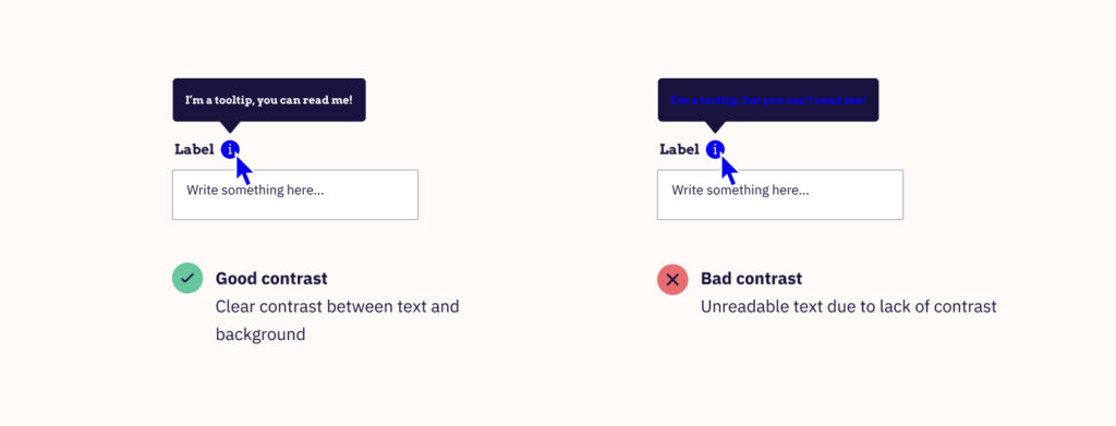
- Choose appropriate colour contrasts: The right contrast isn’t just about looking pretty; it’s about being seen. It’s important to stick to the WCAG 2.1 AA standard for colour contrast to make sure everyone can read those tooltips with ease. If you are unsure about your colour choices, tools like the WebAim Contrast Checker, the Stark plugin for Sketch, Adobe XD, and Figma, or the Accessible Color Palette Builder are excellent assets for testing your colour contrast selection.
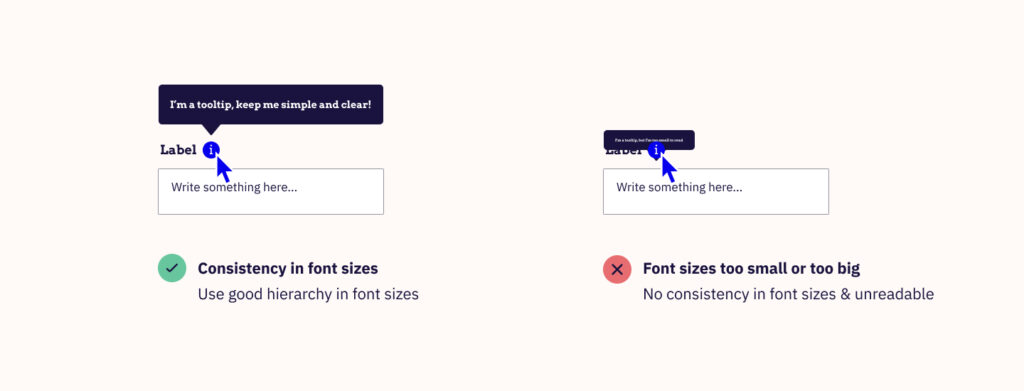
- Use reader-friendly fonts: Typography in tooltips is also crucial for accessibility. It’s about choosing the right font as well as the right size. A clear, simple style and larger font size improve readability, especially for visually impaired visitors and elderly people who might find reading smaller or more complex fonts challenging.
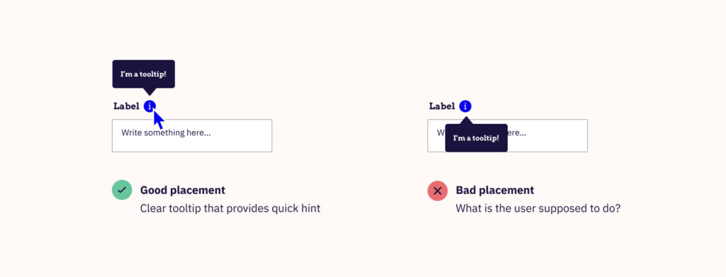
- Location, location, location: Where you put your tooltip is key. It is important that tooltips are clearly visible, but they should not obscure other important website information or elements.
- Keyboard-friendly = User-friendly: Not everyone’s using a mouse. Some of us navigate with keyboards, so your tooltips must be ready to respond to the tap of a key.
A comprehensive understanding of WCAG 2.1 guidelines for content on hover and focus can also suitably inform your tooltip design. Keeping these in mind while creating tooltips can be valuable:
- Dismissible: Users should be able to remove the tooltip without moving the pointer hover or keyboard focus. This does not apply when tooltips communicate an error or do not obscure or replace other content on the page.
- Hoverable: If a tooltip appears due to pointer hover, it should remain visible even when the pointer is moved over it.
- Persistent: The tooltip should remain visible until the reason for its appearance is no longer relevant. This could be until the triggering element loses hover or focus or when the user intentionally dismisses the tooltip.
By covering these bases, you can successfully build a welcoming web for all. And that’s what good design is all about.
Ensuring compatibility with assistive technologies
The next step is ensuring that tooltips play nicely with assistive technologies, including screen readers, keyboard navigation, and other assistive tools.
- Collaboration with screen readers: Screen readers serve as the auditory guide for visually impaired users, interpreting and vocalising the content displayed on the screen. To ensure that tooltips are accessible to screen reader users, it’s crucial to implement ARIA (Accessible Rich Internet Applications) attributes correctly to provide the necessary semantic information to assistive technologies, enabling them to convey the purpose and function of tooltips.
- Keyboard navigation proficiency: Accessibility requirements dictate that tooltips must be operable through keyboard interfaces. Users who rely on keyboards for navigation should be able to activate and close tooltips without any hindrance.
ARIA attributes are pivotal for enhancing the accessibility of web content. While they do not alter the visual aspect of tooltips, they are instrumental in making them accessible for users with disabilities.
Attributes such as aria-describedby or aria-label can provide descriptive information for tooltips, crucial for understanding content without visual cues.
Compliance with the Web Content Accessibility Guidelines (WCAG) is also non-negotiable. These guidelines are the benchmark for creating accessible web content, and they ensure that individuals with disabilities have equal access to information and functionality.
The business case for accessible tooltips
Creating accessible tooltips is not just about ticking off a checklist to meet legal standards – it’s a smart business move. Let’s explore why prioritising accessibility in your tooltips is essential for your business.
Expanding your reach
By making your tooltips accessible, you’re opening your digital doors to a broader audience. People with disabilities represent a significant portion of potential users. By ensuring everyone can use your website or app, you’re not just being inclusive, you’re tapping into an expanded market. This inclusivity can lead to more visitors, translating into more customers, more sales, and a broader audience engagement with your content.
Enhancing user experience
When users find your site easy to navigate and the information easy to understand, they’re more likely to stay, explore, and return. This enhanced user experience fosters engagement and loyalty, significantly bolstering your brand’s reputation.
Legal and ethical considerations
The Americans with Disabilities Act (ADA) and the Web Content Accessibility Guidelines (WCAG) are two key benchmarks for digital accessibility. They set the standard for making sure web content is accessible to everyone, including those with disabilities.
Ensuring your tooltips comply with these guidelines helps you avoid potential legal pitfalls and align with an ethical framework that values digital inclusion.
Beyond compliance: doing the right thing
At the heart of it, making your tooltips accessible is simply the right thing to do. It’s about ensuring that everyone has equal access to information and functionalities online. When you prioritise accessibility, you’re acknowledging the importance of digital spaces that welcome everyone. It’s a powerful statement about your business’s values and commitment to inclusion.
Ultimately, in business and life, inclusivity drives us to do better, igniting positive change. It should simply be the way things are done.
Tools and resources for developing accessible tooltips
Creating tooltips that everyone can use is no small task, especially when aiming to meet all those ADA and WCAG standards. Fortunately, a host of tools and resources are at your disposal, easing this task significantly and aiding in crafting a more inclusive and user-friendly website or app.
Accessibility courses and training
A well-rounded knowledge of web accessibility is a crucial tool when creating accessible tooltips. Here, online courses and programs, like the ones from The A11y Collective, come to the rescue, offering a wide range of carefully curated content suitable for novices and experts.
“Web accessibility, the basics” is a solid first step.
This course is designed to give you the fundamentals of accessible design and development. Think of it as your base camp before you climb the accessibility mountain.
And for those ready to tackle more advanced concepts, the ARIA Explained course is your next summit. It’s perfect for developers looking to master the art of using ARIA to craft tooltips that are both informative and accessible.
Tools for developing accessible tooltips
Creating accessible tooltips is a breeze with the right toolkit. There are HTML and CSS tools that can help optimise layout and styling. Additionally, JavaScript libraries like jQuery UI greatly simplify adding interactive features to tooltips.
These tools make technical tasks easier and simplify the complex coding involved in making tooltips accessible. Whether you’re crafting tooltips from scratch or improving the existing ones, these toolkits pave a smooth path.
Resources for understanding accessibility standards
Decoding web accessibility standards such as WCAG and ADA is key in shaping accessible tooltips. A multitude of resources like WebAIM and W3C’s WCAG 2.1 guidelines break down these standards, making them easily digestible and implementable.
These guides steer you towards the legal nuances tied to accessibility, and by abiding by these standards, designers, and developers ensure that their tooltips meet all essential requirements.
While the process of creating accessible tooltips might seem daunting at first, with the right tools and resources, you can make it happen. Resources like the A11y Collective courses, diverse design toolkits, and detailed accessibility standard guidelines can empower you to create tooltips that are visually captivating, useful, and completely accessible.
Taking the next steps towards tooltip accessibility
The bottom line is – accessible tooltips are more than just a nice-to-have. They’re essential. Yes, there are hurdles when it comes to getting them right, but the payoff is enormous. Accessible tooltips can widen your audience, enhance user experience, and solidify your brand as one that cares about every user.
So, how can you progress towards enhancing tooltip accessibility? Here are some practical steps:
- Evaluate your existing tooltips against accessibility standards. This evaluation can help you identify any areas that need advancement.
- Take the initiative to broaden your understanding of website accessibility. This extends beyond tooltips, exploring the wider scope of creating an accessible interface. The A11y Collective’s comprehensive range of courses is an ideal place to commence this learning expedition.
- Maintaining accessibility requires consistency. After implementing accessible tooltips, it’s crucial to frequently review and update them. Stay updated with the evolving accessibility standards to ensure your content remains inclusive for all users.
So, if you’re ready to embrace inclusive design, feel free to explore our extensive range of courses. Elevate your website’s accessibility with The A11y Collective!