
Andrée Lange has over ten years of experience working as a digital designer at several agencies. At heart, she is a true UX and UI designer. In recent years, she has specialised in web accessibility and, more specifically, in accessible design.
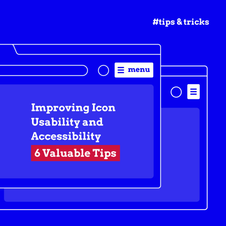
In this article, we delve into six actionable tips to elevate your icon designs from good to exceptional, focusing on inclusivity and ease of use.
Whether you’re a seasoned designer, a developer with an eye for detail, or simply an enthusiast for digital inclusivity, these insights will empower you to create icons that resonate with a broader audience.
Understanding the importance of accessible Icons
Icons are small images or symbols used to represent an idea, function, or feature in a graphical user interface (GUI). They provide a quick, intuitive way to convey information without relying on text. They can represent actions (like a trash can for ‘delete’), objects (such as a shopping cart for ‘cart’), or concepts (a heart for ‘like’).
Icons need to be understandable and user-friendly for everyone, including those with disabilities. A user experience that fails to consider all users can inadvertently:
- Push away potential visitors or customers.
- Make you lose traffic or revenue.
- Cause you to miss opportunities to connect and engage with a broader audience.
- Create barriers, leading to frustration and disengagement, which are the antitheses of what effective web design aims to achieve.
Making icons accessible also means complying with key regulations and guidelines such as the European Accessibility Act (EAA), the Americans with Disabilities Act (ADA), and the Web Content Accessibility Guidelines (WCAG). These regulations are benchmarks of a commitment to inclusivity and equality in the digital realm.
Key elements of accessible icon design
- Clear visibility: The goal is to ensure that every user, regardless of their visual abilities, can easily identify and understand the icons. This involves choosing colours with sufficient contrast to ensure that icons are distinguishable for users with colour vision deficiencies or visual impairments and maintain clarity in various screen resolutions and sizes.
- Universal recognisability: An icon’s design should communicate its function clearly and intuitively, reducing the cognitive load on users. Opt for symbols and imagery that are widely understood across different cultures and demographics.
- Appropriate size: Icons need to be large enough to be easily interacted with yet balanced enough not to overwhelm the interface. This entails considering touch targets for users on mobile devices to make sure that icons can be tapped without error. This also encompasses accommodating users with motor impairments who might find interacting with smaller icons challenging.
- Discoverability with a keyboard, mouse, and screen reader: Icon buttons must be navigable using a variety of tools like keyboards, mice, and especially screen readers for users with visual impairments. This involves proper coding practices, such as including alt text and ARIA (Accessible Rich Internet Applications) labels, to ensure that icons are seen and understood in the way they are intended.
Key steps in creating accessible icons
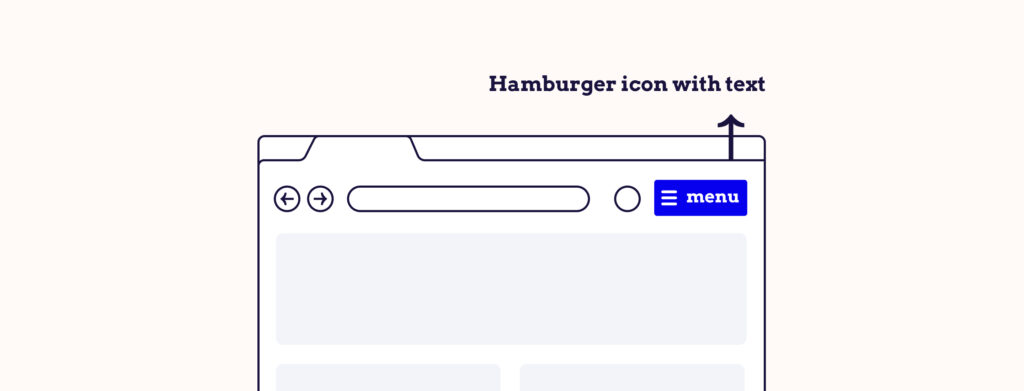
1. Use accompanying text
Even the most commonly used icons can sometimes fail to convey their intended message to all users. Take, for instance, the hamburger icon, commonly used to denote a menu. While it’s prevalent in many interfaces, not all users immediately recognise its purpose, especially those who are new to digital navigation or come from different cultural backgrounds.
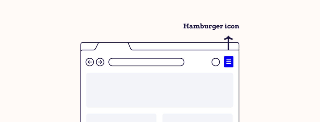
This is where accompanying text steps in, eliminating guesswork and providing clear, unambiguous guidance on what the icon represents.
By adding text, you:
- Increase the visibility of the icon, which is particularly beneficial for users with visual impairments who might find it challenging to discern smaller graphical elements.
- Enlarge the clickable area, making it easier for users to interact with them. This is a significant advantage for users with motor impairments who may struggle with precise movements.
2. Apply sufficient colour contrast
An often overlooked yet crucial aspect of accessible icon design is the application of sufficient colour contrast. Icons must exhibit a strong contrast between the foreground (the icon itself) and the background. This contrast is necessary for users who have low vision or colour vision deficiencies.
The Web Content Accessibility Guidelines (WCAG) 2.1 AA standard is the benchmark to aim for when it comes to colour contrast. This standard ensures that your icons are designed with a level of contrast that is accessible to a wide range of users, including those with visual impairments.
Fortunately, several tools are available to help you test and achieve the right colour contrast in your icons:
- The WebAim Contrast Checker: This tool allows you to easily check the contrast ratio of your icons against their backgrounds.
- The Stark plugin: Available for design platforms like Sketch, Adobe XD, and Figma, Stark helps ensure that your designs meet accessibility standards, including colour contrast.
- The Accessible Color Palette Builder: This tool assists in creating colour palettes that are accessible and compliant with WCAG guidelines.
While ensuring the right colour contrast is important for accessibility, relying solely on colour to communicate information can render the icons inaccessible to users with certain visual impairments, such as colour blindness. Icons should be understandable without colour reliance, making them universally accessible.
3. Use effective alt text
Alt text, AKA alternative text, serves as a textual description of an image, icon, or other non-text elements in digital media. For icons, alt text should succinctly describe the function of the icon rather than its appearance.
For instance, an email icon could have the alt text “Email us”, directly informing the user of the icon’s purpose. This practice ensures that the functionality of icons is conveyed effectively to users who cannot visually perceive them.
Keep the following in mind to make your alt texts effective:
- Descriptive and concise: The alt text should accurately describe the appearance and function of the icon. For instance, an icon for a ‘home’ button should have an alt text like “Home” to clearly indicate its function.
- Non-decorative indication: If the icon is purely decorative and has no functional or informative value, it’s often best to have empty alt text (alt=””) so screen readers can ignore it.
- Avoid redundancy: Avoid phrases like “image of” or “icon of” since screen readers often already announce the type of element.
- Keyboard navigation friendly: For icons that are interactive, such as buttons, the alt text should reflect the action they perform, aiding in keyboard navigation.
Users with visual impairments rely on screen readers to navigate web content. Others might use text-to-speech software, magnifiers, or other assistive tools. Each tool has different compatibilities with various image filetypes, interpreting HTML elements differently. That’s why it’s vital to implement alt text for different image file types:
Standard <img> elements
For most web images, you use the <img> HTML tag. The alt attribute is used here to provide a text alternative for the image.
<h2>Image with alt text</h2>


<p>This image has an alt attribute, which contains the description of the image.</p>

<img src="https://placekitten.com/g/200/300" alt="Black and white photo of kitten">
SVG (Scalable Vector Graphics)
SVGs are often used for icons due to their scalability and crispness at various resolutions. They cannot have an alt attribute. Instead, you can give an SVG an accessible name by giving it a role and a title.
<span class="icon-inline icon-search">

<svg xmlns="http://www.w3.org/2000/svg" viewBox="0 0 20 20" style="width:1em;height:1em;" role="img">

<title>Search</title>
<path d="M8.093.493a7.6 7.6 0 0 1 6.034 12.22l5.38 5.38-1.414 1.414-5.38-5.38A7.6 7.6 0 1 1 8.094.493Zm0 2a5.6 5.6 0 1 0 0 11.2 5.6 5.6 0 0 0 0-11.2Z" fill-rule="evenodd"></path>

</svg>
</span>
Some SVGs are decorative icons. You can hide them for assistive technologies by adding an aria-hidden state.
<span class="icon-inline icon-search">


<svg xmlns="http://www.w3.org/2000/svg" viewBox="0 0 20 20" style="width:1em;height:1em;" aria-hidden="true">

<path d="M8.093.493a7.6 7.6 0 0 1 6.034 12.22l5.38 5.38-1.414 1.414-5.38-5.38A7.6 7.6 0 1 1 8.094.493Zm0 2a5.6 5.6 0 1 0 0 11.2 5.6 5.6 0 0 0 0-11.2Z" fill-rule="evenodd"></path>

</svg>
</span>
It is always best to write a label, too, since not everyone knows what a certain icon means. In this case, you can hide the image for assistive technologies and just add text to the icon.
<span class="icon-inline icon-search">

<svg xmlns="http://www.w3.org/2000/svg" viewBox="0 0 20 20" style="width:1em;height:1em;" aria-hidden="true">

<path d="M8.093.493a7.6 7.6 0 0 1 6.034 12.22l5.38 5.38-1.414 1.414-5.38-5.38A7.6 7.6 0 1 1 8.094.493Zm0 2a5.6 5.6 0 1 0 0 11.2 5.6 5.6 0 0 0 0-11.2Z" fill-rule="evenodd"></path>

</svg>

Search
</span>
CSS background images
Sometimes icons or images are added via CSS as background images. These are not accessible by default since CSS is for styling and not content. To make these accessible, you would typically have an accompanying HTML element with appropriate ARIA attributes or visually hidden text to convey the same information.
<button class="icon-email" aria-label="Email us"></button>.icon-email {
background-image: url('email-icon.png');
}Icon fonts
Icon fonts, such as FontAwesome, use font glyphs instead of traditional images. For these, ensure that you use appropriate ARIA attributes or include hidden text that screen readers can interpret.
<button>
<i class="fa fa-envelope" aria-hidden="true"></i>
<span class="visually-hidden">Email us</span>
</button>
Here, aria-hidden="true" hides the icon from screen readers, and the accompanying hidden text provides the necessary description.
Image maps
For image maps (using <map> and <area> tags), each clickable area should have an alt attribute.
<img src="navigation-map.png" usemap="#navmap" alt="Navigation Map">
<map name="navmap">
  <area shape="rect" coords="34,44,270,350" href="home.html" alt="Home">
  <!-- more areas -->
</map>
4. Make your icons clearly visible
Generally, users should not need to perform any actions (like hovering or clicking) for icons to be visible. This rule has an exception for accessibility features like “Skip to main content” icons, which are designed to become visible when keyboard users press the “Tab” key.
However, visibility isn’t just about colour and text; the physical size of the icons plays an equally important role. Icons typically have a square shape, and popular sizes (in pixels) include:
- 128×128
- 16×16
- 512×512
- 64×64
- 256×256
While these sizes cater to various design needs, it’s necessary to consider the minimum size for accessibility. Icons smaller than 44×44 pixels may pose challenges for some users, especially on mobile devices where touch interaction is the primary mode of navigation.
According to the WCAG 2.2 guidelines, a clickable icon should be at least 24×24 pixels. However, as a best practice, aim for a minimum size of at least 44×44 pixels. This size ensures that icons are not only visible but also comfortably interactable for users with varying degrees of motor skills.
The challenge lies in balancing aesthetic design with practical accessibility. Striking this balance is key to creating an inclusive web environment where design elegance meets accessibility standards.
5. Be consistent with your use of icons
Consistency in the use of icons on your website is paramount in reducing ambiguity and ensuring that all users can immediately recognise and understand them. When users know what to expect from each icon, it reduces cognitive load and makes the user experience more intuitive.
Always use the same icon to signify the same meaning. For example, if a magnifying glass icon is used to represent searching on one page, it should be used for the same purpose throughout the site.
An icon should never signify multiple different meanings. This can cause confusion and uncertainty, especially for users who rely on patterns and predictability to navigate. For example, using the same icon for “opens in new tab” and “opens external website” could be misleading as the actions are different, and the distinction might not be clear. Each function or action should have a distinct and unique icon to avoid misinterpretation.
The icons on a mobile app should correspond in appearance and function to those on the desktop version of the website. This uniformity ensures a seamless user experience regardless of the device or platform used.
6. Ensure your icon buttons and links are mouse, touchscreen, and keyboard accessible
To truly make your icon buttons and links accessible to all users, it is essential that they are interactable through multiple input methods: mouse clicks, touchscreens, and keyboard inputs. This inclusivity ensures that users with different abilities or preferences can interact with your site effectively:
- Mouse click accessibility: Icons that function as buttons or links should be easily clickable with a mouse. This involves ensuring that the clickable area is large enough to be easily targeted, which is especially important for users with motor impairments who may have difficulty with precise movements.
- Touchscreen accessibility: With the increasing use of mobile devices, touchscreen accessibility has become critical. Icon buttons should be of adequate size and spaced appropriately to prevent accidental taps and to accommodate users who may have difficulty with fine motor skills.
- Keyboard accessibility: Keyboard navigation is essential for users who cannot use a mouse or touchscreen, including those with motor impairments or visual impairments. Ensure that all interactive icons can be focused and activated using keyboard controls, typically through the use of the ‘Tab’ key to navigate and ‘Enter’ or ‘Spacebar’ to activate.
Finding and using accessible icons
There is no need to be intimidated by designing and creating your own accessible icons – there are plenty of pre-made icon sets available online for you to download. These icons are ready to use and can help ensure your website meets accessibility standards.
Opt for SVG or PNG (Portable Network Graphics) formats. These formats are generally more accessible than icon fonts because they are better recognised and interpreted by screen readers and other assistive technologies. SVGs, in particular, are scalable without compromising quality, making them ideal for various screen sizes and resolutions.
If you decide to use icon fonts, be cautious about their interaction with screen readers. To avoid confusion, add the aria-hidden="true" attribute to the font characters. This attribute tells screen readers to ignore these elements, preventing them from reading out irrelevant information. However, remember that relying solely on icon fonts can be less accessible, so use them judiciously.
To deepen your understanding of accessibility in web design, consider exploring The A11y Collective’s courses. You can go for the “ARIA explained” course or “Accessible Design, The Basics” course to gain valuable insights into how ARIA attributes work and how they can enhance the accessibility of your web content.
Next steps: Improving your platform’s accessibility with The A11y Collective
As we wrap up our exploration of creating accessible icons, it’s important to remember that this is just one aspect of a much broader and incredibly vital field: accessible web design. The journey toward creating an inclusive digital world is ongoing, and continuous learning plays a binding role in this endeavor.
The A11y Collective stands as a beacon in this journey, offering a wide range of courses designed for various levels of expertise in web accessibility. Whether you’re just starting out or looking to deepen your existing knowledge, The A11y Collective provides the resources to guide you every step of the way.
For those inspired to further immerse themselves in the world of accessible web design, start the “Accessible Design, The Basics” course. This course is an excellent next step for anyone eager to expand their understanding and skill in creating web designs that are not only visually appealing but also universally accessible.
Now, it’s your turn to take action – your journey in enhancing website accessibility starts here. Check out the full suite of courses from The A11y Collective today and become a champion of web accessibility!