

Focus indicators are one of the most essential, yet often overlooked, aspects of accessible design. When absent or styled invisibly, they make a website nearly impossible to navigate without a mouse. This excludes millions of users with motor disabilities, visual impairments, or temporary injuries who rely on keyboard navigation.
That’s why designers and developers need to master striking a balance between creating visually appealing interfaces and meeting the rigorous standards of the Web Content Accessibility Guidelines (WCAG). Of course, this is challenging, especially when dealing with modern user interfaces (dropdown menus, modals, carousels, or custom widgets) where default browser focus styles often fall short or disappear entirely.
Here, we’ll untangle the practical and technical intricacies of focus indicators – what they are, why they matter, and how to implement them in a way that’s both beautiful and accessible. You’ll learn how to use :focus-visible for smarter styling and meet key WCAG 2.2 requirements!
What are focus indicators?
A focus indicator is a visual highlight that shows you which element on the page is currently active or “in focus”. If you’re using the tab key on your keyboard to navigate from one interactive element to another on a site, you’ve probably seen outlines, borders, or glowing effects around links or buttons. That’s the focus indicator doing its job: showing you where you are in the interface. Just as sighted users would be lost without seeing where the mouse pointer is, keyboard users rely on focus indicators to navigate effectively.
Browser defaults usually handle native elements well, but when you create custom components (such as custom buttons or dropdowns) or override default styles, that’s where things can get messy. We’ll then need to use CSS – there are two pseudo-classes related to focus:
- :focus (e.g.,
button:focus {}), which applies styles when an element gains focus, regardless of the input method, like keyboard, mouse, or touch. - :focus-visible (e.g.,
button:focus-visible {}), which applies styles only when the browser determines that the focus should be visible, typically during keyboard navigation. This lets us keep our User Interface (UI) clean for mouse users while giving keyboard users the visual guidance they need. It’s context-aware styling that respects user interaction patterns.
Why focus indicators matter for web accessibility
Focus indicators aren’t optional for web accessibility. If your site hides or removes them, it fails WCAG compliance and fails real users.
Now, here’s the part where many well-meaning developers get caught out. To “clean up” a design, it’s common to see :focus {outline: none;} in stylesheets. While it might make the UI look sleeker to a designer, it breaks keyboard navigation for users who need that visual outline. Unless you’re replacing the focus style with something equally or more visible, this snippet is an accessibility anti-pattern and a direct WCAG failure.
When you make your site accessible with focus indicators, you gain:
- Wider reach – your site works for keyboard-only users and those with assistive technology.
- Legal safety – avoid potential lawsuits or complaints under laws like the ADA.
- Enhanced User Experience (UX) – keyboard navigation becomes smoother for everyone.
- Brand value – inclusion shows you care about your users, your design, and the web as a whole.
Why edit or redesign focus indicators?
It’s common that developers and designers resort to redesigning these default focus styles. The goal is to maintain a polished, cohesive look across platforms that’s also accessible for all users.
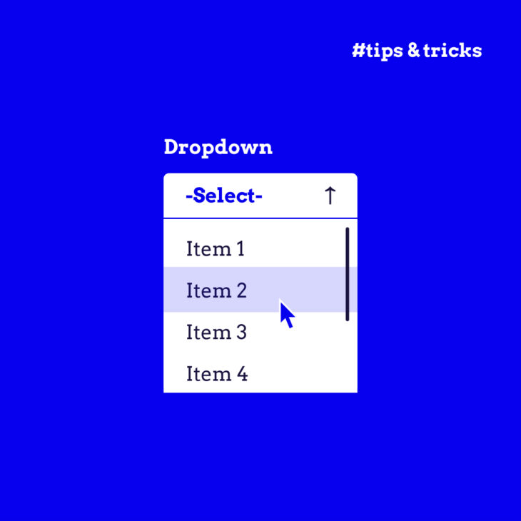
That’s especially important when building custom UI elements like dropdowns, sliders, date pickers, or interactive cards. Browsers don’t automatically apply focus styles to those. It’s up to you to make sure they’re focusable and visually indicate that focus. This means managing tabindex, sometimes adding JavaScript for keyboard behaviour, and always making sure your custom element shows some kind of visual focus when users tab to it.
How to create accessible focus indicators
Now let’s talk about how to apply focus indicators correctly – accessible, stylish, and fully WCAG-compliant.
1. Start with the outline
According to SC 2.4.13 Focus Appearance (Level AAA) and SC 2.4.12 Focus Not Obscured (Enhanced) (Level AAA), at a minimum, your focus indicator should:
- Be at least 2 CSS pixels thick.
- Have a 3:1 contrast ratio against both the element and its background.
- Not obscured by other content (like a tooltip or dropdown).
Here’s a solid baseline example using :focus-visible:
:focus-visible {
  outline: 2px solid #0174FE;
  outline-offset: 2px;
}
That outline-offset helps the focus ring breathe a bit around the element, making it more noticeable and less cramped.
For more resilient contrast, use a double-outline technique by layering two contrasting colours – typically one light and one dark. As long as the two layers have a contrast ratio of at least 9:1 with each other, at least one will maintain sufficient contrast with any solid background.
Here’s how it looks in CSS:
:focus-visible {
  /* inner indicator */
  outline: 2px solid #F9F9F9;
  outline-offset: 0;

  /* outer indicator */
  box-shadow: 0 0 0 4px #193146;
}
This combination creates a light inner outline surrounded by a darker outer ring.
Important note: This technique assumes the focus indicator is rendered on top of a single, solid background colour. If your UI includes gradients, images, or overlapping elements, you’ll still need to check the pixels of the indicator against the background colour. Also, avoid using outline-none and relying only on box-shadow. Browsers may suppress shadows in forced-colour modes, so pairing box-shadow with a real outline ensures consistent accessibility.
2. Colour and contrast
Focus indicators need to have at least a 3:1 contrast ratio against the background behind the element, and the element itself in its unfocused state.
If your site uses themes, dark mode, gradients, or image backgrounds, test your indicators across all of them. What looks sharp on a white card might disappear entirely on a dark hero banner.
💻 Use tools like the WebAIM Contrast Checker to verify you’re hitting that contrast threshold.
3. Don’t let content hide the indicator
Popups, tooltips, hover cards – any content that appears on top of other UI elements – should never fully cover the focus indicator.
This is a common problem with menus and modals. You tab into a dropdown, and suddenly… where did the focus ring go? If users can’t see where they are, they’re stuck.
To fix this, make sure your styles are layered thoughtfully with z-index, and test your focus indicators across all components.
4. Respect motion and flashing guidelines
If your focus indicator uses animation or blinking, it must not flash more than three times in a second, especially if it’s red. This is a WCAG 2.3.1 requirement to prevent seizures or motion sensitivity issues.
Examples of well-designed focus indicators
Let’s move from theory to practice. What does a great focus indicator actually look like in the wild?
If you head over to The A11Y Collective’s homepage and start pressing the Tab key, you’ll see a textbook example of accessible focus design in action.
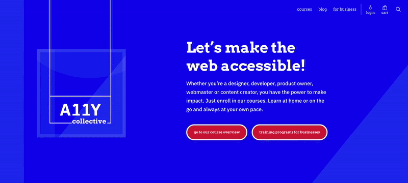
Each interactive element clearly shows when it’s in focus – no mystery, no guesswork, no lost-in-the-interface moments.
Let’s break down what works and how you can apply it to your own site:
- A link pops in at the top‑left that says “Skip to content” the moment it receives focus, then disappears again once you tab past it.
- Every link, button, and form control gets a bold white outline that sits a couple of pixels outside the element’s edges. Mouse users never see it, so the design stays clean for them.
- Wherever there’s a hover style (e.g., colour shift on a course “Learn more” link), there’s a matching focus style so keyboard users get the same visual feedback.
- Nothing hijacks the natural order, so focus always progresses top‑to‑bottom, left‑to‑right.
Focus indicator best practices
Here’s your go-to list of best practices to make sure your indicators are visible, reliable, accessible, and effective across your entire interface:
- Never remove focus styles without replacing them: If you’re removing the default browser focus style (outline: none), you must replace it with a custom indicator that meets accessibility standards. If not, you’re leaving keyboard users stranded.
- Use
:focus-visiblefor a smarter, cleaner experience: This pseudo-class helps keep your UI clean for mouse users while ensuring keyboard users still have full guidance. - Don’t make them subtle to the point of invisibility: Make it thick enough (≥ 2px), and make sure it pops against both the element and the background (contrast ratio ≥ 3:1). Be bold. Be obvious.
- Test early, test often, test everywhere: Test your focus styles on all major browsers (Chrome, Firefox, Safari, Edge), in both light and dark modes, at different zoom levels, and with different input methods (keyboard, screen reader).
- Manual keyboard testing is a must: Tab through your entire site using just the keyboard. Check that you can clearly see where focus is at all times, skip to main content quickly, and navigate through dropdowns, modals, and custom widgets. If not, there’s work to do.
- Use tools but don’t rely only on them: Automated tools like Lighthouse or axe-core can catch missing focus indicators, contrast issues, and more. Use them, but always supplement with real-world testing.
- Keep learning: Accessibility is a journey, and even the pros are always refining their skills. If you want to go deeper, check out our hands-on courses at The A11y Collective, built for designers and developers who care about inclusive design.
Enhance your accessible design skills with The A11Y Collective
Focus indicators may seem like a small part of the accessibility puzzle, but as you’ve seen, they’re a big deal. They’re what make interfaces usable for people who navigate with a keyboard, assistive tech, or under conditions where a mouse just isn’t an option.
But here’s the thing: focus indicators don’t work alone. They rely on solid semantic markup, logical tab order, proper ARIA use, and good visual contrast. And when all these crucial accessibility elements come together, you get a user experience that’s not just technically compliant, but genuinely inclusive.
That’s exactly what we teach at The A11Y Collective! Our “Accessible design, the basics” course is made for designers and developers who want to build interfaces that don’t leave anyone behind. We’ll walk you through practical ways to implement the WCAG guidelines – like the ones we explored in this article – and turn them into everyday design practices.
Ready to take your accessibility skills to the next level? Sign up for our “Accessible design, the basics” course and start designing with everyone in mind!

Ready to take your skills to the next level?
Join our “Accessible design, the basics” course and learn to build interfaces that work for everyone.