When people ask about what makes website content good, they often think about search engine optimisation, and not necessarily about the real purpose of any written word – effective communication. And when you write to connect with your audience, good rankings come naturally.
Take the NHS Digital as an example. Between 2017 and 2019, they completely transformed their website with a focus on clear language and user-friendly design. The result? Their daily users jumped from 15,000 to 26,000 – a 73% increase in just two years.
As Owain Davies from NHS Digital points out, “Content is often overlooked in terms of accessibility.” However, content creators have a huge opportunity – and responsibility – to make the web accessible to all users.
This article offers practical techniques aligned with WCAG standards you can implement right away to boost your content’s accessibility. You won’t find complex jargon or theoretical discussions here – just actionable steps that align with accessibility standards while creating a better experience for everyone.
Writing for web accessibility: essential techniques
If you want your content to reach and engage more people, accessibility should be at the heart of your writing process. Here’s what we mean by that:
Write in plain, concise language
💡 Did you know? NHS website content for the public is written at an 8-year-old reading level, while their professional-facing site aims for a 12-year-old reading level. And guess what? Even experts prefer reading simpler content!
When you write in plain language, you remove barriers for users with cognitive disabilities and make your content easier for everyone to understand.
Here’s how to make your text more accessible:
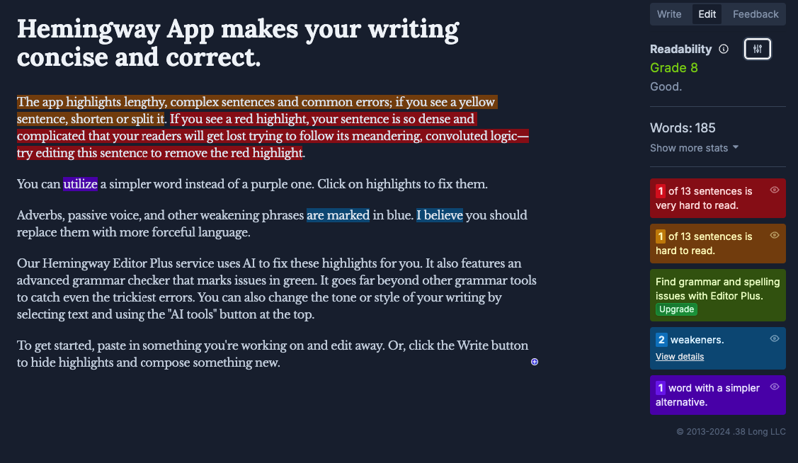
- Aim for lower secondary education level. Use tools like Hemingway Editor to check if your content hits around an 8th-grade reading level.
- Replace technical terms with everyday language.
- Poor: “The interface utilizes responsive design principles to optimize viewing across devices.”
- Good: “The website adjusts to fit your screen, whether you’re using a phone, tablet, or computer.”
- Use active voice and speak directly to readers.
- Poor: “It is recommended that passwords be changed every three months.”
- Good: “Change your password every three months.”
- Keep paragraphs short. One main idea per paragraph helps readers follow along more easily.
- Choose person-first language as per the Disability Language Style Guide. For example, say “people who are blind” rather than “blind people.”
- Put important information first. Front-loading helps readers quickly find what they need.
Use unique page titles and URLS
Clear titles and URLS help screen reader users orient themselves better and improve navigation for everyone. For example, one difference from default navigation is that screen readers announce page titles when a new page loads. This is why they need to be informative and useful.
| Element | Poor example | Good example |
|---|---|---|
| Page Title | “Home – Company Name” | ” Web Design Services in London – Company Name” |
| URL | example.com/page?id=47289 | example.com/web-design-services |
Follow these guidelines:
- Create descriptive page titles that accurately summarise your content.
- Ensure each page has a unique title to help users distinguish between similar pages.
- Structure URLS with meaningful keywords separated by hyphens.
- Avoid special characters, unnecessary numbers, and session IDS in URLS.
- Match page titles with H1 headings for consistency.
- Position key identifying information at the beginning of titles.
Taeke Reijenga, CEO and founder at The A11Y CollectiveIt’s your developer team’s job to make the site accessible, but from then on, the torch is passed onto the content team.”
Structure with headings and hierarchy
Headings are an important part of a page because they create a framework that helps all users navigate your content efficiently. This is vital for people using screen readers, who often jump between headings to scan content and navigate a page by headings alone, similar to how sighted users might skim for bold text.
So, a proper heading structure creates a mental map of your content.
Here’s how to structure your headings properly:
- Use only one H1 per page for your main title.
- Create a logical outline with headings that divide content into meaningful sections.
- Maintain proper hierarchy without skipping levels (don’t jump from H2 to H4).
- Keep headings concise yet descriptive of the content that follows.
Think of your heading structure like a book: the title (H1), chapters (H2), and sections within chapters (H3), and so on down to H6.
💡 Did you know? When testing the NHS website, they found that the percentage of pages without priority accessibility issues went from 36% to 100% between April 2018 and October 2019 after improving their content structure.
Make link text meaningful
When someone uses a screen reader, they often navigate by tabbing through links or reviewing a list of all links on a page. If your links just say “click here” or “read more,” users will have no idea where those links lead.
| Poor Link Text ❌ | Better Link Text ✅ |
|---|---|
| Click here | Download our accessibility guide |
| Read more | Learn about WCAG 2.1 guidelines |
| https://example.com/page | Visit our accessibility tools page |
As WebAIM advises, the purpose of each link should be clear from the link text alone and not depend on its surrounding context.
- Ask “where will I go?” rather than “how do I get there?”
- Be specific about what users will find at the destination.
- Ensure links make sense out of context – screen readers can read all links as a list.
- Never use the same link text for different destinations.
- Avoid generic phrases like “click here” or “more information”.
When users know exactly where a link will take them, they’re more likely to click it – and less likely to get frustrated when they arrive.
Want to become a link accessibility pro? Read our guide that builds upon the basic principles!
Add alt text for images
In 2024, 21.6% of all home page images had missing alternative text. This means a significant portion of web content remains inaccessible to people who are blind or have low vision.
Alt text serves as a text equivalent for images, allowing screen reader users to understand visual content. It also appears when images fail to load, benefiting all users.
Follow these guidelines for effective alt text:
- Focus on purpose, not appearance. Convey what the image communicates rather than describing every visual detail.
- Keep it concise. Aim for 125 characters or fewer in most cases.
- Use empty alt attributes (alt=””) for purely decorative images.
- Include text from images. If an image contains text, include it in the alt text.
For complex images like charts or infographics, provide a brief alt text summary and include a more detailed description nearby in the page content.
⚠️ Common mistakes to avoid:
| Poor Alt Text ❌ | Better Alt Text ✅ |
|---|---|
| “Image” | “Woman using a screen reader to browse a website” |
| “Banner.jpg” | “Banner promoting our accessibility workshop on June 15” |
| “Chart showing data” | “Bar chart comparing website accessibility scores across the construction (56%) and ecommerce (37%) industries for the year 2023” |
Run this simple test: read your alt text aloud and ask yourself – does it convey the image’s purpose to someone who can’t see it?
Provide transcripts and captions for multimedia
Audio and video content create barriers for people who are deaf or hard of hearing unless proper text alternatives are provided. These alternatives also benefit users in noisy environments, those with limited bandwidth, and people who prefer reading to watching or listening.
Here’s what you need to include:
- Accurate captions for all spoken content in videos that are:
- Synchronised with the audio.
- Equivalent to spoken content.
- Accessible and readily available.
- Speaker identification when multiple people are talking.
- Audio descriptions that narrate important visual information not conveyed through dialogue.
- Complete transcripts capturing both speech and relevant non-speech sounds.
- Easy-to-find placement of transcripts near the media.
📝 Transcript tip: Include timestamps for longer content to help users locate specific sections quickly.
Remember that auto-generated captions often contain errors – always review and edit them before publishing. The extra effort creates a significantly better experience for all users.
Include clear instructions
Clear instructions help everyone navigate your website successfully, particularly people with cognitive disabilities who may process information differently.
When writing instructions:
- Be specific about what users need to do. For example, instead of “Fill in your details,” try “Enter your full name and email address in the fields below”.
- Explain form requirements upfront. Tell users about password requirements or character limits before they start typing.
- Write helpful error messages. Don’t just say “Invalid input” – explain what went wrong and how to fix it.
- Describe elements by name and function. Avoid phrases like “Click the green button in the corner”, which rely on vision.
⛔️ Avoid instructions that depend solely on:
- Colour (“Click the red button”).
- Location (“See information on the right”).
- Shape (“Select the round icon”).
- Sound (“When you hear the beep”).
Instead, use clear references such as “Select the ‘Continue’ button” or “Complete the ‘Contact Information’ section.”
Format content for clarity
How you format your content dramatically affects readability and accessibility. Strategic formatting choices can make the difference between an inclusive website and one that creates barriers.
Essential formatting guidelines:
- Maintain sufficient colour contrast. Aim for a minimum 4.5:1 ratio for normal text and 3:1 for large text.
- Left-align text rather than using justified text, which creates uneven spacing that can be difficult for people with dyslexia.
- Break up content with:
- Short paragraphs (3-4 sentences maximum).
- Bullet points for lists.
- Numbered steps for processes.
- Choose readable fonts. Sans-serif fonts at a readable text size: 12pt minimum for body text
- Ensure text remains readable when zoomed to 200%.
- Use adequate white space between paragraphs and sections.
⚡ Pro tip: Don’t forget to specify your document language with the HTML lang attribute [<html lang="en">]! This is one of the top six WCAG failures found on homepages. Screen readers need this information to pronounce content correctly, yet many sites overlook this simple fix.
This small addition ensures screen readers can accurately announce your content in the correct language as required in WCAG Success Criterion 3.1.1.
Case study: Scope highlights the importance of accessible writing
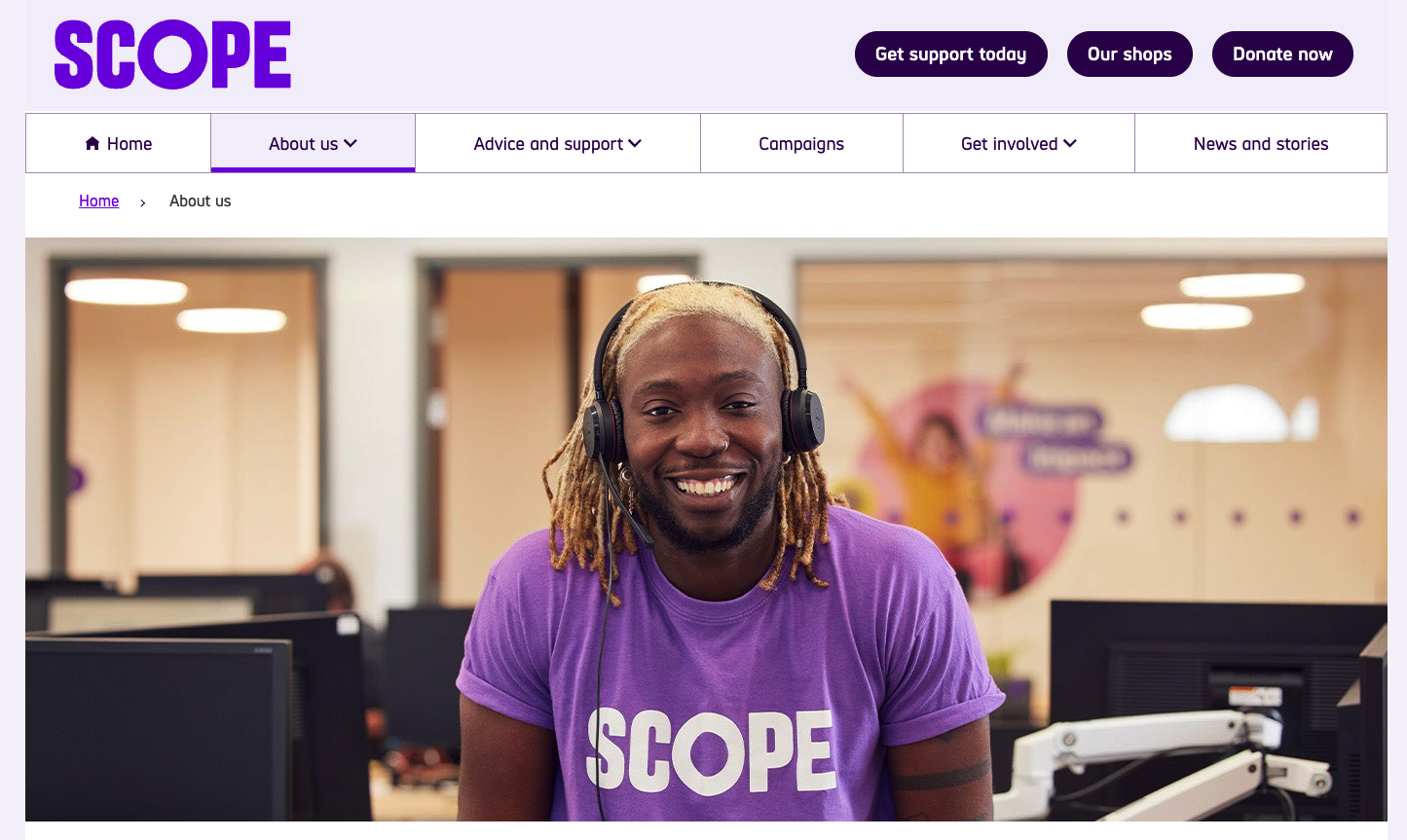
Scope is a UK organisation that deals with campaigns battling disability injustice and transforming attitudes around disabilities. All the text on their website is short, to the point, and easy to understand.
For example, this is the text for their “About us” page:
About us
We are Scope.We’re here to create an equal future with disabled people.
We campaign to transform attitudes to disability, tackle injustice and inspire action.
We create opportunities and provide information and support that empowers.
One in four of us in the UK are disabled. We are a diverse, proud, and vibrant community.
We are part of a powerful movement of disabled people, allies, organisations and businesses.
And together, we will be unstoppable.
This is an excellent example of a piece of text that is devoid of ego and is clearly created to serve its audience.
So what makes Scope’s writing stand out?
- Short sentences with one idea each.
- Simple words that most people know (Grade 6 reading level).
- Clear purpose in every line.
- No jargon or technical terms.
- Plenty of space between lines.
- High contrast between text and background.
- Easy-to-read font size.
They write like this not because it’s easy, but because they want more people to use their content and understand their purpose. This includes people with cognitive disabilities, people who speak English as a second language, and people who are in a hurry.
Tools and tests to verify your content’s accessibility
Creating accessible content is just the first step – you also need to verify it works for everyone. A good testing process helps identify barriers that might otherwise go unnoticed.
Automated testing tools
Several tools can help you spot common accessibility issues:
- WAVE by WebAIM highlights accessibility errors with visual indicators directly on your page. Look beyond just counting errors – understand how each issue affects real users.
- Readability analysers like Hemingway Editor identify complex sentences, passive voice, and difficult vocabulary that may create barriers for users with cognitive disabilities.
- Colour contrast analysers such as the WebAIM Contrast Checker help verify that your text is visible across different visual conditions and device settings.
- Markup validators such as W3C Markup Validation Service check that your web documents in HTML, XHTML, SMIL, MathML, etc, are well-formatted, which is particularly important for ensuring the technical quality of web pages.
Manual testing methods
Automated tools are valuable, but they can only identify about 71% of accessibility issues. The remaining 29% require human judgment and manual testing.
Include these methods in your testing process:
- Screen reader testing with NVDA (Windows) or VoiceOver (Mac) reveals how your content’s structure translates to audio experiences.
- Keyboard navigation confirms all interactive elements can be accessed without a mouse – make sure focus indicators are clearly visible throughout.
- Diverse user testing provides invaluable insights from people with different abilities and perspectives.
Create a testing checklist
Use the WCAG guidelines to create targeted test cases for your content:
- Document structure: Verify that headings are properly nested and that content follows a logical sequence.
- Text alternatives: Confirm all images have appropriate alt text.
- Language specification: Check that your page includes the correct lang attribute.
- Link purpose: Ensure all links are meaningful when read out of context.
- Form labels: Verify all form fields have clear labels and instructions.
Regular audits
Schedule regular content accessibility audits to maintain standards over time. Consider using a professional service provider like The A11Y Collective for comprehensive evaluations, especially for larger websites or applications.
Transform your accessibility skills with The A11Y Collective
Congrats! Now you know the basics of writing accessible content. By following these simple tips, you can make sure that more people use your website, but there are always areas for improvement.
If you want to become a real expert, at The A11Y Collective, we offer a course called “Writing accessible content for the Web.” This course teaches you even more skills to make your writing better for everyone.
The course is specially designed for content creators, managers, marketers, and website owners, and you don’t need to know anything about accessibility to start. But if you already work in accessibility, you’ll earn 2 CAEC credits for your IAAP certification.
Taking this course will change how you write, and with it, accessibility will become a natural part of your work, not just a checklist item.
Want to become better at accessible writing? Sign up for “Writing accessible content for the Web” today.

Ready to master accessible writing?
Join our “Writing accessible content for the Web” course and make accessibility a natural part of your workflow.