
Andrée Lange has over ten years of experience working as a digital designer at several agencies. At heart, she is a true UX and UI designer. In recent years, she has specialised in web accessibility and, more specifically, in accessible design.

Are you looking to optimise your website’s font size for accessibility?
This includes selecting font sizes that meet international accessibility standards and crafting an overall better user experience. By mindfully choosing font sizes, you significantly elevate the user experience on your website for all users, including those with visual and cognitive disabilities.
To make this process easier, the Web Content Accessibility Guidelines (WCAG) offer website owners a clear path on how to optimise font sizes for accessibility.
In this article, we’ll explore the importance of accessible font size and how you can apply the WCAG guidelines to choose the best size for your website.
How font size impacts readability and user experience
Just as a pair of ill-fitting glasses can make reading a book a strain, a website with the wrong font size can strain eyes and patience, leading to a bad online experience.
Choosing a font size that’s too small or too large can decrease readability, especially for users who may be experiencing conditions such as myopia, hyperopia, or astigmatism. This could make it harder for them to absorb your web content and navigate your site, leading to many unwanted consequences, such as poor user experience, increased bounce rates, bad Search Engine Optimization (SEO) performance, and reduced conversions.
With over half of online traffic coming from mobile devices, each with varying screen sizes, the challenge of font size becomes even bigger. This makes responsive design and scalable font sizes essential to ensure users can access your content in a format that caters to their device requirements.
How to choose the perfect font size for accessibility
The ideal font size for your website depends on how users interact with your site, but since people use websites differently, it’s hard to define a universally perfect font size.
Often, designers start with base sizes as follows:
- Regular body text – a size of 12pt (16px) is generally suggested.
- Large text – a size of 18pt (24px) is typically recommended as a minimum.
Remember, these values are not hard rules. The suitability of different font sizes can vary based on the context of use, specific typefaces, and the needs of your audience. It’s always encouraged to test usability with different types and sizes, reflecting your diverse user base.
Andrée Lange – Digital Designer at Level Level & Trainer at The A11Y CollectiveAt the heart of every design decision you make, the primary aim should be to create an intuitive and inclusive web experience that effectively communicates your content to your entire audience, regardless of their abilities.
What WCAG says about font size
The Web Content Accessibility Guidelines recommend the incorporation of ‘scalable’ text, meaning the users should be able to resize the text up to 200% using standard browser features without losing any content or functionality.
They also don’t directly recommend a specific font size so you’d have to adjust that to your specific website. We recommend testing different versions and font sizes with users and see whether the page is clear enough for everyone.
However, WCAG does mention specific font sizes in relation to contrast. Text elements that are at least 18pt (around 24px) or 14pt (around 18.66px) for bold text can be considered large enough that they require a lower contrast ratio than the one that is usually recommended, which is 4.5:1 for normal text.
Importance of relative units over absolute ones
When it comes to defining font sizes on your website using CSS, leveraging relative units is considered best practice. The purpose is to have your text size adapt effectively, in line with the device or the settings a visitor is using to view your site.
Relative units such as em, rem, percentages, or named font sizes are practical to use. Why? Because they ensure your website’s text remains readable, regardless of the device or browser used to view it.
- Percentages: This involves font sizes that automatically adapt to the base font size of the parent element to which they are applied. By defining text size in percentages, the text responds dynamically to the base font size of its parent element.
strong {font-size: 120%}

...

<h1>Letting the <strong>user</strong> control text size</h1>
<p>Since only the user can know what size text works for him,
it is <strong>very</strong> important to let him configure the text size.
...- Named font sizes: These are predefined font sizes set by the browser like ‘small’, ‘medium’, ‘large’, etc. They are inherently flexible, adjusting in response to user preferences.
strong {font-size: larger}

...

<h1>Letting the <strong>user</strong> control text size</h1>
<p>Since only the user can know what size text works for him,
it is <strong>very</strong> important to let him configure the text size.
...
- em units: An ’em’ is used to define a measurement that is relative to the font size of the element to which it is applied. If the element’s font size hasn’t been specifically defined, the ’em’ refers to the base font size of the document or the default setting of the browser.
strong {font-size: 1.6em}

...

<h1>Letting the <strong>user</strong> control text size</h1>
<p>Since only the user can know what size text works for him,
it is <strong>very</strong> important to let him configure the text size.  </p>
...- Rem units: The ‘rem’, or root em, is similar to the ’em’ unit but with a key difference: it is relative to the root (html) element regardless of the font size set for a specific parent element. This means that ‘rem’ provides a consistent scale across the whole document.
It’s important to test font scalability across different devices as it helps you create consistent and accessible user experiences.
Best practices for website text
While choosing the correct font size is undeniably vital for accessibility, it’s equally important to follow other best practices to create a fully comprehensible and user-friendly website experience. Let’s examine some quick practical guidelines:
- Use text over images of text whenever possible: This is more compatible with screen readers, aiding users with visual impairments. However, if images of text are essential, such as in logos, ensure they are complemented with alt text to uphold accessibility standards.
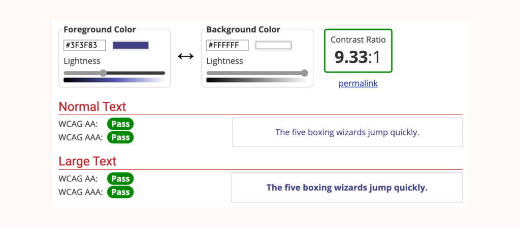
- Maintain suitable text colour contrast: Consider the contrast ratio between your text and its background. The WCAG recommendation is 4.5:1 for normal text up to 24px, 3:1 for bold text of at least 19px or larger, and 3:1 for regular text of at least 24px or larger. Use online tools like the WebAIM Contrast Checker to evaluate your website’s contrast ratios.
- Select clear and readable typefaces: A distinct and straightforward typeface greatly enhances readability. Avoid character ambiguity, where two characters appear remarkably alike, to avoid confusion (like the capital “I” and lowercase “L” ). The more straightforward the typeface, the easier it will be for your users to read.
- Limit font styles and varieties: Numerous typefaces or font styles can disorient users. Maintain a small, consistent set of fonts to aid readability and reduce cognitive load, offering a more consistent user interface.
- Maintain clarity in letter and word spacing: Avoid crowding letters and tightly packed text, which can be tough, especially for users with reading difficulties. Maintain appropriate spacing using CSS properties like ‘letter-spacing’ and ‘word-spacing’ to ensure clarity.
Take action: Improve your web accessibility now
Creating an accessible website should be the goal of every web developer and website owner. One vital component of this process lies in making sure that the font size across your site allows every visitor to have an inclusive experience.
However, it’s important to remember that paying attention to one element in your website isn’t enough for it to be fully accessible – there are many moving parts involved. These include colour contrast and text spacing to image labels and site navigation. It’s an ongoing journey to inclusivity.
At The A11y Collective, we offer a comprehensive set of tools in our line-up of accessibility courses. The perfect starting point? Our course – “Accessible design, the basics”! Enroll today and start making your website more inclusive for every person.
Ready to improve your website accessibility?
Get started with “Accessible design, the basics” to get a comprehensive understanding of the fundamentals of accessible website design.