
Caitlin de Rooij is a Web Accessibility Specialist. She works as an Accessibility Consultant for Level Level and provides training and workshops for enhancing digital accessibility. Caitlin’s expertise lies in ensuring that websites and digital content are designed and developed to be inclusive and usable for individuals with diverse abilities and disabilities.
Have you ever tried navigating a website using the keyboard and found yourself lost, unable to reach certain elements, or jumping around the page in a seemingly random order? It’s a frustrating experience, isn’t it?
This issue highlights the importance of a well-organised tab order on a website, not just for sighted users who prefer to use the keyboard but also for individuals relying on assistive technologies to browse the internet.
The solution lies in a powerful yet often misunderstood HTML attribute: tabindex.
In this article, we’ll guide you through the dos and don’ts of employing tabindex effectively to enhance navigation on your web pages, ensuring they are accessible and user-friendly for everyone. We’ll explore how to structure your tab order for optimum user experience and delve into common pitfalls.
How tabindex influences keyboard navigation
Proper use of the tabindex HTML attribute ensures that all important elements on a web page are focusable and accessible in a logical sequence when navigating the website using the tab key on the keyboard.
However, we should note that adding a tabindex attribute is not always necessary. Proper use of semantic HTML elements – such as <button>, <input>, <a> with an href attribute, and others – automatically makes an element focusable.
The need to manually add a tabindex could be essential in specific cases, such as when creating a custom component like a tablist, where the natural tab order and focusability might not align with the desired user experience.
When you do need to use tabindex, understanding the three types of values it can take – positive, negative, and zero – is key to manipulating keyboard navigation effectively:
Positive value
When you assign a positive value to an element (any value greater than zero), you’re effectively placing that element higher up in the navigation order. This means it will be focused on before elements with a tabindex of “0”, negative values, or no tabindex value at all.
For instance, an element with tabindex=”1″ will gain focus before those with tabindex=”2″, tabindex=”3″, and so on. In cases where multiple elements share the same positive tabindex value, they are navigated in the order they appear visually on the page.
⚠️ Important note: The use of positive tabindex values is generally discouraged. This practice can create a navigation order that contradicts the visual layout of the page or the expected order for screen reader users, leading to confusion and a disjointed user experience.
Negative value
Assigning a negative value (specifically, tabindex=”-1″) to an element does the opposite of a positive value; it excludes the element from the sequential keyboard navigation. This does not mean the element is entirely unfocusable; it can still receive focus programmatically or through other interactions.
This is particularly useful for elements that need to be focusable but not part of the standard tab sequence, such as modals that appear off-screen until triggered or error messages that need focus when they become relevant. That way, you’ll be able to grab the reader’s attention.
⚠️ Important note: Negative tabindex values should not be used on elements that require direct keyboard navigation, like links or buttons. Doing so removes them from the keyboard’s tab flow, making them inaccessible to users who rely on keyboard navigation.
Value zero
Assigning tabindex=”0″ to an element places it in the default navigation order. This means it will be focusable in the order it appears in the HTML document without disrupting the natural flow.
This is incredibly useful for making elements that aren’t natively focusable (such as <div>, <span>, or <p> tags) keyboard accessible.
Additionally, with tabindex=”0″, you can create interactive components from non-interactive elements, enhancing the usability and accessibility of your web designs. For instance, if you’re incorporating an interactive quiz or a dynamic content section in your webpage, assigning tabindex=”0″ to these elements ensures they are seamlessly integrated into the keyboard navigation flow without resorting to positive values and the issues they bring.
By adhering to the above principles, you can create more accessible, intuitive, and enjoyable web experiences for all users, regardless of how they navigate.
Navigating common tabindex pitfalls and their solutions
The tabindex attribute is a double-edged sword in web design. When used correctly, it enhances website accessibility and usability. However, misapplication can lead to navigation nightmares.
Let’s explore some common pitfalls and how to avoid them:
Using positive tabindex values to define keyboard tabbing order
Problem: Assigning a positive tabindex value (e.g., tabindex=”1″) to elements dictates an unnatural navigation order, potentially mismatching the visual and screen reader sequence. This discrepancy creates a confusing user experience for anyone relying on keyboard navigation.
Solution: Steer clear of positive tabindex values. The default behaviour of HTML already ensures that all interactive elements are accessible via the Tab key, following the document’s reading order. By sticking to this natural flow, you maintain consistency and predictability in navigation.
Using tabindex value zero on non-interactive elements
Problem: Applying tabindex=”0″ to non-interactive elements (like <div>, <span>, or <p>, etc.) disrupts the expected tab order. It confuses users about which elements are interactive, adding unnecessary hurdles for keyboard-only users without additional assistive technologies.
Solution: Reserve tabindex=”0″ exclusively for interactive elements that lack inherent keyboard focusability. If you must make a non-native element focusable, ensure it behaves interactively (responds to Enter and Spacebar key presses) and communicates its function clearly, ideally through ARIA roles (e.g., role=”button”) and properties (e.g., aria-expanded=”true”).
Misusing tabindex with non-interactive content
Problem: Leveraging tabindex on a non-interactive container, like a <div>, to mimic interactive behaviour can obstruct assistive technologies’ ability to interact with these pseudo-interactive components. This practice often results in accessibility barriers.
Solution: Opt for inherently interactive elements (e.g., <button>, <input>, <textarea>) that don’t require tabindex manipulation to be focusable or interactive. These elements come with built-in roles and states, providing clear communication to assistive technologies about their function and status.
⭐ Remember, the goal of web design should always be to facilitate ease of use, and proper use of tabindex is a significant step in that direction.
Best practices for utilising tabindex in your projects
Here’s a guide of the Dos and Don’ts when using the tabindex HTML attribute:
| ✔️ Do‘s | ❌ Don’ts |
|---|---|
| ✔️ Prioritise the default tabbing order for page navigation: Maintaining the natural tabbing order ensures a logical navigation flow that aligns with the visual layout and content structure, enhancing accessibility and usability. | ❌ Use positive tabindex values to disturb the natural navigation order:Positive tabindex values can create a confusing and disorienting navigation experience by deviating from the document’s logical structure. |
| ✔️ Ensure that elements with tabindex=“0” applied have correct and intuitive keyboard interaction:Elements with tabindex=”0″ should be fully interactive, responding to keyboard inputs like Enter and Spacebar, to ensure a seamless user experience. | ❌ Apply tabindex=“0” to make non-interactive elements focusable:Non-interactive elements should not be made focusable as it leads to user confusion about which elements are actionable, complicating navigation for keyboard and assistive technology users. |
| ✔️ Use tabindex=“-1” to remove elements that shouldn’t be navigated to directly from the navigation order:tabindex=”-1″ allows for the temporary removal of elements from the sequential navigation flow, useful for modal dialogues or temporarily hidden content without affecting their focusability via script. | ❌ Assign tabindex=“-1” to any element that should be directly keyboard navigable:Interactive elements requiring direct keyboard access should never have tabindex=”-1″ as it removes them from the keyboard navigation flow, hindering accessibility. |
Ensuring your website is accessible and easy to navigate also requires the right tools and techniques. Let’s look at some valuable resources and strategies that can aid in optimising your site’s tabindex for better accessibility:
Browser accessibility inspectors
For example, the Firefox Accessibility Inspector allows developers to visualise the focus order of elements on a web page. This is invaluable for verifying that the navigation order is logical and intuitive, especially after implementing tabindex attributes.
To use this feature:
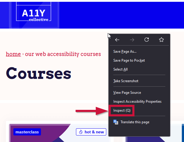
- Go to the web page you want to inspect, right click on it, then select the Inspect option. Alternatively, you can just press the Ctrl + Shift + I keys at the same time.
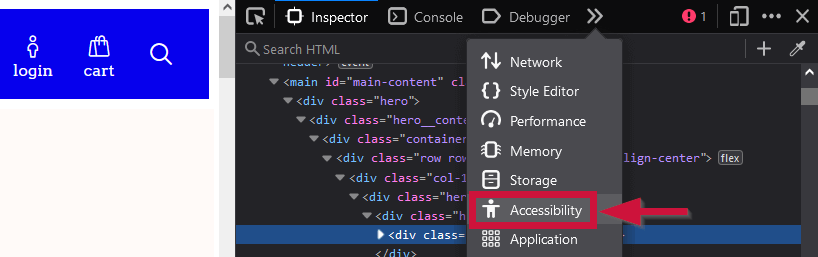
- Navigate to the Accessibility tab, and look for the option to show the focus order. This visual guide can help you identify and correct issues where the focus order does not match the expected sequence of interaction.
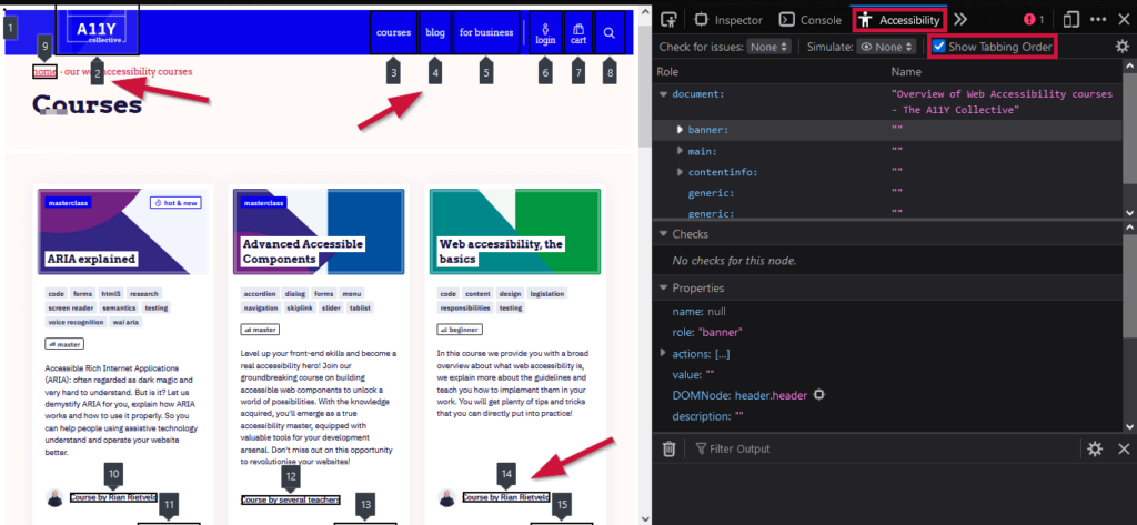
Similarly, Chrome offers comprehensive tools for accessibility testing within its DevTools. While it might not have a dedicated focus order visualisation like Firefox, it does provide detailed information on how elements are perceived by assistive technologies. The Accessibility Tree in Chrome DevTools is particularly useful for understanding how elements with tabindex are integrated into the navigable structure of the page.
Other tools
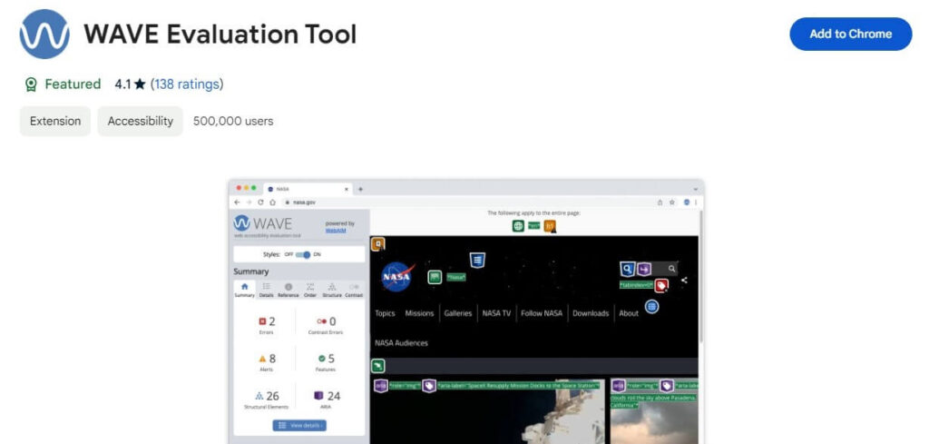
Another great resource is the WAVE Evaluation Tool, which provides visual feedback on accessibility issues directly in your browser. It can help highlight elements with improper tabindex values that might disrupt the user’s navigation experience.
Beyond automated tools, manual testing of keyboard navigation is essential. Navigate your site using only the keyboard, paying close attention to the tab order and how focus is managed. This hands-on approach can reveal nuances and issues that automated tools might miss, especially in complex interactive components.
Take the next steps in web accessibility
The proper application of tabindex can significantly enhance keyboard navigation, making your site a welcoming place for everyone, including those who rely on assistive technologies. However, improperly used tabindex can disrupt the natural tabbing flow, potentially leading to a less accessible and more frustrating experience for visitors.
Mindful usage of tabindex is essential for improving keyboard navigation, but remember that effective tabindex usage is just one element of crafting an accessible website.
Accessibility is a broad and multifaceted domain, encompassing everything from visual design to content strategy and beyond. To truly create inclusive digital experiences, we must extend our efforts beyond tabindex and dive deeper into the world of web accessibility.
The A11y Collective is your go-to for enhancing your accessibility skills. Offering a comprehensive suite of courses designed to cater to various aspects of web accessibility, The A11y Collective empowers developers, designers, content creators, and anyone involved in the digital space to build more accessible websites and applications.
Ready to take your web accessibility skills to the next level? Explore the courses offered by The A11y Collective today and create a more inclusive digital space!
Ready to take the next step?
Enrol in “Accessible design, the basics” today to learn the fundamentals of accessible website design and make your site an inclusive environment for all users.