Images are a powerful way to clarify complex ideas, reinforce content, and make the web more engaging. But if they aren’t accessible, some people will miss part of the story.
That’s where Scalable Vector Graphics (SVGs) come in handy. Bitmap image formats, like JPEG or PNG, are widely used and have their merits, but there’s one area where SVG has got them beat – infinite scalability without losing sharpness. That’s a huge win for users who rely on zooming. The images remain legible and easy to perceive without any distortion. SVGs can also include semantic elements and accessible markup, making them much more screen reader-friendly than bitmap images.
But there’s a caveat: SVGs only offer these benefits if they’re implemented with accessibility in mind. Whether you’re new to SVGs or simply haven’t considered their accessibility implications before, this guide will give you the practical knowledge you need to make your graphics accessible to everyone.
You’ll learn practical, WCAG-compliant techniques for making SVGs more inclusive – from choosing the right markup pattern to providing meaningful text alternatives!
SVG accessibility fundamentals
SVGs are a bit of a double-edged sword when it comes to accessibility – they offer huge potential but only if you use them thoughtfully and implement them correctly.
They are XML-based graphics that live right in your HTML or can be linked externally, which gives you a lot of control over how they behave and how they’re interpreted by assistive tech. What makes them so unique is how customizable they are. Unlike JPEGs or PNGs, SVGs aren’t static pixel grids – they’re made up of shapes, paths, and text that are described mathematically. That means they scale cleanly at any size without blurring, making them perfect for users who zoom in or use screen magnifiers, and they can carry extra layers of meaning through markup.
When SVGs are structured correctly, a screen reader can identify and relay:
<title>and<desc>elements (used for accessible names and longer descriptions).- Actual text within the SVG, like labels or legends.
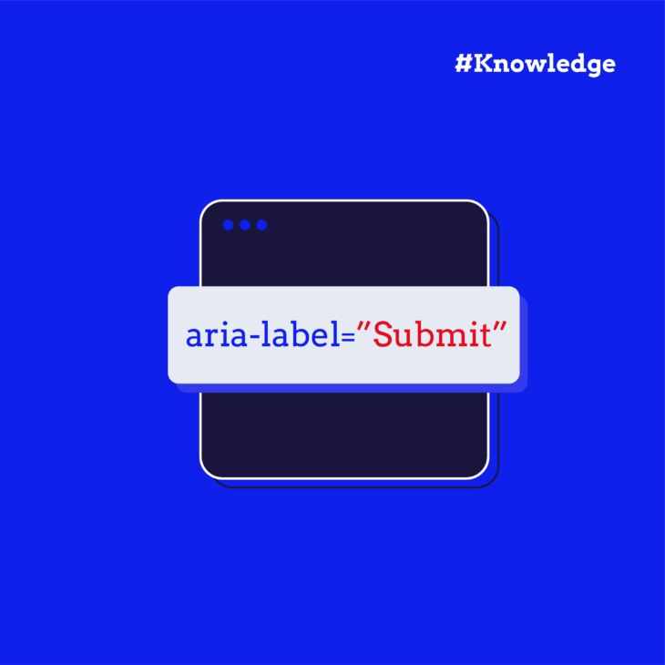
- ARIA roles and attributes that define the SVG’s purpose and behaviour.
It can even ignore decorative elements when told to. And that brings us to an important distinction: decorative vs. informative SVGs.
Decorative SVGs serve no functional or informative purpose – they’re purely visual. Think background patterns, flourishes, or icons that are repeated for aesthetic effect. These should be hidden from assistive tech using aria-hidden="true", which omits them from the accessibility tree altogether.
Informative SVGs, on the other hand, carry meaning. These might include logos, data visualisations, icons with a function (like a search or download icon), or illustrations that support content. These must be accessible. That means giving them a proper accessible name, possibly a description, and using ARIA attributes when needed to clearly communicate what they are and what they do.
Unfortunately, many common SVG implementations fall short. Accessibility issues often creep in through:
- Missing or vague text descriptions.
- Incorrect or missing ARIA roles.
- Reliance on colour to convey meaning (which WCAG specifically warns against).
- Interactive SVGs that can’t be accessed or operated with a keyboard.
The good news is that all of this is fixable – here’s how!
The best patterns for accessible SVGs
The way you include SVGs in your code determines what information assistive technologies can pick up and how much control you have over that experience. Let’s break down the two main patterns:
Inline SVGs
Inline SVGs are written directly into your HTML using <svg> tags. This is the most flexible and accessibility-friendly way to use SVGs, because you have full control over both the markup and the accessibility hooks. Perfect for illustrations or detailed graphics that need to be accessible inside your HTML. However, this approach can become less ideal when an icon is repeated multiple times on a page, as it can bloat the size of the HTML and potentially slow down loading times and scrolling performance.
Inline SVGs are great for accessibility because you can:
- Include a
<title>element to give the SVG an accessible name. - Add a
<desc>element for a more detailed description. - Use semantic roles (
role="img",role="presentation“, etc.) and ARIA attributes directly. - Leverage assistive technologies to read and interact with the structure just like any other HTML content.
Here’s an example:
<p class="sr-only" id="accessibilityInfo">Concise title of the graphic: More detailed description of the graphic</p>
<svg role="img" aria-labelledby="accessibilityInfo">
  <!-- SVG content goes here -->
</svg>
In this snippet:
- The
<p>element with a class of sr-only provides an accessible description for screen readers only, making the information available without visually cluttering the page. This paragraph is linked to the<svg>element via aria-labelledby. - The aria-labelledby attribute references the ID of the accessible description, ensuring that screen readers can provide context to the user about the graphic.
- The
role="img"attribute tells browsers and screen readers to treat the SVG as an image.
Using the <title> and <desc> elements directly inside the SVG works in some cases, but it may lead to duplication issues in some browser and screen reader combinations. Using a “screen reader-only” paragraph element, like in the example above, is one recommended approach to avoid this duplication and provide a clean, accessible experience.
💻 Pro tips: For complex SVGs with multiple meaningful components, consider adding separate titles for important shape groups. And if your SVG is purely decorative, use aria-hidden=”true” and skip the title/desc to keep it out of the accessibility tree.
Externally referenced
If the graphic is purely decorative or a simple static illustration, the most robust pattern to use is the external file referenced by <img src="…"> with a succinct alt attribute like this:
<img src="chart.svg" alt="Chart description">
These can be more convenient in some workflows, but they offer less flexibility for accessibility. There’s no way to include <title> or <desc> within the SVG from the HTML alone unless the SVG file includes them internally. Also, background images should never convey important content – they’re invisible to assistive technologies.
For more complex graphics or longer descriptions, it’s recommended to provide a transcript near the image. Long alt text can be difficult for users to navigate, especially when it contains too much detail. Instead of overwhelming users with lengthy descriptions in the alt attribute, an accessible alternative is to include an inline transcript that can be easily navigated by screen reader users.
The transcript can be hidden within a disclosure widget, which allows users to expand and collapse the content as needed. This method ensures that the description is available without cluttering the page layout. To implement a disclosure widget, you can refer to the ARIA pattern guide on disclosure widgets.
The best use cases for embedded SVGs are when you’re reusing icons across a site or when you don’t need interactive or richly described content.
Best practices for SVG accessibility
Ensure sufficient contrast for SVG text
If your SVG includes text elements (e.g., labels, chart annotations), make sure they meet WCAG’s minimum contrast requirements, so users with low vision or colour blindness can have a comparable experience to other users. A great-looking chart doesn’t help if the axis labels are unreadable.
Use tabindex=”-1″ on non-interactive SVGs
Browsers can be inconsistent about whether an inline <svg> becomes a tab stop. To guarantee that a purely decorative graphic never interrupts sequential keyboard navigation, add tabindex="-1" (and usually aria-hidden="true";). This negative tabindex removes the element from the tab sequence while still letting scripts or pointer clicks give it focus when needed. When the SVG is meant to act as a control, give it tabindex="0" (or place an actual <button>, <a>, etc. inside the SVG), wire up keyboard handlers, and supply a visible focus style.
Use ARIA attributes with care
ARIA can be incredibly helpful, but it’s easy to overdo it. Follow the WAI-ARIA Authoring Practices and:
- Avoid redundant or conflicting roles.
- Don’t use ARIA when native HTML does the job better.
- Always test with screen readers to verify behaviour.
Make interactive SVGs keyboard accessible
If your SVG is interactive – like a chart with hover/click details or a custom control – it must:
- Be focusable (
tabindex="0"). - Be operable via keyboard.
- Include accessible names and state indicators (e.g. aria-pressed, aria-expanded).
💡 And remember, interaction must be conveyed in more than just colour or motion. Use shape, text, or labels for users who may not perceive visual changes.
Accessible colours in SVG
SVGs are often used for charts and infographics, but colourblind users won’t always see differences in red vs. green or blue vs. purple. Therefore, you should use texture, labels, or patterns to reinforce meaning. This is a WCAG 2.1 requirement (success criterion 1.4.1: Use of Color).
In some cases, consider using currentColor in your SVGs to inherit the surrounding text colour. For example, when you have an icon and text in a button or link. This allows the SVG to adapt automatically to theme changes (like light or dark mode), improving both accessibility and maintainability. It also ensures that icons or graphical elements remain consistent with text-based colour schemes, which helps users who rely on high-contrast settings or custom themes.
Just remember the inheritance only works when the SVG is part of (or shadow‑uses) the same DOM. Avoid hard‑coding colours if you want to stay flexible.
Test with real assistive technologies
No matter how clean your code looks, test it. Use VoiceOver, NVDA, TalkBack – whatever tools your audience might rely on. Check for:
- Correct reading order.
- Presence of accessible names.
- Hidden elements staying silent.
- Interactive elements behaving as expected.
Transform your design accessibility skills today
As you’ve seen, making SVGs accessible entails designing with empathy, coding with intention, and communicating meaning to everyone, no matter how they navigate the web.
That’s why, at The A11Y Collective, we’ve carefully crafted our “Accessible design, the basics” course to teach you how to turn good‑looking layouts into experiences everyone can actually use. You’ll master:
- Meeting WCAG and regional requirements without stripping away creativity.
- Planning clear information hierarchies that read well visually, audibly, and with keyboard‑only input.
- Choosing typography and colour combinations that stay readable across low vision, colour‑blindness, and high‑contrast settings.
- Building navigation, forms, modals, and animations that are operable via keyboard and assistive tech, and that don’t trigger motion sensitivity.
What are you waiting for? Start your journey today with our Accessible design course and create digital experiences that include everyone!

Ready to get started?
Contribute to a better user experience for everyone.