
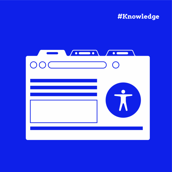
Tab interfaces are everywhere – product pages, dashboards, profile settings – and for good reason. They organise lots of content into a small space without overwhelming people. But when tabs aren’t built with accessibility in mind, they can create serious roadblocks for users who rely on keyboards, screen readers, or other assistive tech.
Building an accessible tab interface means getting the details right: keyboard behaviour, focus management, clear relationships between tabs and their content, and more. But don’t worry – we’ve got you covered.
We’ll walk through everything you need to know to build tabs that look good and work well for everyone. You’ll learn what often goes wrong, how to fix it, and how to create tabs that meet accessibility standards without sacrificing usability or design.
Understanding accessible tab interfaces
By design, tabs hide and reveal content dynamically. That’s no problem for someone using a mouse or touch, but for users relying on keyboards, screen readers, or other assistive technologies, it can become a maze without the right cues in place.
In fact, Alastair Campbell’s research highlights that even skilled screen reader users can struggle when navigating poorly implemented ARIA tabs. That’s why a great accessible tab experience should make it just as easy (if not easier) for users of all abilities to navigate, understand where they are, and interact with the content.
Think about a product page on an eCommerce site. One tab might show “Description”, another “Reviews”, and another “Shipping Information”. Or picture a web app dashboard where “Profile Settings”, “Notifications”, and “Security” are tucked neatly under tabs. Without clear accessibility considerations, users might not even realise there’s more content beyond what’s immediately visible.
In some cases, especially when working with highly content-driven pages, it can be more user-friendly to offer direct links that allow users to skip or jump straight to the relevant content.
However, if you’re using tabs and they go wrong, it’s often because of one (or more) of these common missteps:
- Keyboard navigation issues: If a user can’t switch between tabs using only their keyboard, they’re effectively locked out. This impacts people with motor disabilities who may not use a mouse at all.
- Screen reader compatibility problems: Without the right semantics and ARIA roles, screen readers might not even announce that tabs exist, or worse, might misrepresent their state, leaving users lost.
- Poor focus management: Focus should move predictably between the active tab and its associated content. When focus behaviour is inconsistent or confusing, users are left guessing where they are.
- Missing ARIA implementation: Tabs, tablists, and tabpanels all need the right ARIA roles and attributes to help assistive tech understand their relationships. If these connections are missing or incorrect, the whole experience falls apart.
⚠️ Caution: while some pre-built tab components (like KadenceWP’s tab block) may pass basic accessibility checks, many drag-and-drop page builders and UI kits fall short. Always approach pre-built solutions critically. When you build your own tabs following accessibility best practices, you have far more control and can create a truly reliable experience.
If you want to go even deeper after this guide, our Advanced Accessible Components course at The A11Y Collective dives into tab implementation (and so much more) to help you level up your accessible UI skills.
Essential ARIA roles and properties for tabs
ARIA is absolutely necessary when building an accessible tab interface. Without the right roles and attributes, assistive technologies have no way of knowing how your tabs relate to each other or what content belongs where.
The core ARIA roles include:
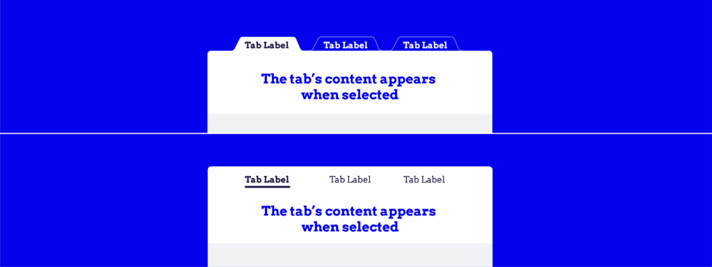
- tablist: This role groups all your tab buttons together. It tells assistive technologies, “Hey, these tabs are part of a related set”.
- tab: Each interactive button that triggers a content panel gets a tab role. It identifies the clickable element that selects the corresponding panel.
- tabpanel: This marks the content area that appears when a particular tab is active. It’s what users ultimately came to read or interact with.
There are also a few important ARIA attributes:
- aria-selected=”true/false”: Indicates whether a tab is currently selected. Only one tab should ever have aria-selected=”true” at a time.
- aria-controls=”PANEL_ID”: Set on each tab, it points to the ID of the associated tab panel. This links the tab to its content.
- aria-labelledby=”TAB_ID”: Set on each tab panel, it points back to the tab that labels it. This creates a clear, two-way relationship between the button and its content.
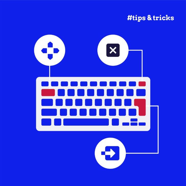
Along with these, the W3C ARIA Authoring Practices Guide (APG) instructs us that proper keyboard navigation for tabs should behave like this:
- The left/right arrow keys (for horizontal tabs) and up/down arrow keys (for vertical tabs) should move focus between tabs without requiring a mouse.
- The Tab key should move focus from the active tab into the active panel’s content, then onward through the page.
- The Home/End keys should quickly jump focus to the first or last tab in the tablist – a huge timesaver for keyboard users.
For tabindex management, the active tab must have tabindex=”0″, making it reachable with the Tab key. Inactive tabs should have tabindex=”-1″, removing them from the Tab order but still reachable via the arrow keys.
Additionally, the W3C recommends automatic activation for most tab interfaces. That means when a tab receives focus (via arrow keys), it should immediately display its content – no need for users to press Enter or Space to activate it. Manual activation – where users focus a tab, then press Enter/Space – is more appropriate in cases where switching content has heavy consequences, like starting a video or submitting a form.
For typical navigation tabs, automatic activation creates a smoother, faster, and more intuitive experience for all users.
How to create accessible tabs
Now that you understand the “why” behind accessible tabs, let’s dig into the “how” following the ARIA APG pattern for Tabs:
1. Structuring the HTML correctly
Getting the right semantic structure is your foundation. Here’s a simple, properly structured example:
<div class="tabs" role="tablist" aria-label="Accessible Tab Example">
  <button class="tab" role="tab" aria-selected="true" aria-controls="tab1" id="tab1-button" tabindex="0">Tab 1</button>
  <button class="tab" role="tab" aria-selected="false" aria-controls="tab2" id="tab2-button" tabindex="-1">Tab 2</button>
  <button class="tab" role="tab" aria-selected="false" aria-controls="tab3" id="tab3-button" tabindex="-1">Tab 3</button>
</div>

<div class="tab-content">
  <div role="tabpanel" id="tab1" aria-labelledby="tab1-button" tabindex="0">
    <p>This is the content for Tab 1.</p>
  </div>
  <div role="tabpanel" id="tab2" aria-labelledby="tab2-button" hidden>
    <p>This is the content for Tab 2.</p>
  </div>
  <div role="tabpanel" id="tab3" aria-labelledby="tab3-button" hidden>
    <p>This is the content for Tab 3.</p>
  </div>
</div>
Snippet breakdown:
- The
<button>elements represent the tabs. These buttons are marked withrole="tab", indicating they are tabs in a tablist. The aria-selected attribute is used to indicate which tab is currently selected. Initially, aria-selected for Tab 1 is true, and for Tabs 2 and 3, it’s false. aria-controlson each tab points to the id of the corresponding panel, linking the tab to the panel it controls. For example,aria-controls="tab1"means that clicking on the first tab will show content related to “tab1”.- aria-labelledby on each panel points back to the tab that controls it (e.g.,
aria-labelledby="tab1-button"for the content under Tab 1). <div role="tabpanel">represents the content sections for each tab. Initially, all panels except the first one are hidden using the hidden attribute. The panels are identified by their id and are linked to the corresponding tab using aria-labelledby.
2. Using proper keyboard navigation and handling tab switching
Keyboard users expect a smooth, intuitive experience. Thankfully, you don’t have to handle focus, tab switching, and keyboard support on your own from scratch. You can follow W3C’s automatic tab-switching pattern to manage:
- Tab switching on click.
- Keyboard accessibility (arrow, Home, End keys).
- Proper ARIA attributes and focus handling.
Just include it (or your own copy of it) using <script defer src="tabs-automatic.js"></script> and the script will run as soon as the DOM is ready. The TabsAutomatic class will initialise any tablist with the .automatic class and set up everything it needs.
3. Providing clear visual indicators
Visual feedback matters, especially for users relying on keyboard navigation or low vision. Here’s a simple CSS example:
.tab[aria-selected="true"] {
  background-color: #4CAF50;
  color: white;
}

.tab:focus {
  outline: 3px solid #0078d4;
}

[role="tabpanel"]:not([hidden]) {
  display: block;
}

[role="tabpanel"][hidden] {
  display: none;
}
This snippet covers four important aspects:
- Tab styling (
.tab[aria-selected="true"]): This rule applies a green background and white text to the active tab (aria-selected=”true”), highlighting the selected tab. - Focus outline (
.tab:focus): When a tab is focused (via mouse click or keyboard navigation), a blue outline (outline: 3px solid #0078d4) is applied for better visibility, enhancing accessibility. - Panel display (
[role="tabpanel"]:not([hidden])): This rule makes sure that tab panels that are not hidden (hidden attribute removed) are displayed as block-level elements. - Hidden Panel (
[role="tabpanel"][hidden]): This hides tab panels by setting display: none; for any tab panel that has the hidden attribute.
💻 Tip: Always check your colour contrast! For standard-sized text, WCAG 2.1 requires at least a 4.5:1 contrast ratio.
4. Testing
Building accessible tabs doesn’t stop at “it works for me”. You should use tools like WAVE, axe DevTools, or Lighthouse to catch missing ARIA roles, keyboard traps, and contrast issues.
But manual testing is just as important. Don’t forget to:
- Navigate using only the keyboard (no mouse at all).
- Use a screen reader (like NVDA or JAWS) to make sure tabs and panels are announced properly.
- Confirm that tab focus, state, and content visibility behave exactly as expected.
Whenever possible, test with real users too – nothing replaces real-world feedback.
Take your accessibility skills further with our advanced courses
Tabs are just one piece of the accessibility puzzle, but mastering them can change how you approach every interactive component you build. When you get the details right – from keyboard handling to ARIA roles to real-world usability – you create interfaces that meet standards, avoid accessibility lawsuits, and genuinely welcome everyone.
At The A11Y Collective, we believe accessible development should be part of every web project from the ground up, not an afterthought. That’s why we created the Advanced Accessible Components course. It’s designed specifically for developers who already understand the basics of web accessibility and are ready to level up.
In this course, you’ll learn how to build complex, dynamic components like tabs, modals, accordions, sliders, and more with web accessibility best practices in mind. You’ll walk away with the confidence to create experiences that are WCAG-compliant, user-friendly, and future-proof.
Michelle Tiba, customer review.This course was incredibly insightful.
Enrol in our Advanced Accessible Components course today and start building accessible experiences that truly make the web better for everyone!

Ready to master advanced accessible components?
Learn how to build complex interfaces like tabs, modals, and accordions that are WCAG-compliant.