
Have you ever clicked a button only to be interrupted by a pop-up that demands your attention? Or perhaps noticed a small information box appear without stopping your workflow? These are examples of modal and dialog components – powerful UI elements that, when used correctly, enhance user experience but, when misused, frustrate users and create accessibility barriers.
Despite the introduction of the HTML <dialog> element making implementation more straightforward, many developers still find themselves asking: “Should this be a modal or a non-modal dialog?”
The answer isn’t always clear-cut. The choice between these two component types can really impact the user flow, attention management, and accessibility. Making the wrong decision can exclude users who rely on assistive technologies or create unnecessary interruptions.
In this article, we’ll explore when to use each type, how to implement them in an accessible manner, and provide practical code examples for creating user-friendly interfaces that work for everyone.
Modals vs dialogs: key differences and use cases
When it comes to UI components that appear on top of your main content, the distinction between modal and non-modal dialogs is significant, and choosing the wrong one can frustrate your users.
What’s the difference?
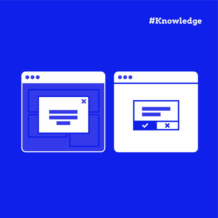
- Modal dialogs block interaction with the rest of the page. When a modal is active, everything underneath becomes “inert” – users cannot click, type, or interact with anything except the modal itself. The background is typically dimmed or blurred to emphasize this separation.
- Non-modal dialogs provide information or options without preventing interaction with the main content. Users can freely switch between the dialog and the underlying page.
Think of a modal like someone stopping you in the hallway and saying, “You must deal with this now.” A non-modal dialog is more like a sticky note attached to your work that you can reference when needed.
So, how do you know when to use each one? Here are a few examples:
| Modal dialogs | Non-modal dialogs |
|---|---|
| Confirming destructive actions (deleting data). | Displaying supplementary information. |
| Collecting required information (payment details). | Showing help text or tooltips. |
| Displaying critical warnings or alerts. | Providing optional settings. |
| Presenting legal notifications requiring acknowledgment. | Offering tools that enhance but aren’t required. |
Besides their function, you also need to think about how it affects the user experience. Both component types have their advantages and disadvantages.
| Component type | Advantages | Disadvantages |
|---|---|---|
| Modal dialogs | • Forces attention to important information. • Prevents errors in critical processes. • Creates clear decision points in user flows. • Ensures important notifications are seen. | • Disrupts user concentration and workflow. • Increases cognitive load by forcing task-switching. • Often dismissed hastily without proper consideration. • Can cause frustration if overused. |
| Non-modal dialogs | • Maintains workflow continuity. • Reduces cognitive burden by allowing users to engage on their terms. • Enables contextual reference while working. • Creates a less intrusive, more pleasant experience. | • Important information might be overlooked. • Less effective for critical warnings. • Can create visual clutter if not properly designed. |
As you can see, it’s not that one type is better than the other – they’re just good for different things. However, for some reason, the most common mistake developers make is overusing modals.
To prevent this, ask yourself: “Is this information so important that it justifies interrupting the user’s current task?” If the answer is no, consider a non-modal dialog or an alternative UI pattern instead.
How to create accessible dialogs and modals
The HTML <dialog> element has revolutionised how we build modal and non-modal dialogs. Before its introduction, developers had to create complex custom solutions with numerous ARIA attributes and JavaScript handlers to ensure accessibility. Now, many common accessibility challenges are solved right out of the box.
<!-- Basic dialog implementation -->
<dialog id="my-dialog">
  <h2 id="dialog-title">Dialog Title</h2>
  <p>Dialog content goes here</p>
  <button id="close">Close</button> <!-- Accessible close option – add click listener to call close() method -->
</dialog>
The <dialog> element offers two distinct methods:
showModal()– Creates a modal dialog that blocks interaction with page contentshow()– Creates a non-modal dialog that allows continued page interaction
When you use these methods, your <dialog> element automatically handles focus management, backdrop creation, and making background content inert.
Semantic HTML and ARIA roles
Proper semantic markup ensures people using screen readers can understand what’s happening on your page. For dialogs, this means clearly communicating that a dialog has appeared, what it contains, and its purpose.
<div role="dialog" aria-labelledby="modal-title" aria-describedby="modal-description">For truly urgent situations, like security warnings or unsaved work notifications, use the alert role:
<div role="alert" aria-live="assertive">This combination ensures immediate announcement by screen readers, regardless of where the user’s focus is on the page.
Keyboard accessibility
Not everyone can use a mouse or touchscreen. For many users, the keyboard is their primary way of navigating, making keyboard accessibility non-negotiable. Luckily, if you use showModal () with your <dialog> element, you can close it automatically using the Escape key.
Styling modal dialogs
The visual design of your modal dialogs significantly impacts their accessibility. Proper styling helps users understand the modal’s purpose, importance, and how to interact with it.
Colour contrast
Text that’s difficult to read defeats the purpose of a modal dialog. WCAG 2.2 requires a contrast ratio of at least 4.5:1 for normal text and 3:1 for large text. This ensures people with visual impairments can read your content.
Creating a proper backdrop
The backdrop provides visual separation between the modal and page content:
dialog::backdrop {
  background-color: rgba(0, 0, 0, 0.7);
}
This semi-transparent overlay helps users understand that the modal is the active element requiring attention, while the rest of the page is temporarily inaccessible.
Preventing background interaction
Even with a visual backdrop, it’s good practice to prevent scrolling of background content:
.modal-open {
  overflow: hidden;
}
This class (applied to the body when a modal is open) prevents the jarring experience of background content scrolling when users reach the bottom of a modal.
Focus indicators
Keyboard users navigate by tabbing through interactive elements. Strong visual focus indicators are essential:
.modal button:focus-visible {
  outline: 3px solid #ff0;
}
This high-contrast yellow outline makes it immediately clear which element has keyboard focus, helping users understand where they are in the dialog.
Visual depth cues
Shadows and borders help reinforce that the modal exists on a layer above the main content. This spatial relationship helps users mentally model the interface hierarchy.
Resizable modals
Users with visual impairments may need larger text, which requires more space:
.modal {
  resize: both;
  overflow: auto;
}
This allows users to adjust the modal size to their needs, which is particularly helpful for complex dialogs with forms or large amounts of text.
Responsive design
Always use media queries to ensure modals work well on all devices. On smaller screens, consider making modals take up most or all of the screen width to maintain readability of content.
Best practices for using the HTML dialog element
So you’ve got your dialog element working, but is it truly user-friendly? Let’s explore some practical tips that’ll make your modals not just technically accessible, but actually pleasant to use.
Keep them in context
Have you ever seen those massive pop-ups that take over your entire screen and make you forget what you were doing in the first place? Pretty jarring, right?
On desktop devices, your users benefit from seeing a bit of the background content. It helps them remember where they are and what they were doing. Full-screen modals make sense on mobile where space is limited, but on larger screens, they’re usually overkill.
That’s why the best tactic here is to show just enough of the background to maintain context.
Give people multiple ways out
We’ve all been trapped in a modal with no obvious escape route, so don’t do that to your users! Here’s what people expect:
A nice, obvious close button that says “Close” (not just a mysterious “X” that people might miss). The Escape key should work too – thankfully, the <dialog> element handles this automatically, which is one less thing for you to worry about!
Many users also expect to click outside the modal to dismiss it. If you implement this feature, remember to add an ARIA announcement so screen reader users know the dialog has closed.
Make it stand out (but not shout)
Your modal needs to clearly say “I’m above the page” without being aggressive about it. A slightly dimmed backdrop works wonders – it’s like turning down the lights to focus attention on the stage.
Add a subtle shadow or border to further distinguish your dialog from the background. These visual cues help everyone, but they’re especially important for people with certain cognitive disabilities who might otherwise struggle to understand where to focus their attention.
Watch out for custom controls
If you’ve got fancy custom components inside your dialog (like date pickers or custom dropdowns), double-check their keyboard accessibility. These often need extra love with ARIA attributes and keyboard event handlers.
A beautiful component that can’t be used with a keyboard isn’t actually beautiful at all – it’s a barrier. Make sure all your interactive elements can be navigated to and operated with a keyboard alone.
Test with real tools
Grab a screen reader and test your dialog implementation yourself. VoiceOver on Mac or NVDA on Windows are great options.
Try using just your keyboard to navigate through everything:
- Can you get to all controls?
- Can you easily close the dialog?
- Does the focus go where you expect when the dialog closes?
These simple tests can reveal issues that might otherwise go unnoticed, and fixing them makes your interface better for everyone.
Elevate your accessible design skills with The A11Y Collective
Creating truly accessible modal and dialog components goes beyond just knowing when to use each type. As we’ve explored, proper focus management, keyboard navigation, and screen reader support are fundamental to interfaces that work for everyone.
Ready to take your accessibility skills to the next level? The A11Y Collective’s “Accessible design, the basics” course builds on these concepts with practical techniques for comprehensive web accessibility.
Through this course, you’ll learn to:
- Design websites that meet accessibility laws and standards.
- Improve navigation, readability, and overall usability.
- Accommodate diverse needs, from keyboard-only users to people using screen readers.
The best part? The course is completely platform-independent, making it perfect for designers and developers working with any framework or toolkit.
Tim Hansen, customer review.“I’m walking away with a stronger understanding and useful takeaways I can apply immediately.”
Join a community of professionals committed to inclusive design and transform how you approach not just dialogs and modals, but all critical UI components in your work. Enroll now for “Accessible design, the basics”.

Ready to master accessible UI components?
Build accessible dialogs, modals, and navigation that work for everyone. Learn practical design techniques aligned with WCAG standards.