
Florian Schroiff has been building for the web for almost 20 years. He has worked on countless accessible websites as a freelancer and for various agencies. As a front-end expert he is always searching for ways to improve accessibility and user experience and to share them with his team — and now with you!
When websites and web apps aren’t built with accessibility in mind, they create real barriers for people with disabilities. In fact, Americans with disabilities are three times more likely to never use the internet compared to people who don’t. This is not because they don’t want to, but because the digital space often isn’t built to include them.
A common issue is that components like tablists, listboxes, and grids often rely on visual cues alone to show what’s selected. That works fine for sighted users, but for those using screen readers or keyboards, these visual-only cues offer no context.
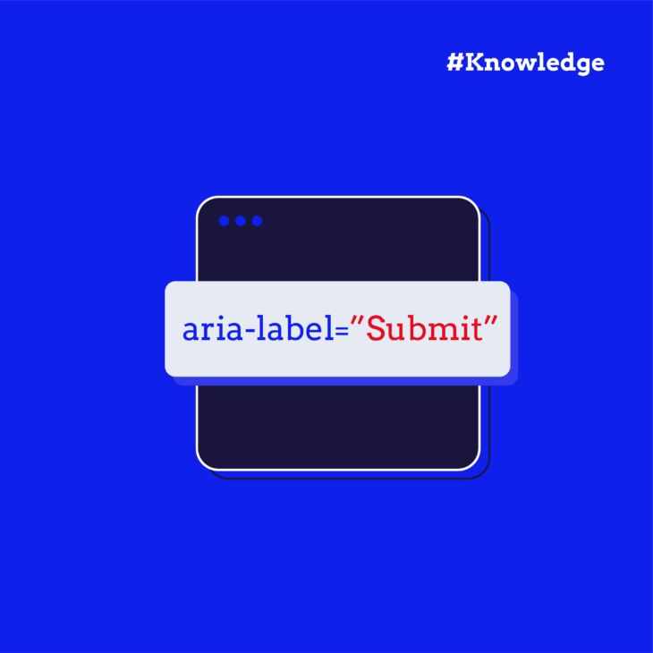
Thankfully, we have Accessible Rich Internet Applications (ARIA) to solve this problem. ARIA attributes help bridge the gap between custom UI elements and assistive technologies. They allow developers to assign explicit roles, properties, and states that define how elements should be interpreted by assistive technologies.
One of the most important attributes for managing selection behaviour in interactive components is aria-selected, which is what we’ll cover here. We’ll also walk you through practical examples that make sure every user can understand what’s selected, no matter how they navigate your site!
What is aria-selected?
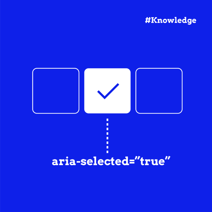
The aria-selected attribute is part of the WAI-ARIA specification, and it’s a way to tell assistive technology which item is currently selected inside a group of options (like tabs, listbox items, or rows in a table). While users who can see the screen might notice a bold font or highlighted colour, screen reader users rely on behind-the-scenes information to know what’s selected. That’s exactly what aria-selected does.
It doesn’t change how an element looks or works, but it adds meaning in the accessibility tree so tools like screen readers can say, “Hey, this one is selected!”.
It accepts three values:
true, which means this item is selected.false, which means this item isn’t selected, but it can be.- No attribute, which means this item isn’t selectable at all.
💡 Good to know: some roles – like treeitem, rowheader, or columnheader – automatically support aria-selected, so you often don’t need to add anything extra for them.
When to use aria-selected vs other attributes
In ARIA, several attributes describe things that are “chosen” or “active” – but they serve different purposes depending on the type of interaction. So, here’s a quick guide to help you choose the right one:
- Use
aria-selectedfor items inside widgets where users can pick one or more options, like tabs, listboxes, grids, or tables. It tells assistive tech that this is the currently selected item. - Use
aria-checkedfor checkboxes and radio buttons for things that can be turned on or off. - Use
aria-pressedfor toggle buttons – like bold/italic buttons in a toolbar. It shows whether the button is currently active or not. - Use
aria-currentin navigation menus to show which link points to the page you’re currently on.
Understanding the subtle differences between these attributes helps create UIs that are truly accessible, not just technically correct.
Practical examples of aria-selected in UI components
Now that we’ve covered the theory, let’s bring aria-selected to life with real UI patterns.
The aria-selected attribute is specifically designed to indicate the current “selected” state for the following roles:
tab (an individual tab inside a tablist)
The aria-selected attribute plays a critical role in creating accessible tab interfaces by communicating the selected state of tabs to assistive technologies. This is especially important for users who rely on screen readers to navigate web content.
Here’s a simple example:
<div class="tab-container">
  <!-- The tablist container -->
  <div role="tablist" aria-label="Example tab list">
    <!-- First tab (selected by default) -->
    <button id="tab-1" role="tab" aria-selected="true" aria-controls="panel-1" tabindex="0">Tab 1</button>

    <!-- Second tab (not selected) -->
    <button id="tab-2" role="tab" aria-selected="false" aria-controls="panel-2" tabindex="-1">Tab 2</button>

    <!-- Third tab (not selected) -->
    <button id="tab-3" role="tab" aria-selected="false" aria-controls="panel-3" tabindex="-1">Tab 3</button>
  </div>

  <!-- Tab panels container -->
  <div class="tab-panels">
    <!-- First panel (visible) -->
    <div id="panel-1" role="tabpanel" aria-labelledby="tab-1" tabindex="0">
      <h3>Tab panel 1</h3>
      <p>Tab panel 1 content.</p>
    </div>

    <!-- Second panel (hidden) -->
    <div id="panel-2" role="tabpanel" aria-labelledby="tab-2" tabindex="0" hidden>
      <h3>Tab panel 2</h3>
      <p>Tab panel 2 content.</p>
    </div>

    <!-- Third panel (hidden) -->
    <div id="panel-3" role="tabpanel" aria-labelledby="tab-3" tabindex="0" hidden>
      <h3>Tab panel 3</h3>
      <p>Tab panel 3 content.</p>
    </div>
  </div>
</div>
The aria-selected attribute in our example:
- Clearly indicates which tab is currently selected. Only the first tab has
aria-selected="true"while others havearia-selected="false". - Enabling screen readers to announce the selected state of each tab, informing users about which tab is currently active.
- Can be used as a CSS selector to visually indicate the selected tab.
Each tab is connected to its corresponding panel through two key attributes:
aria-controls: On the tab element, this points to the ID of the panel it controls.aria-labelledby: On the panel element, this points back to the ID of its controlling tab, creating a bidirectional relationship.
And in order to make this tablist fully accessible and functional, you’ll need to add JavaScript to handle:
- Tab selection:
- Set
aria-selected="true"on the clicked tab. - Set
aria-selected="false"on all other tabs. - Remove the hidden attribute from the panel associated with the selected tab.
- Add the hidden attribute to all other panels.
- Update the tabindex of tabs (0 for selected, -1 for others).
- Set
- Keyboard navigation:
- Left/Right arrow keys to navigate between tabs in a horizontal tablist.
- Up/Down arrow keys for vertical tablists.
- Home/End keys to move to the first/last tab.
- Space/Enter to activate the focused tab.
- Focus management: Focus should move to the selected tab. In some implementations, focus may move to the associated panel
- State persistence: Optionally, remember the selected tab across page reloads (e.g., using localStorage)
💡 Bonus tips: For interfaces where multiple tabs can be selected simultaneously, use aria-multiselectable="true" on the tablist element, and for vertical tablists, add aria-orientation="vertical" to the tablist element.
option (a selectable item in a listbox)
Listboxes can be single or multi-select (with aria-multiselectable="true"), and aria-selected indicates which option(s) are currently selected – here’s how:
<div class="listbox-wrapper">
  <!-- Listbox container -->
  <div role="listbox"
      aria-label="Example listbox"
      id="example-listbox"
      tabindex="0"
      aria-activedescendant="option-one">

    <!-- Selected option -->
    <div role="option"
        id="option-one"
        aria-selected="true"
        class="selected-option"
        tabindex="-1">
      Option 1
    </div>

    <!-- Unselected options -->
    <div role="option"
        id="option-two"
        aria-selected="false"
        tabindex="-1">
      Option 2
    </div>

    <div role="option"
        id="option-three"
        aria-selected="false"
        tabindex="-1">
      Option 3
    </div>
  </div>
</div>
Here, the parent element uses:
role="listbox"to identify this as a selectable list.aria-labelto provide an accessible name for screen readers.tabindex="0"to make the container focusable.aria-activedescendantto point to the ID of the currently focused option.
After that, each child element uses:
role="option"to identify selectable items.aria-selected(true/false) to indicate selectiontabindex="-1"so that only the listbox container (not the options) are focusable with the Tab key.- Unique IDs so that the
aria-activedescendantattribute can point to the ID of the currently focused option.
And of course, we still need to add JavaScript to handle selection management, keyboard navigation, focus control, and state communication.
💡 Note: For very long lists, adding type-ahead support is recommended (i.e., typing a letter jumps to the next option starting with that letter) – but we’re keeping it simple in our example.
gridcell (a single cell inside a data grid or table)
A gridcell is a single cell inside a grid (or treegrid), which is a two-dimensional arrangement of rows and columns. It’s typically used in applications like spreadsheets, data tables, or calendars where users need to interact with individual cells (e.g., editing, selecting, or navigating).
In the same context, the role="row" attribute is used to explicitly mark an element as a row, which helps assistive technologies (like screen readers) understand and announce the structure of tabular data.
Let’s walk you through a simple implementation:
<div role="grid"
    aria-label="Product inventory"
    aria-multiselectable="false"
    tabindex="0"
    aria-activedescendant="cell-1-2">

  <!-- Column Headers -->
  <div role="row">
    <div role="columnheader" aria-colindex="1">Product</div>
    <div role="columnheader" aria-colindex="2">Price</div>
    <div role="columnheader" aria-colindex="3">In Stock</div>
  </div>

  <!-- Data Rows -->
  <div role="row" aria-rowindex="1">
    <div role="gridcell"
        id="cell-1-1"
        aria-colindex="1"
        aria-selected="false">
      Example product 1
    </div>
    <div role="gridcell"
        id="cell-1-2"
        aria-colindex="2"
        aria-selected="true"
        class="selected-cell">
      $29.99
    </div>
    <div role="gridcell"
        id="cell-1-3"
        aria-colindex="3"
        aria-selected="false">
      15
    </div>
  </div>

  <div role="row" aria-rowindex="2">
    <div role="gridcell"
        id="cell-2-1"
        aria-colindex="1"
        aria-selected="false">
      Example product 2
    </div>
    <div role="gridcell"
        id="cell-2-2"
        aria-colindex="2"
        aria-selected="false">
      $89.99
    </div>
    <div role="gridcell"
        id="cell-2-3"
        aria-colindex="3"
        aria-selected="false">
      8
    </div>
  </div>
</div>
Here:
role="grid"tells assistive technology that this is a data grid, similar to a spreadsheet or table.aria-label="Product inventory"gives the grid a name for screen readers.tabindex="0"makes the grid focusable with the keyboard.aria-activedescendant="cell-1-2"points to the currently focused cell (by its ID).aria-selectedindicates whether the cell is selected or not.role="row"marks each row in the grid.aria-rowindex(on data rows) tells assistive technology the row’s position (1-based index).role="columnheader"marks header cells (like<th>in a table).aria-colindextells assistive tech the column’s position.role="gridcell"marks each cell as a data cell (like<td>in a table).
Again, just like the previous examples, you’ll need to add JavaScript to make it interactive and accessible.
row (a row in a selectable table or grid)
Now, if you’re looking to implement selectable rows rather than gridcells, there are a few fundamental differences. aria-selected will need to be applied to the entire row as well as receiving focus (tabindex="0" on the row) like so:
<div role="grid"
    aria-labelledby="grid-header"
    aria-multiselectable="false"
    tabindex="0"
    aria-activedescendant="row-2">

  <!-- Column Headers -->
  <div role="row" id="grid-header">
    <div role="columnheader" aria-colindex="1">Product</div>
    <div role="columnheader" aria-colindex="2">Price</div>
    <div role="columnheader" aria-colindex="3">Stock</div>
  </div>

  <!-- Data Rows -->
  <div role="row"
      id="row-1"
      aria-selected="false"
      aria-rowindex="1"
      tabindex="-1">
    <div role="gridcell" aria-colindex="1">Example product 1</div>
    <div role="gridcell" aria-colindex="2">$29.99</div>
    <div role="gridcell" aria-colindex="3">15</div>
  </div>

  <div role="row"
      id="row-2"
      aria-selected="true"
      aria-rowindex="2"
      tabindex="-1"
      class="selected-row">
    <div role="gridcell" aria-colindex="1">Example product 2</div>
    <div role="gridcell" aria-colindex="2">$89.99</div>
    <div role="gridcell" aria-colindex="3">8</div>
  </div>

  <div role="row"
      id="row-3"
      aria-selected="false"
      aria-rowindex="3"
      tabindex="-1">
    <div role="gridcell" aria-colindex="1">Example product 3</div>
    <div role="gridcell" aria-colindex="2">$299.99</div>
    <div role="gridcell" aria-colindex="3">4</div>
  </div>
</div>
The JavaScript here will need to allow users to select entire rows (e.g., data tables) and enable arrow key navigation between rows.
Best practices for implementing aria-selected with accessibility in mind
Focus management matters
How focus behaves depends on whether your component is single- or multi-select:
- Single-select (like tabs): Keep focus within the widget (e.g., the tablist). Arrow keys should move focus and update selection at the same time.
- Multi-select (like listboxes or grids): Let users move focus independently of selection. Pressing Space or Enter should update
aria-selectedwithout necessarily moving focus.
Visual feedback for everyone
Selection should always be visibly clear, and not just through colour, so:
- Use high contrast for selected items to meet WCAG 2.2 guidelines.
- Don’t rely on colour alone. Add a shape, icon, bold text, or underline.
- Provide visual cues for focus and hover as well – these states help keyboard and mouse users alike.
Keyboard support is non-negotiable
Make sure users can interact with selection states entirely from the keyboard:
- Arrow keys: Navigate between items.
- Space / Enter: Select or toggle selected state.
- Tab: Move between major UI regions.
- Escape: Optionally deselect or exit multi-select mode.
Always test
Accessibility isn’t finished when the code compiles. You still have to:
- Use screen readers (NVDA, VoiceOver, JAWS) to verify that the selection is announced properly.
- Navigate entirely by keyboard to confirm logical movement and focus.
- Check visual indicators meet contrast and non-colour-reliance rules.
Master ARIA attributes with The A11Y Collective
As you’ve seen, aria-selected might seem simple at first glance, but its proper use across different components like tabs, listboxes, and data grids requires a solid understanding of both ARIA semantics and real-world interaction patterns.
But like many ARIA attributes, it’s easy to misuse if you’re not familiar with how roles, state, focus, and keyboard behaviour all work together. That’s why accessibility can’t be an afterthought – it’s a skillset.
At The A11Y Collective, we offer a comprehensive Advanced web accessibility: ARIA explained course, which digs deep into:
- Semantic HTML and when ARIA is (and isn’t) needed.
- Common accessibility pitfalls and how to avoid them.
- Testing strategies with screen readers and keyboards.
- Building inclusive components from the ground up.
So, if you’re genuinely passionate about creating experiences for everyone, then start our Advanced web accessibility: ARIA explained course today!

Want to level up your ARIA skills?
Enrol in our advanced web accessibility course to learn more about ARIA roles, states, and properties, when and how to use them, and how to avoid common pitfalls.