
When navigating the web, you’ve no doubt noticed websites that use different colours or highlighted text and bolded information to help you identify where you are on a page.
Now imagine experiencing that same site through a screen reader.
The highlighting disappears. The bold text cannot be perceived. That helpful “you are here” signal? Gone.
This is the daily reality for millions of users who rely on assistive technology.
Sighted users can instantly spot which page they’re on through visual cues: highlighted menu items, breadcrumb trails, or progress bars showing checkout steps. But these visual indicators are invisible to screen readers, making it much harder for non-sighted users to navigate your website.
The aria-current attribute fixes this entirely.
This ARIA attribute explicitly tells screen readers which item in a group is currently active. It ensures that users with screen readers can access the same contextual clues as sighted users, vastly improving their experience with the website.
With that in mind, let’s explore when and how to implement aria-current properly. We’ll provide you with real examples, common mistakes to avoid, and testing methods that actually work.
Let’s go!
What is aria-current?
The aria-current attribute is part of the WAI-ARIA 1.2 specification and tells screen readers which item in a set is currently active. It’s often added into breadcrumb navigation links to provide screen reader users with the context to understand where they are on a website.
When you add aria-current="page" to a navigation link, screen readers announce “current page” along with the link text. Take a look below at what the complete HTML element would look like:
<a href="/about" aria-current="page">About Us</a>When a screen reader encounters this link, it announces: “About Us, current page, link” instead of just “About Us, link.”
That’s the magic.
You’re already showing visitors where they are through visual design, whether through highlighted menu items, bold text, or an underline. The aria-current attribute simply communicates this same information through code, ensuring everyone gets the “you are here” context regardless of how they access your site.
Keep in mind, however, this is not the same as aria-selected.
aria-current= where you are right now (the page you’re viewing)aria-selected= what you’ve chosen for future action (a tab you want to display)
You’d use aria-selected for interactive widgets to provide context on what is selected or can be selected for screenreaders. The currently active (i.e., selected) item usually has some kind of visual treatment to distinguish it from the other, not selected, items.
On the other hand, aria-current is to assist in navigation.
When should you use aria-current?
The beauty of aria-current lies in its versatility. Anywhere you’re visually indicating “this is where you are now,” you should consider adding this attribute.
Navigation and breadcrumbs
- Primary navigation menus are the most common use case.
- Breadcrumb trails help users understand their location in your site hierarchy:
- Pagination controls that mark pages as the 3rd of 10 as current helps users track their progress through search results or blog archives.
Multi-step processes
- Checkout flows showing “Payment Information” as the current step.
- Registration wizards highlighting “Account Details” while users fill out forms.
- Survey progress indicators marking “Question 5 of 12.”
Date and time interfaces
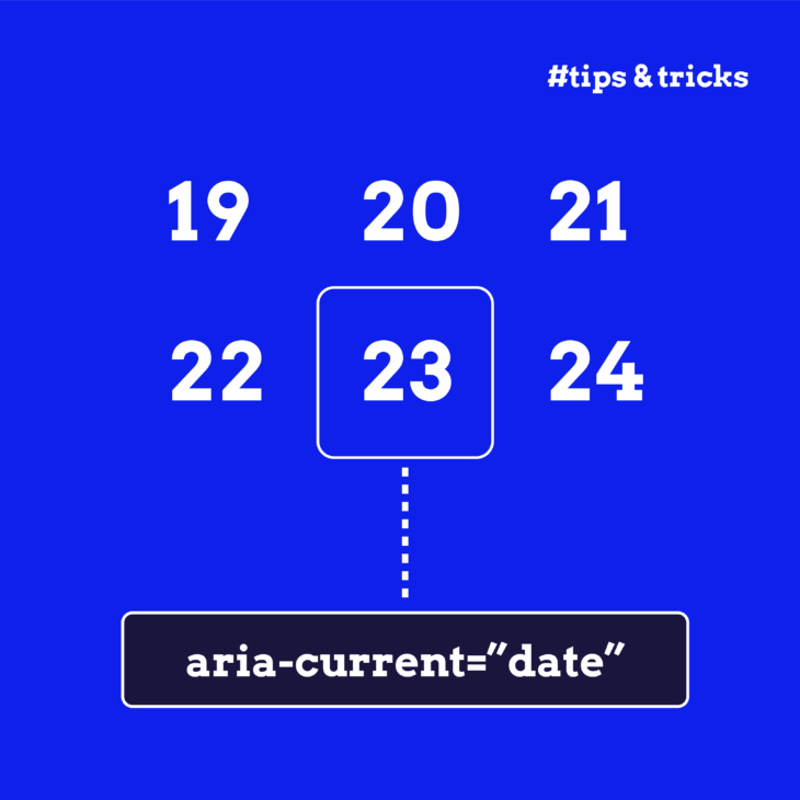
- Calendar widgets can mark today’s date.
- Schedule displays for the current time slot, particularly helpful in booking systems where users need to understand availability.
- Timeline interfaces showing historical events can highlight “present moment” or current year.
Other use cases
- Image galleries marking the currently displayed photo in a carousel (1 of 24).
- Tab-like interfaces (not actual tabs!) on websites without proper ARIA tab roles.
aria-selectedis usually better for actual tabs like those you’d find on Google. - Location indicators in interactive maps or building diagrams.
The different values of aria-current
Here’s where developers often get stuck: “What exactly do I put in the attribute?”
The good news is you’ve got six options, but most projects only need one or two.
aria-current=”page”
- When to use: current page in navigation menus or breadcrumbs.
- Screen reader announcement: “Current page, About Us.”
🌟 This is your go-to value for website navigation. Simple, clear, and covers the majority of use cases.
aria-current=”step”
- When to use: current step in a multi-step process.
- Screen reader announcement: “Step 2, Shipping Information, current.”
🌟 Perfect for checkout flows, registration pages, or any sequential process where users need to track progress.
aria-current=”location”
- When to use: current location in an environment or diagram.
- Screen reader announcement: “Marketing Department, current location.”
🌟 Practical example: highlighting the “Marketing Department” on an interactive office floor plan or showing “Terminal 3” on an airport map.
aria-current=”date” and aria-current=”time”
- When to use: current date in calendars, current time in schedules.
- Screen reader announcements: “27 October, current date” or “2:00 PM, current time.”
🌟 Implementation tip: particularly useful for booking systems where users need to understand “today” versus available dates.
aria-current=”true”
When to use: generic current item when other values don’t fit. Any unrecognised value defaults to “true” anyway, so aria-current="banana" behaves exactly like aria-current="true".
🚨 Use this sparingly. The specific values above are almost always better.
aria-current=”false” or omitting the attribute
- When to use: when an item is not current.
- Best practice: don’t use it. Simply omit the attribute entirely.
Best practices and common mistakes
Getting aria-current right isn’t difficult. But there are still some considerations you’ll need to know to ensure you use it effectively. After all, bad ARIA is worse than none, especially if it confuses screen reader users more than assisting them.
Here’s how to implement aria-current properly and avoid the pitfalls that trip up even experienced developers.
✅ Do’s
- Only mark ONE item as current within each group – Multiple “current” items confuse screen reader users.
- Update aria-current when users navigate – Remove from old item, add to new item.
- Use the most specific value – Choose
page,step, etc. rather than generictrue. - Combine with visual styling using CSS attribute selectors –
[aria-current="page"] { font-weight: bold; }. - Test with actual screen readers – NVDA and VoiceOver will tell you if it’s working.
❌ Don’ts
- Don’t use aria-current on multiple items in the same group – Only one item can be current.
- Don’t use it as a replacement for aria-selected in interactive widgets – They serve different purposes.
- Don’t use it on grid cells, options, rows, or tabs – Use
aria-selectedinstead for these roles. - Don’t forget to update it dynamically – Single-page apps need JavaScript to manage state changes.
- Don’t use aria-current on hidden elements – Elements with
display:noneoraria-hidden="true"are excluded from the accessibility tree. - Don’t forget cleanup in component unmount – Remove the attribute when components are destroyed.
💡 Even developers who handle complex build pipelines stumble on toggling one attribute. The key is treating aria-current like any other piece of application state: set it, clear it, test it.
Going deeper with ARIA and The A11Y Collective
Here’s the beautiful thing about aria-current: it’s a small change that makes a massive difference. Adding one attribute to your navigation transforms the experience for screen reader users. They go from guessing where they are to knowing instantly.
You don’t need to overhaul your entire site overnight. Start with your main navigation menu – add aria-current="page" to the active link. Test accessibility with a screen reader. Hear the difference. Then expand gradually; breadcrumbs next week, pagination the week after, multi-step forms when you’re ready.
Remember, aria-current works best as part of a larger accessibility ecosystem alongside semantic HTML, ARIA labels, live regions, and focus management. Each attribute has a specific role, and understanding how they work together distinguishes good accessibility from mere checkbox-ticking.
And just remember: behind every aria-current implementation is someone trying to complete a task. Your job is to make that as easy as possible.
Want to master ARIA attributes like aria-current and create truly accessible web experiences? The ARIA Explained course by the A11Y Collective provides in-depth, practical training on implementing ARIA correctly. Learn not just the “how” but the crucial “when” and “why” behind each ARIA feature, ensuring your websites work beautifully for all users, regardless of how they access the web.

Ready to master ARIA attributes for better navigation?
Understand when and why to use each ARIA feature for truly accessible web experiences.