
Misusing a button or a link element might seem like a harmless oversight, but under the hood, it can quietly derail accessibility, break keyboard navigation, and create confusing experiences for users relying on assistive technologies.
According to the HTTP Archive (2020), 15% of websites misuse these elements, often by assigning role="button" to links. That’s a violation of ARIA’s first rule: don’t use ARIA when native HTML does the job. It also risks failing WCAG 2.1.1: Keyboard: users of assistive technology rely on accurate semantics to navigate predictably.
That’s why choosing the right element from the start is more efficient and inclusive, which is what we’re covering here. We’ll break down:
- The fundamental differences between links and buttons.
- When and why to use each.
- How to ensure accessible, standards-compliant styling and behaviour.
- Real-world examples of common pitfalls and how to avoid them.
When to use buttons vs links
At first glance, buttons and links may appear interchangeable. After all, both can be styled to look identical. But their roles in the web’s architecture are fundamentally different.
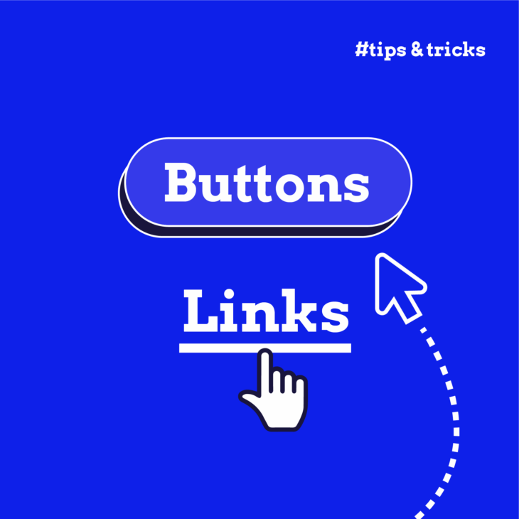
✨ If there’s one golden rule to remember in the button vs link debate, it’s this: Links go places. Buttons do things.
Ask yourself:
- Does this element take the user somewhere? If yes, use a link.
- Does it do something on the same page? If yes, use a button.
Unfortunately, developers often reach for whichever element fits the design specification or looks right with the least CSS. But the choice between a <button> and an <a> element should always be driven by function, not appearance. We need to ensure we’re setting accurate expectations for users and ensuring consistent, accessible interaction patterns.
For many users with disabilities trying to navigate the web, these differences matter a great deal. Screen readers announce links and buttons differently, which informs how users understand and interact with them. Keyboard navigation changes, too. Links activate with the Enter key only, while buttons must respond to both Space and Enter.
Web accessibility expert Jeremy Keith frames this well in Resilient Web Design when he talks about material honesty:
“One material should not be used as a substitute for another, otherwise the end result is deceptive.”
Using an anchor to trigger an action (or a button for fake navigation) violates this principle. It creates a mismatch between what users expect and what they get, and in accessibility, this means creating barriers for individuals who rely on assistive technology.
Buttons: actions that affect the current page
Buttons are built for interactions. They’re meant to initiate changes right where the user is – no page load, no navigation. Whether you’re submitting a form, opening a modal, toggling a menu, or deleting an item, the <button> element is your semantic go-to.
So, use <button> when the action:
- Changes data or modifies the UI (e.g. show/hide panels, toggle dropdowns).
- Submits a form or user input.
- Triggers dynamic content (e.g. loading additional results).
- Initiates a process (e.g. delete, upload, save).
- Plays a prominent role in a user flow (like “Submit”, “Continue”, “Add to Cart”).
If it triggers an action, it should be a button. The semantics matter.
Here are some practical rules for button implementation:
- Keyboard interactions must include both Space and Enter keys: Native buttons handle this automatically. If you’re building a custom button with a
<div>or<span>, you’ll need to manually manage keyboard support, which is a red flag. Native is always better. - Always show a visible focus indicator: A button without a clear focus state is a dead-end for keyboard users and fails WCAG 2.4.7.
- Avoid ARIA unless necessary: ARIA can fill semantic gaps, but using it unnecessarily (like assigning
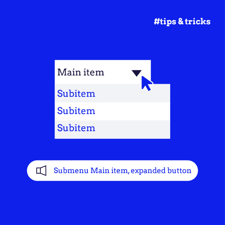
role="button"to an anchor) creates more problems than it solves. Stick to<button>whenever possible. It’s accessible out of the box. - Use ARIA thoughtfully when building custom controls: If you’re creating something like a toggle button or dialog trigger, you may need attributes like aria-pressed, aria-expanded, or aria-controls. But again, only after checking that HTML alone can’t do the job.
Common patterns where developers incorrectly use links instead of buttons
❌ Let’s say you’re using a styled link like this to submit a form:
<a href="#" onclick="submitForm()">Submit</a>This looks fine to sighted users. But for others:
- Pressing Space does nothing. That’s a broken interaction pattern, and it fails WCAG 2.1.1: Keyboard.
- Screen readers announce “link,” not “button”, which creates an expectation mismatch. It violates WCAG 4.1.2: Name, Role, Value and introduces a barrier for keyboard and assistive tech users.
- JavaScript is required to make it work. This breaks the principle of progressive enhancement – the idea that your site should offer baseline functionality to everyone, and add richer interactions on top if the environment supports it.
✅ Here’s the correct version:
<form>
<!-- Form fields -->

  <button type="submit">Submit</button>

</form>
This simple, semantic markup does everything right:
- It works with keyboard and assistive tech.
- It activates on both Enter and Space.
- It submits the form even if JavaScript fails.
- It is announced as a “Submit button” to screen readers.
It’s cleaner, more robust, and requires less code because you’re working with the browser, not against it.
Let’s take another example. If you want to display your Terms of Service in a modal, then:
❌ Don’t do this:
<a href="#" onclick="openModal()">View Terms</a>✅ Do this:
<button aria-controls="terms-modal" aria-haspopup="dialog">View Terms</button>

<div id="terms-modal" role="dialog" hidden>...</div>
Here’s why:
- Buttons are designed to trigger UI changes.
- ARIA attributes like aria-controls and aria-haspopup help screen readers understand what’s happening.
- Focus management is easier to implement when you start with a button, so users don’t get trapped outside the modal.
💡 In our Accessible code course at The A11Y Collective, we go deeper into proper button usage – whether you’re building in plain HTML or working within frameworks. We show you how to ensure your buttons behave as expected across browsers, input types, and assistive technologies!
Links: navigation to new locations
The entire purpose of links is to move users from one location to another within the same page, to a different section, or to a whole new site. When you use the <a> element for anything else (like triggering actions or manipulating UI), you’re swimming upstream against accessibility, semantics, and user expectations.
You should use a link when the element:
- Navigates to a new page, section, or resource.
- References external content.
- Appears inline within a paragraph or body copy.
- Creates a breadcrumb trail or navigation menu.
- Moves the user through a multi-step flow or to a section jump.
If clicking the element will change the URL or redirect the user, it’s a link. Full stop.
Keep the following rules in mind when creating accessible links:
- Links must have a valid href attribute. Without it, the element isn’t a link at all – it’s just a styled span. JavaScript-only links (
<a onclick="...">) are inaccessible by default and won’t support progressive enhancement. - Avoid opening links in a new tab unless absolutely necessary. If you must, communicate it clearly, both visually and programmatically. Use aria-label to announce behaviour like “opens in a new tab” to screen readers.
- Avoid vague link text like “Click here” or “Read more.” However, using aria-label is appropriate only when design constraints necessitate ambiguous text.
- Screen reader users often browse by link text alone. So, use clear, descriptive text that makes sense out of context.
❌ Let’s say your homepage has a “Learn More” button that goes to another page:
<button onclick="window.location='/about'">Learn More</button>This might look right, but it violates multiple principles:
- The button doesn’t announce itself as a navigational link.
- Screen reader users expect actions, not page loads.
- Right-click, middle-click, and open-in-new-tab behaviours all break.
✅ Here’s the correct version:
<a href="/about">Learn More</a>It’s accessible, expected, and supports all native link behaviours.
Let’s now look at common patterns where links are essential:
Same-page section jumps (“Skip to main content”)
Use a link to let keyboard users bypass repetitive content, like navigation menus, and jump to the main content of the page.
<a href="#main" class="skip-link">Skip to Main Content</a>This matters because it provides:
- Fragment identifier support: Native browser behaviour scrolls and focuses correctly without JavaScript for a URL that follows #.
- Semantic clarity: Appears in screen reader Links Lists, unlike buttons, which show up under “Form Controls”.
- Progressive enhancement: Works even if JavaScript is unavailable.
- Keyboard trap protection: Buttons that scroll without focus shifting can leave users trapped in navigation (WCAG 2.1.2).
Using a button for the same behaviour would require complex focus management and custom scripting, and even then, it often fails.
External resource downloads
Links are the ideal choice for download actions because they require no extra JavaScript. Browsers show the destination in the status bar, helping users preview what they’re downloading. Users can right-click or middle-click to download in a new tab.
Trying to build the same behaviour with a <button> involves fetch APIs, Blob construction, and a lot of unnecessary complexity. Instead, use <a> like this:
<a href="/report.pdf" download>Download Report (PDF)</a>Here, the download attribute on the <a> tag tells the browser, “Hey, instead of opening this file in the browser window, prompt the user to save it.” This is a native behaviour that works across most modern browsers, doesn’t require JavaScript, and respects user choice (e.g. browser settings, save dialog).
Also, screen readers will understand that this is a link. And because the link text is clear, they’ll announce it as something like “Link, Download Report, PDF”. This gives the user a clear action, the destination file type, and the confidence that the result will be a download (not navigation or a UI change).
💡 Clear, descriptive, and keyboard-friendly links are just the start. If you’re serious about making the web usable for everyone – including screen reader users and keyboard navigators – our Accessible code course dives deep into the right way to build links and so much more!
Best practices for accessible buttons and links
Once you’ve chosen the correct element – button for actions, link for navigation – the next step is making sure those elements are accessible, usable, and inclusive for all users. This means designing for clarity, supporting assistive technologies, and respecting interaction norms.
Styling and visual appearance
Visual users rely on design cues to understand which elements are interactive. However, for accessibility, visual clarity must go beyond aesthetics – it must align with WCAG requirements.
Here are the key visual accessibility rules:
- Links should be distinguishable from surrounding text: Use underlines by default or a clear icon indicator. Also, colour alone is not enough (WCAG 1.4.1). If links are only differentiated by colour, there must be a 3:1 contrast ratio between link text and non-link text.
- Text contrast requirements (WCAG 1.4.3):
- Regular text: 4.5:1 contrast ratio.
- Large text (18pt+ or 14pt bold+): 3:1 contrast ratio.
- Interactive target size (WCAG 2.5.5 – Level AAA): The minimum touch target is 44×44 CSS pixels. While 44×44 is not required at AA, it’s strongly recommended for mobile/touch devices.
- Focus indicators must always be visible (WCAG 2.4.7): When navigating by keyboard, users must be able to see where they are. Don’t remove outlines without replacing them with custom focus styles.
- Styled links as buttons: If you’re visually styling a link to look like a button (for example, in a CTA), make sure it
- Retains native link behavior (activated with Enter, not Space).
- Is semantically correct (
<a href="...">). - Communicates its purpose clearly.
Remember: Visual design shouldn’t override semantic truth. The goal isn’t to make buttons and links look different, but to make them behave correctly, accessibly, and predictably.
Naming conventions
Accessible naming is critical for assistive technologies. Every <button> must have a non-empty accessible name. This can come from:
- The button text (
<button>Save</button>). - An aria-label (
<button aria-label="Save item"></button>). - An associated label element via aria-labelledby.
According to W3C ACT Rule 97a4e1, unlabeled buttons are a failure point for WCAG 4.1.2 (Name, Role, Value).
As for a link, its text should be descriptive. Users navigating with screen readers often pull up a list of all links on the page. In that case, “click here” is meaningless in isolation.
Automated and manual testing
To ensure buttons and links are implemented accessibly, testing is essential. Use a combination of automated tools and manual techniques.
Use real screen readers to hear how buttons and links are announced:
- For Windows, use NVDA (Firefox/Chrome) or JAWS (Edge/Chrome).
- For macOS/iOS:, use VoiceOver (Safari).
- For Android, use TalkBack (Chrome).
Check the following:
- Is the element announced as a button or link?
- Does the name describe its purpose?
- Does the behaviour match the announcement?
For keyboard testing:
- Tab through the page. Are all interactive elements reachable?
- Use Enter and Space. Links should activate on Enter only.
- Buttons must activate with both Space and Enter.
- Observe focus styles. Do they meet WCAG 2.4.7?
Last but not least, voice control testing. Tools like Voice Control (for macOS/iOS) or Speech Recognition (for Windows) are great. Speak commands like “Click Submit” or “Click Learn More” and check that the right element is triggered and has a recognisable name.
Elevate your development skills with our Accessible code course
Choosing the right element – button or link – might seem like a small detail in the big picture of web development. But as you’ve seen, it carries a surprising amount of weight when it comes to accessibility, usability, and overall quality of experience.
If you’re ready to deepen your accessibility knowledge and apply it confidently across real-world projects, our Accessible code course is your next step. This course is designed for developers who already know their way around HTML, CSS, and JavaScript but want to go further.
We cover the practical implementation of accessible UI patterns, including buttons and links. You’ll learn how to test with screen readers, handle ARIA properly, and write code that works for everyone, not just some.
Don’t wait any longer. Enrol in our Accessible code course today and start building web interfaces that are functional, beautiful, and usable by all!