

When designing for the web, we often focus on what users see. But what about what users hear? For the over 2.2 billion people globally with a vision impairment, how a website communicates through screen readers is just as vital as how it looks.
In this case, two seemingly similar attributes come to mind: aria-label and title.
At first glance, both attributes seem to do the same thing, which is adding a label or description to an element. However, their behaviour and best use cases couldn’t be more different. They vary significantly in terms of visibility, screen reader support, device compatibility, and accessibility.
What’s more, accessibility experts caution that relying on aria-label as a first option is usually a “code smell” – a sign that there may be a more robust solution available. While it can technically provide a label, it does so in a way that is hidden from sighted users, fragile across assistive technologies, and harder to maintain in the long run.
Accessibility specialists even propose a priority list for labelling controls: start with native HTML text whenever possible, then use associated elements like <label> or <aria-labelledby>. aria-label and title sit at the bottom of that hierarchy, reserved for specific edge cases where no better alternative exists.
If aria-label and title are used incorrectly, they can end up hindering accessibility rather than helping. That’s why understanding the key differences between the attributes and knowing when to use each one correctly is necessary to ensure that you’re creating an inclusive web experience for all.
Understanding aria-label vs title: how they differ
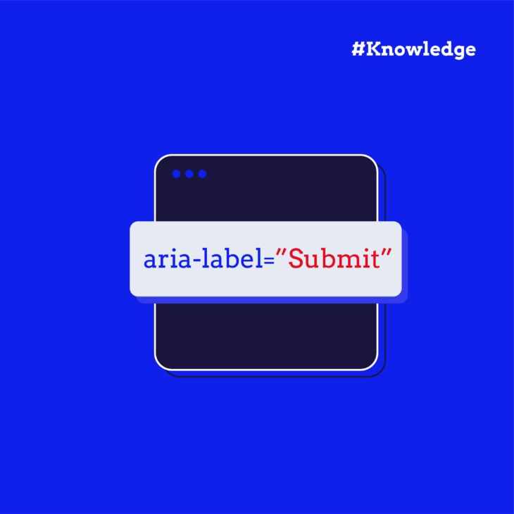
aria-label is part of the ARIA (Accessible Rich Internet Applications) specification, which is designed to enhance accessibility for users who rely on assistive technologies like screen readers. It’s a non-visible label, so it doesn’t appear on the screen but is read aloud by screen readers to provide crucial context to users who can’t see the visual design of the page.
When applied to an element, aria-label ensures that screen readers announce the element with a meaningful, programmatic name. This is particularly useful for elements that have no visible text, like icon-only buttons or custom controls.
In contrast, title is a native HTML attribute that provides a visible tooltip when users hover over or focus on an element. It’s not meant to serve as the primary source of information for critical functionality. It only offers supplementary information to sighted users, giving them extra context when interacting with a particular element. For instance, hovering over a link or button might show a brief description or hint about what will happen if clicked.
However, the title attribute has some serious drawbacks when it comes to accessibility. While it works well for sighted users, it doesn’t always translate well to screen readers. The content of the title attribute is often ignored or read inconsistently, leaving users who rely on assistive technology at a disadvantage. Also, it’s dependent on mouse hover or keyboard focus. It won’t be accessible on mobile devices or touchscreens, where there’s no concept of hovering.
The key takeaway here is that aria-label is for assistive technology and title is for visual aids. Each serves its purpose, but they should never be swapped or relied upon interchangeably.
When to use aria-label
It’s tempting to reach for aria-label when an element doesn’t have a visible label, such as icon-only buttons or image-based controls. However, accessibility experts consider this attribute a “code smell”, signalling that there’s usually a better approach.
The most robust solutions start with native text that is either visible in the interface or associated with the control using standard HTML elements like <label> or aria-labelledby. For icon buttons, that often means placing a short, descriptive text string directly inside the button, styled as visually hidden so it’s available to screen readers without cluttering the interface.
By contrast, aria-label sits at the bottom of that priority list. They can work, but support is inconsistent across browsers, devices, and assistive technologies, and they don’t provide any benefit to sighted users. This attribute is best treated as a last-resort option for specific edge cases where no better method is possible.
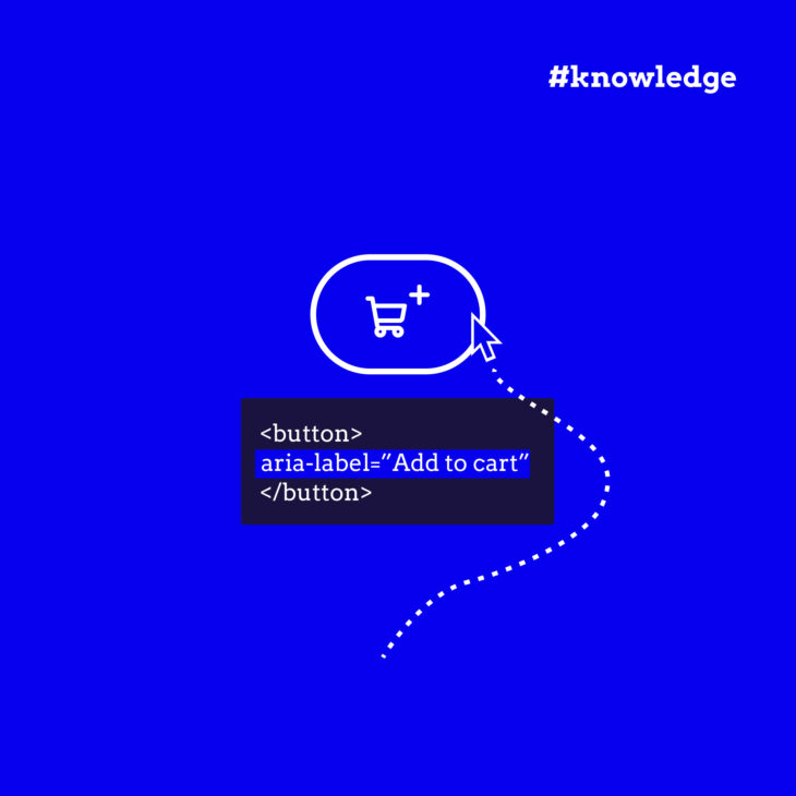
Remember: when crafting the text for aria-label, clarity is key. The label should convey the function or purpose of the element in the fewest words possible, ensuring it’s both understandable and relevant to screen reader users. Avoid unnecessary jargon, and always prioritise simplicity.
For example:
❌ Bad: aria-label="Click here to open the menu"
✅ Better: aria-label="Open menu"
Also, keep in mind that aria-label overrides most other naming methods, though aria-labelledby takes precedence over it. When visible labels exist, ensure aria-label contains the visible text (preferably at the beginning) to comply with WCAG 2.5.3 Label in Name. If content is visible, it should be accessible both visually and programmatically, with consistent naming between what users see and what assistive technologies announce.
When to use the title
The primary use case for the title attribute is to provide optional tooltips that offer extra information to sighted users when they hover over or focus on an element. The content of the tooltip can be helpful for clarifying abbreviations, acronyms, or providing extra context that isn’t essential but might enhance the user experience.
Unfortunately, as we explained earlier, not all screen readers consistently announce the content of title. Using this attribute as the sole means of providing crucial information will negatively impact accessibility and exclude users who rely on assistive technology.
Unlike title, which screen readers may or may not announce, aria-label gives you certainty. It’s the difference between hoping users get the information and ensuring they do.
Remember, it’s always good practice to test accessibility using NVDA, for example, to check how elements are announced. Browser extensions like axe DevTools also help identify accessibility issues.
Start building accessible websites with our accessible code course
When designing a website, accessibility is a core aspect of building a site that’s usable for all. Using the aria-label and title attributes correctly is only the beginning.
If you want to dive deeper into building websites that everyone can access and interact with, enrol in our “Accessible code” course. It’s designed to help you integrate accessibility practices seamlessly into your workflow, ensuring your websites are usable by people with disabilities, including those who use assistive technologies.
With interactive lessons, real-world examples, and a focus on practical implementation, our course will guide you through the process of writing accessible code that’s both functional and user-friendly. It’s time to take the next step in building more inclusive digital experiences for all users.
Walter Ravenhorst, 5-star customer reviewLots of examples and interactive parts where you learn how to make sure your website is accessible for all users. Highly recommended!
Join our “Accessible code” course today and start building more accessible websites!

Ready to master accessible coding practices?
Learn proper ARIA implementation, semantic HTML, and accessibility best practices.