You can’t always spot accessibility issues just by looking at a web page.
The hidden problems – missing alt text, broken heading structures, poor keyboard navigation – these slip through even careful visual checks. For developers on tight deadlines (which, let’s face it, is all of us, thanks capitalism), manually testing every element feels impossible.
Here’s where bookmarklets become your secret weapon.
What’s the appeal? Zero installation. No software licenses. No admin privileges needed. Just drag, drop, and instantly reveal what’s broken. (Though heads up – some strict corporate environments block them for security reasons.)
These JavaScript snippets transform your browser into an accessibility scanner in seconds. Click once, and suddenly you can see ARIA landmarks highlighted in bright colours. Missing form labels jump out. Keyboard traps become obvious.
But let’s be clear about what these tools actually do.
Bookmarklets are diagnostic flashlights, not compliance certificates. They’ll show you where problems might exist, but they won’t replace proper WCAG testing or screen reader checks. Think of them as your first line of defence – the quick sanity check before deeper testing begins.
What accessibility bookmarklets actually test
Bookmarklets are JavaScript links saved as browser bookmarks that reveal hidden accessibility features on any web page.
Click one, and your page transforms:
- ARIA landmarks appear as coloured overlays.
- Missing alt text gets flagged with red warnings.
- Heading structures display as numbered hierarchies.
- Form fields without labels stand out.
The beauty? Pure simplicity. The JavaScript runs directly in your browser – drag the link to your bookmarks bar, and you’re ready to test by seeing the semantic structure beneath the visual design.
Bookmarklets expose what screen readers encounter: proper HTML semantics, ARIA roles, form associations, and image descriptions. They make the invisible visible, showing whether your code communicates meaning beyond just appearance.
This visual feedback helps developers understand why semantic HTML matters. A <div> might look like a button, but without proper roles, assistive technologies won’t know it’s interactive.
For developers wanting to master these foundations, The A11Y Collective’s Accessible Code course dedicates an entire module to meaningful HTML – the exact principles bookmarklets help you verify.
10 essential bookmarklets every developer should save today
Every bookmarklet here meets WCAG 2.2 requirements and works across modern browsers – Chrome, Firefox, Safari, and more.
Installation couldn’t be simpler – just drag the bookmarklet link to your bookmarks toolbar. Or alternatively, right-click, copy the link location, create a new bookmark manually, and paste the code as the URL.
To test, simply visit any webpage and click the bookmarklet in your bookmarks bar. Bookmarklets are great because they give developers the opportunity to test everything during the building stage, not after everything is done. After all, the best accessibility issues are the ones you never ship. Bookmarklets give you that instant feedback loop. Click, check, fix, move on. That’s how accessibility becomes part of your muscle memory, not a last-minute panic.
Now that we have the basics, let’s check out the ten best bookmarklets that transform invisible problems into obvious visual warnings.
1. Heading hierarchy checker
The heading hierarchy bookmarklet inserts black-on-yellow tags around every heading element – both H1-H6 and ARIA role="heading" elements – making your heading structure impossible to ignore.
Why it matters: Screen reader users navigate by headings. A broken hierarchy (jumping from H1 to H4) leaves them lost.
What you’ll see: Yellow labels like <h1> and </h1> wrapped around each heading. Spot skipped levels instantly – if you see H1 followed by H3, you’ve found a problem.
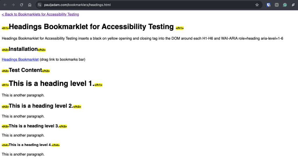
Daily use: Run it after adding new content sections. Takes two seconds to verify that your heading logic makes sense.
2. Lists structure validator
The lists bookmarklet visually highlights all list elements – <ul>, <ol>, <li>, <dl>, <dd>, and <dt> tags – revealing whether your lists use proper semantic markup.
Why it matters: Screen readers announce list items differently than regular text. Fake lists (using dashes or asterisks) rob users of navigation shortcuts.
What you’ll see: Coloured outlines around list containers and items. Improperly nested lists or orphaned <li> elements stand out immediately.
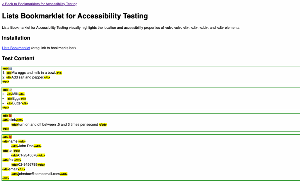
Daily use: Perfect for checking navigation menus, feature lists, and FAQs. If it looks like a list, it should be coded as one.
3. Tables accessibility scanner
The tables bookmarklet exposes table structure and relationships – headers, captions, scope attributes – that screen readers depend on for navigation.
Why it matters: Complex data tables without proper headers become incomprehensible mazes for screen reader users.
What you’ll see: Visual indicators showing <th> elements, scope attributes, and caption tags. Missing headers or incorrect scope values become obvious.
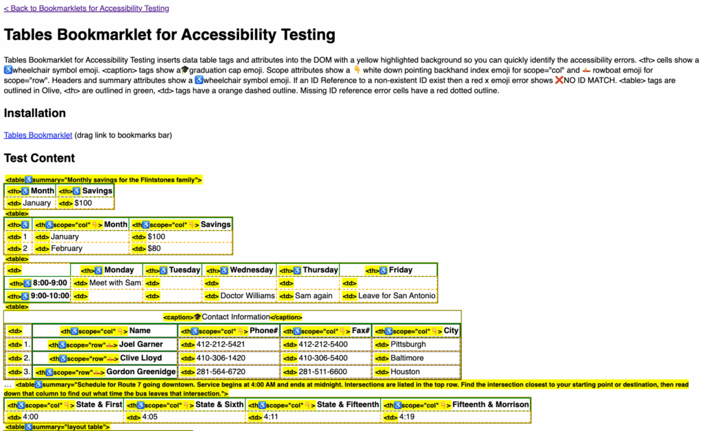
Daily use: Essential for pricing tables, comparison charts, or any data grid. Catches the difference between layout tables (bad) and data tables (good).
4. Lost focus alert
The various focus tools display warning messages when keyboard focus disappears – even when it’s not visually obvious. It catches focus lost from removed elements, hidden items, disabled controls, or blur() events.
Why it matters: Keyboard users get trapped when focus vanishes. They can’t navigate forward or backward.
What you’ll see: JavaScript alerts when focus disappears unexpectedly. Particularly useful for dynamic interfaces with modals, tabs, or single-page apps.
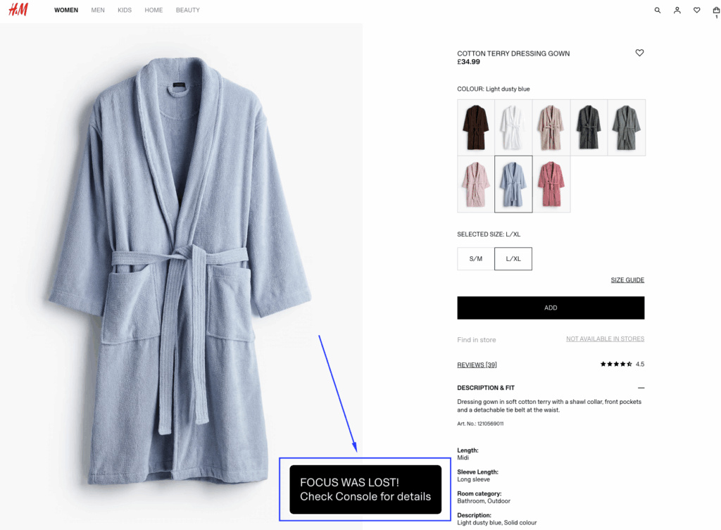
Daily use: Run before keyboard testing any interactive component. Catches focus traps that visual testing misses.
5. Missing alt text detector
This is a great alt-text detector that flags every image on your page, highlighting which ones lack alternative text or use empty alt attributes incorrectly.
Why it matters: Screen readers can’t describe images without alt text. Users miss critical information, from product photos to infographics.
What you’ll see: Red borders around images missing alt attributes. Yellow borders for decorative images with empty alt="". Green for properly described images.
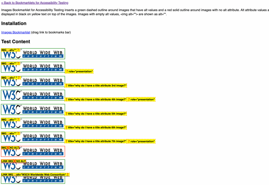
Daily use: Run after any content update involving images. Catches both missing descriptions and wrongly-marked decorative images that actually convey meaning.
6. Target size checker
This tool from gov.uk overlays a 24×24 pixel circle from the centre of every interactive control, instantly revealing which targets meet WCAG’s minimum size requirements.
Why it matters: Small tap targets frustrate everyone, but particularly users with motor disabilities, tremors, or limited dexterity. Users who struggle with precise movements need adequate space to accurately select controls.
What you’ll see: Blue circles show undersized controls – check if their boundary circles overlap with other elements. Green circles indicate controls that are at least 24×24 pixels and therefore pass. A pop-up reports the total number of overlapping controls found.
Daily use: Essential for mobile-responsive designs and dense interfaces. Run it on navigation menus, icon buttons, and form elements. Pay special attention to close buttons and inline links – they’re frequent offenders.
7. Form label inspector
This form label bookmarklet reveals the connection (or lack thereof) between form fields and their labels, exposing accessibility gaps in your forms.
Why it matters: Screen readers announce form fields by their labels. Missing or improperly associated labels leave users guessing what information to enter.
What you’ll see: Visual connections between labels and inputs: the orphaned fields flash red and the properly associated labels show green connectors.
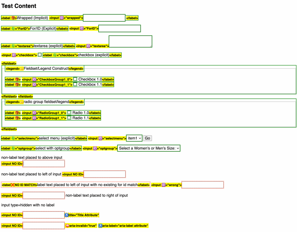
Daily use: Test every form before deployment. Catches placeholder-only fields, missing labels, and broken for/id associations.
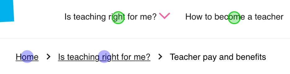
8. ARIA landmarks highlighter
This tool creates coloured overlays for all ARIA landmarks and HTML5 sectioning elements – main, nav, header, footer, aside – showing your page’s structural regions.
Why it matters: Landmarks let screen reader users jump directly to page sections. Missing or incorrect landmarks force linear navigation through entire pages.
What you’ll see: Coloured boxes outlining each landmark region. Labels identify role types. Nested landmarks show hierarchy through transparency levels.
Daily use: Verify page structure after template changes. Ensures navigation, main content, and complementary areas are properly marked.
9. Colour contrast analyser
This is the one exception because it’s not really a bookmarklet but still an essential tool that calculates contrast ratios for text against backgrounds, flagging combinations that fail WCAG AA or AAA standards.
Why it matters: Low contrast makes reading difficult for everyone, impossible for users with low vision. It’s the most common accessibility failure.
What you’ll see: A specific score and colour-coded results that tell you whether the specific colour combination is accessible or not. It also shows whether the contrast ratio is enough for the different levels: AA and AAA.
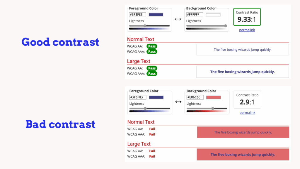
Daily use: Check after brand colour updates or designing new components. Particularly important for light grey text, a common offender.
10. Text spacing simulator
Based on WCAG’s text spacing requirements, this bookmarklet applies user-defined spacing adjustments to test content reflow and readability.
Why it matters: Users with dyslexia or vision issues often increase spacing. Your design must accommodate these adjustments without breaking.
What you’ll see: Expanded letter spacing, word spacing, line height, and paragraph spacing. Content that overlaps or gets cut off reveals design rigidity.
Daily use: Test responsive layouts and fixed containers. If text disappears or overlaps when spacing increases, your CSS needs work.
Want comprehensive testing in one tool? Consider ANDI (Accessible Name & Description Inspector) – it combines most of these checks into a single, powerful bookmarklet. While individual tools excel at specific issues, ANDI provides the full accessibility audit experience when you need deeper analysis.
Why does your bookmarklet show ‘pass’, but you still have problems?
So, are accessibility bookmarklets accurate? Yes and no. They’re brilliant at finding specific technical issues, but they can’t understand context.
Take false positives. Your bookmarklet flags a decorative border image as “missing alt text” – sounds like a problem, right? But decorative images should have empty alt attributes. The tool can’t judge whether that swirl graphic adds meaning or just visual flair.
Similarly, they’ll spot missing labels, but can’t tell if your label text actually makes sense. Or find colour contrast failures, but won’t know if your error messages are helpful. In simple terms, they see structure, not meaning.
Corporate complications add another layer.
Remember those strict corporate environments we mentioned? Many enterprise environments block bookmarklets entirely – security policies treat them as potential code injection risks. That’s why keeping lightweight browser extensions like WAVE or axe DevTools as backup makes sense. They’re pre-approved in most corporate settings.
Your complete testing toolkit should include:
- Screen reader testing – NVDA (free), JAWS (industry standard), or VoiceOver (Mac/iOS).
- Automated scanning – Pick one: axe DevTools or WAVE. They both catch roughly the same issues, just with different ways of showing results.
- Manual keyboard navigation – Tab through everything, no mouse allowed.
- Real user feedback – Nothing beats actual users with disabilities testing your site.
Think of bookmarklets as your first line of defence, not your only defence. They’re the spell-checker of accessibility – catching obvious errors while you work, but never replacing proper editing.
Learn how to approach development with accessibility in mind
Bookmarklets are like X-ray glasses for your code – they reveal problems, but they don’t fix them.
The truth? These tools catch surface issues only. A bookmarklet might show perfect heading structure, but it won’t tell you if those headings make logical sense. It’ll flag missing alt text, but can’t judge if your descriptions are actually helpful.
They’re diagnostic x-ray glasses, not compliance certificates.
That’s why understanding the principles behind the problems makes the difference. When you know why heading structure matters, how screen readers interpret ARIA, and what makes forms truly accessible, bookmarklets become genuinely useful tools rather than confusing noise.
Ready to master these foundations? The A11Y Collective’s Accessible Code course teaches the principles that make bookmarklet results meaningful, turning quick tests into actionable improvements.