
Florian Schroiff has been building for the web for almost 20 years. He has worked on countless accessible websites as a freelancer and for various agencies. As a front-end expert he is always searching for ways to improve accessibility and user experience and to share them with his team — and now with you!
Buttons are fundamental components in web applications, used for actions like submitting forms, opening dialogs, or canceling tasks. However, when the native HTML <button> element doesn’t meet the design or functional needs of a project, custom ARIA buttons often come into play.
However, these buttons require careful implementation to ensure full accessibility, including proper keyboard support and screen reader compatibility. But don’t worry – in this post, we’ll teach you exactly how to create accessible custom ARIA buttons that align with WCAG standards to help you build more robust, accessible user interfaces!
How to create an accessible ARIA button
ARIA attributes allow you to enhance your website for users relying on assistive technologies. They give your site extra meaning, making it easier to navigate and use, especially for those who may have trouble interacting with traditional HTML elements.
⚠️ While custom ARIA buttons can serve specific needs, they should be considered a fallback – not a first resort. Native HTML elements should be your go-to choice whenever possible.
Still, custom ARIA buttons may be necessary in specific scenarios, like creating custom components with specialised behaviours not available in native elements. Developers must manually:
- Add
role="button"to identify the element as a button to assistive technologies. - Make the element focusable and responsive to keyboard interactions.
- Ensure proper focus handling through
tabindex="0". - Implement both mouse and keyboard event handlers.
Let’s take a closer look at what it takes to create an accessible ARIA button:
Basic accessibility
A custom ARIA button typically uses the role="button" attribute, but that’s just the beginning. Developers must handle specific tasks like keyboard event management, ensuring the button responds to the Enter and Space keys. Focus management is also crucial, especially for dynamic content.
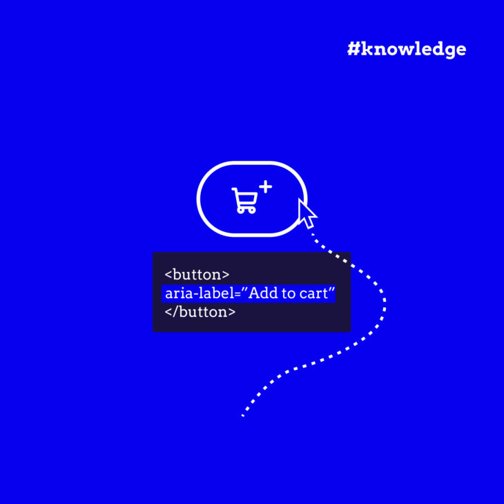
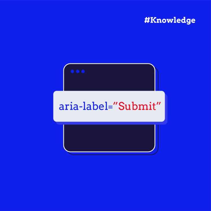
You also need to make sure your button has an accessible name. This can be achieved by using the aria-label or aria-labelledby attribute if the button’s text isn’t visible or descriptive enough. The name should clearly communicate the button’s purpose.
Another key element is colour contrast. Ensure that the button’s text and background have sufficient contrast so they’re easy to read by users with visual impairments. WCAG guidelines recommend a contrast ratio of at least 4.5:1 for normal text.
ARIA roles, states, and properties
The key to making custom buttons accessible is to understand the ARIA roles that help define them:
role=”button”
The role="button" attribute is what you use to tell a browser or screen reader, “Hey, this element is a button!”. This helps users who can’t see or easily interact with the visual design know that the element can be activated, just like a traditional <button> element would be.
However, it’s not enough to just slap this attribute on any element and call it a day. If you mark something as a button but it doesn’t behave like one (i.e., it’s not interactive, or doesn’t trigger an action), you’ll confuse users relying on assistive technology. So, while this role is critical, it’s important to ensure that the element actually has a functional behaviour attached to it. Otherwise, it’ll just be a button in name, but not in practice.
aria-pressed
The aria-pressed attribute is essential for toggle buttons – those that switch between two states, like a mute button or a play/pause button in an audio player. It helps screen reader users know whether the button is currently pressed (active) or not.
For example, a mute button might have aria-pressed="true" when muted and aria-pressed="false" when unmuted. This simple attribute does a lot to clarify the state of the button, making your site much more intuitive for users who depend on assistive technology.
It’s a powerful tool when used correctly – but keep in mind that just marking a button as “pressed” isn’t enough. You also need to make sure the button’s behaviour changes accordingly, and this update is reflected both visually and programmatically. For instance, if you’re toggling a mute button, the sound should actually mute when the button is pressed.
aria-haspopup
aria-haspopup tells screen reader users that activating the button will open a menu, pop-up, or other interactive element. When you use this attribute, you’re helping users anticipate the action of the button.
But it’s not just about the button itself; you need to make sure that the interaction is fully accessible, too. For example, after the menu or dialog opens, it should be focusable, and users should be able to navigate through it with the keyboard.
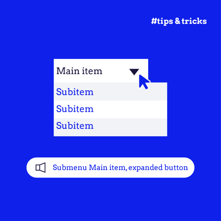
aria-expanded
The aria-expanded attribute is used when buttons control collapsible content, like expanding a section of a page or showing a hidden menu. It tells assistive technologies whether the content is currently visible or hidden.
For example, if you have a “Show more” button that reveals additional text, aria-expanded="true" would indicate that the content is expanded, and aria-expanded="false" would indicate that it’s collapsed. But the key here is to make sure that this attribute is updated dynamically as the user interacts with it. Otherwise, users may get the wrong impression about the state of the content.
aria-disabled
aria-disabled is used to indicate that a button is in a disabled state — that is, it’s visually present, but it cannot be interacted with. However, while aria-disabled can communicate the disabled state, it doesn’t actually prevent interaction with the button. This means you need to add extra logic to make sure users can’t activate the button, even if it’s still focusable.
Think of it like this: aria-disabled="true" tells assistive technologies, “This button is disabled, but don’t completely ignore it – it might still be important to the user”. But you’ll also need to make sure that the button doesn’t fire any actions when pressed.
Technical implementation
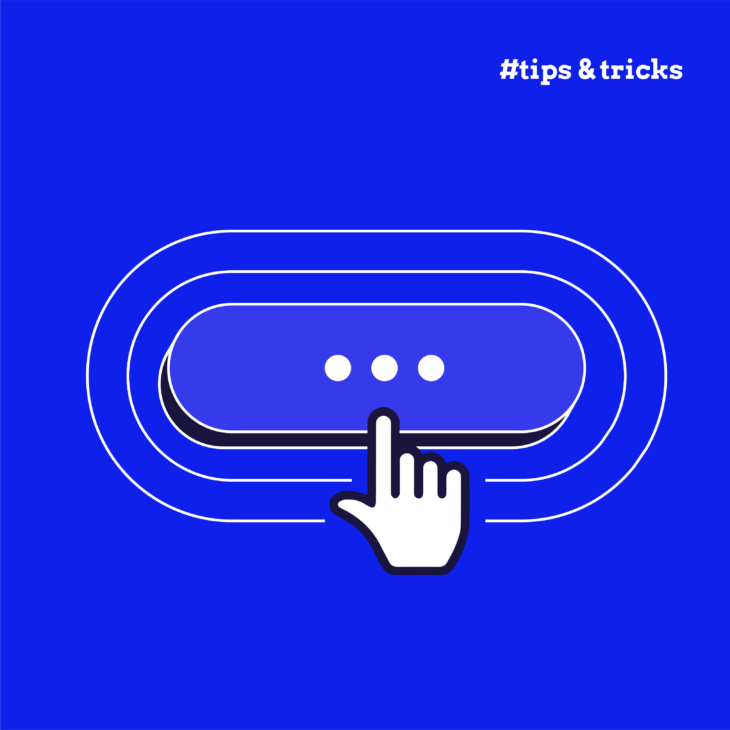
It’s essential to follow certain size and spacing guidelines. Ensure your button is large enough for users to interact with easily – aim for at least 44×44 CSS pixels. Also, consider the button’s proximity to other interactive elements to avoid accidental clicks or focus confusion.
For interaction, implement keyboard event listeners to respond to the Enter and Space keys for activation. On mobile, don’t forget to handle touch events to ensure the button is usable across all devices.
Interaction patterns
When building complex interfaces, like modals or dropdowns, focus management becomes critical. You must ensure focus is trapped within the modal while it’s open, and that users can navigate through buttons smoothly. Likewise, be mindful of nested interactive elements and manage tab order properly to avoid confusing navigation.
Testing and validation
After implementing your ARIA button, you’ll need to test it for accessibility. Start by validating your button against WCAG 2.2 criteria, particularly the 4.1.2 success criterion for name, role, and value.
Testing with screen readers (like NVDA, VoiceOver, or JAWS) and using keyboard-only navigation will help you identify any issues. Tools like the W3C HTML Validator and aXe can also help ensure your implementation is correct.
Best practice for accessibility: The button element
Native HTML buttons are incredibly powerful, and they should be your first choice whenever possible. Unlike custom ARIA buttons, <button> elements are natively focusable, fully keyboard-operable, and, most importantly, automatically convey meaningful information to screen readers and other assistive technologies. No need to manually code these behaviours — they’re built-in and don’t require extra ARIA roles or attributes to function properly.
When developers lean heavily on non-semantic elements (like <div> or <span>) to create buttons, they often introduce complexity that can lead to broken interactions, poor accessibility, or even confusion. For instance, custom buttons might not behave consistently across different screen readers, and managing state or focus can become time-consuming. Also, real-world experience shows that custom ARIA buttons can break during browser updates or with newer assistive technologies. This creates unnecessary maintenance challenges.
💡 It’s worth noting that while semantic HTML reduces the need for ARIA attributes, ARIA can still be helpful in situations where native elements don’t fully capture the desired behaviour. However, these cases should be the exception, not the rule.
If styling is the primary reason you’re reaching for custom buttons, try using CSS first.
Master ARIA with our expert-led course
While we’ve covered the key steps for making ARIA buttons accessible, there’s so much more to explore – handling complex user interactions, managing dynamic content, and fine-tuning your interfaces for accessibility.
If you’re ready to take your accessibility skills to the next level, sign up for our ARIA explained course at The A11Y Collective. Led by accessibility expert Rian Rietveld, this course provides practical guidance on implementing ARIA in real-world scenarios. Learn how to tackle common ARIA challenges, design inclusive components, and meet WCAG standards effectively.
As one of our students, Dominic Bärtschi, said:
“The masterclass was very insightful and full of real-life examples, which makes a highly technical topic much easier to understand. Rian’s experience and expertise are remarkable.”
Don’t wait – join our advanced web accessibility course today and take the next steps towards becoming an accessibility expert!

Want to master ARIA?
Join our advanced web accessibility course today to get practical guidance on ARIA implementation. Take the next step in designing inclusive components!